Perspective Drawing
One-, two- and three-point perspective, and why getting it slightly wrong looks so strange.
Perspective Drawing
A picture where everything is slightly impossible
In 1754, the English artist William Hogarth designed a print for the opening page of a book about how to draw in perspective. It's usually called Satire on False Perspective, and it's one of the funniest images in the history of art education. At first glance it looks like an ordinary country scene, with a river, a bridge, an inn, trees and people going about their day. Then you start to notice the problems. A man on a hill in the distance is lighting his pipe from a candle held by a woman leaning out of a window much closer to us. A fisherman's line crosses behind another fisherman's line in a way that can't make sense. Sheep get bigger as they go further away. The sign of the inn is attached to two buildings at once. Hogarth's caption warned that anyone who makes a design without knowing perspective will be liable to the kind of absurdities shown in the picture.
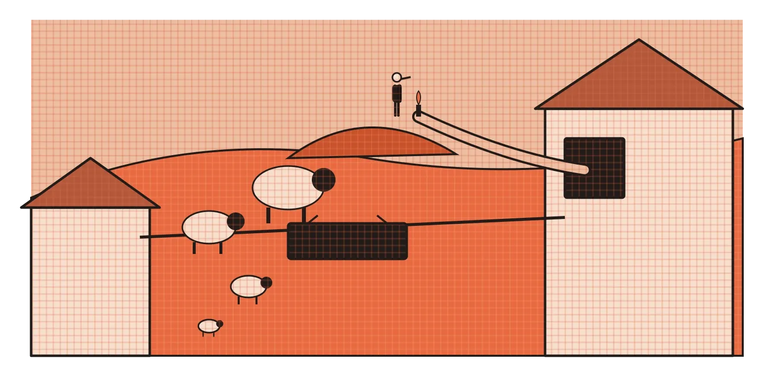
The print is funny because almost every detail is believable on its own. It's only the relationships between them that are wrong. That's exactly what perspective is about. It's a system for drawing three-dimensional space on a flat surface so that sizes, positions and angles all agree with each other, the way they would from a single point of view. In the post on space, I wrote about how Brunelleschi demonstrated linear perspective in Florence in the early 1400s. This post goes further into how it actually works, and why it's still a basic skill for anyone who designs physical things, spaces or even many kinds of illustration.
Your eye level and where lines meet
Perspective drawing starts with two simple ideas. The first is the horizon line, which in drawing means your eye level. If you're standing on a beach, it's where the sea meets the sky. Indoors, you can't see the real horizon, but the line still exists: it's an imaginary horizontal line at the height of your eyes. Anything above it, like a ceiling, you see from below. Anything below it, like a table top, you see from above. If you crouch, the horizon line drops, and you start to see more of the underside of things. If you climb a ladder, it rises, and you see more of their tops. Getting the horizon line right is the foundation of a convincing drawing, because everything else depends on it.
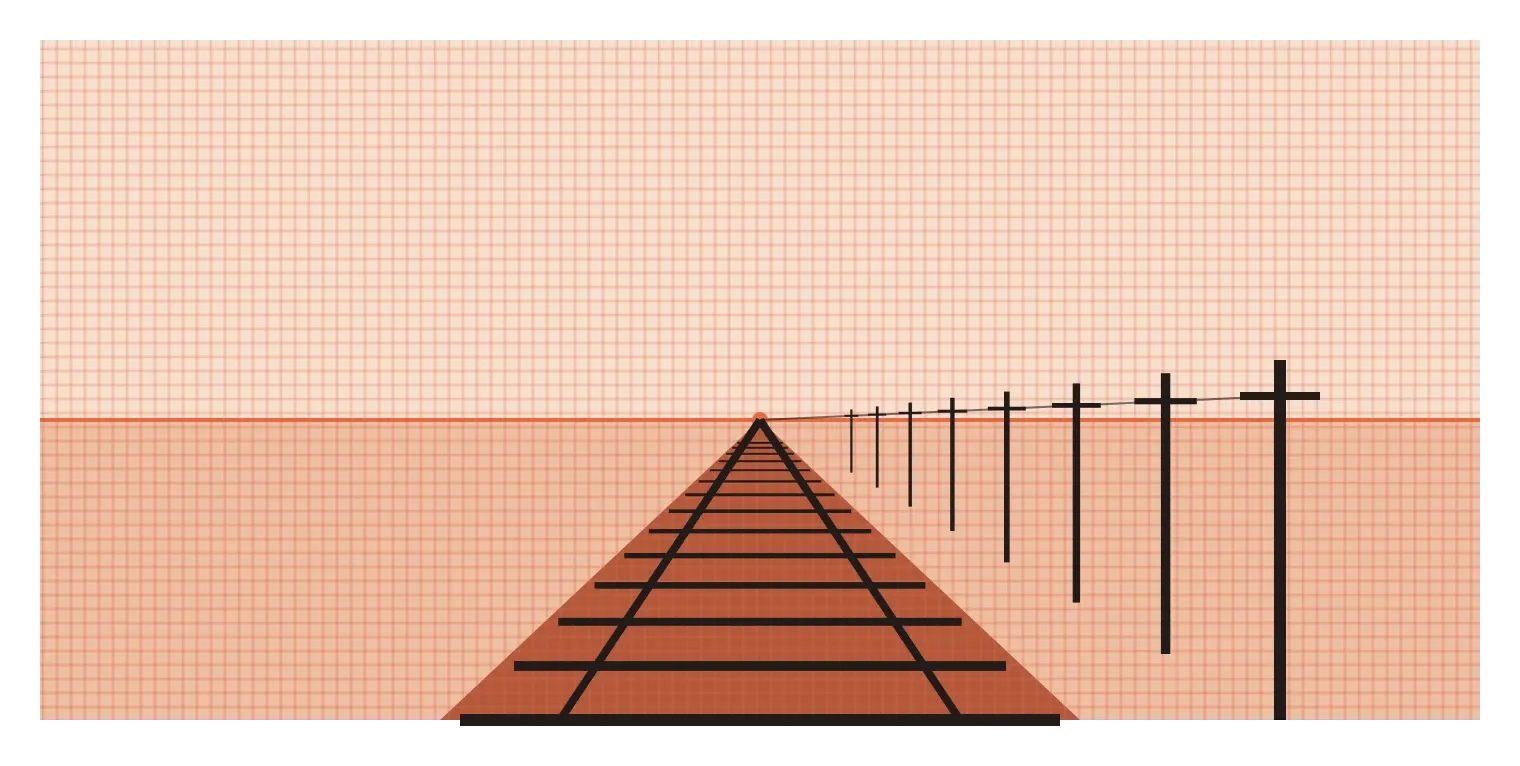
The second idea is the vanishing point. Parallel lines that run away from you, like the two rails of a railway track, the edges of a long road or the lines of floor tiles in a corridor, appear to get closer together as they recede, until they seem to meet at a single point on the horizon line. That point is the vanishing point. The rails don't actually meet, of course. They just take up a smaller and smaller part of your view as they get further away.
The simplest system, one-point perspective, uses just one vanishing point. It works well when you're looking straight at something head-on, like standing in the middle of a road, looking down a long corridor or facing a shelf of books. Lines going straight away from you all head to the single vanishing point in the middle. Lines that run across your view stay horizontal, and lines that go straight up stay vertical. One-point perspective gives a strong sense of depth and symmetry, which is why it's often used for interiors, stage sets and dramatic film shots that pull your eye straight into the distance.
Turning the corner: two and three vanishing points
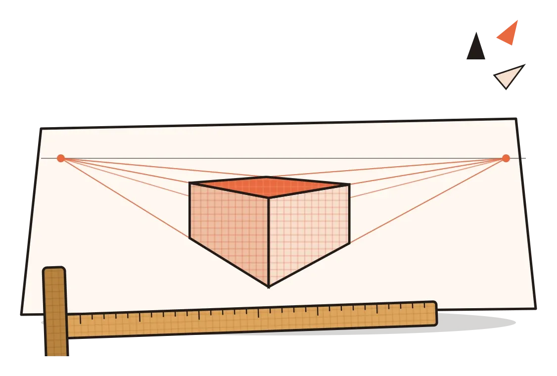
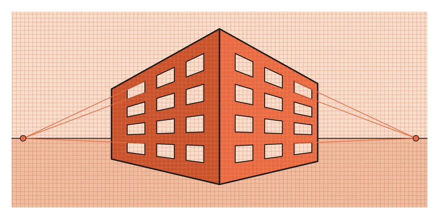
Most of the time, we don't look at things perfectly head-on. We see a building from a street corner, a box from slightly to one side, or a chair at an angle. That's where two-point perspective comes in. Imagine standing at the corner of a building, looking at its nearest vertical edge. One wall stretches away to your left and the other to your right. The horizontal lines of the left wall, its roof edge, window tops and base, all head towards a vanishing point somewhere on the left of the horizon line. The lines of the right wall head towards a second vanishing point on the right. Vertical lines, like the corner and the sides of the windows, stay vertical. Two-point perspective is the system most product designers and architects use day to day, because it shows an object's shape, depth and two of its sides in a natural, easy-to-read way.
Three-point perspective adds a third vanishing point, either far above or far below the horizon line. You need it when you're looking steeply up at something very tall or steeply down at something below you. Stand at the foot of a skyscraper and look up, and the vertical edges of the building no longer look parallel. They lean inwards, converging towards a point high in the sky. Look down from the top of the same building, and the walls seem to rush towards a point far below. This system creates a strong sense of height or depth, which is why it's popular in comics, games and film posters when artists want something to feel towering, dizzying or dramatic.
There are more complex systems too, including curvilinear perspective, which uses curved lines to imitate very wide views, like those from a fisheye lens. But one-, two- and three-point perspective cover almost everything most designers will need. The important thing to understand is that they're not separate tricks. They're the same principle, parallel lines converging towards the horizon, applied to different viewpoints.
Machines for seeing, and other ways to show space
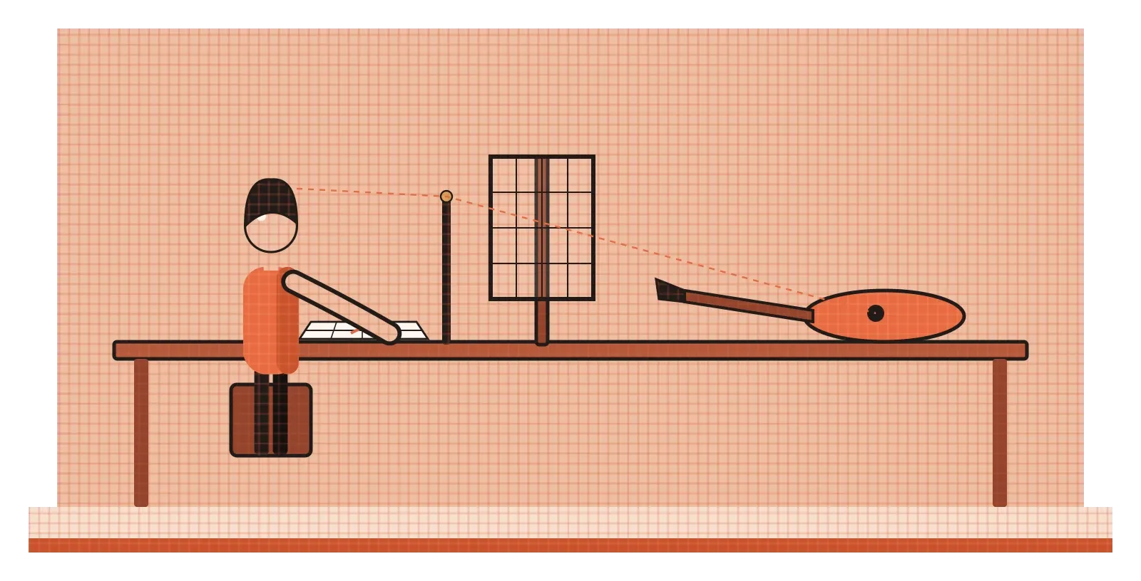
In the decades after Brunelleschi's demonstration, artists across Europe worked hard to master perspective, and some of them built devices to help. In 1525, the German artist Albrecht Dürer published a book called Underweysung der Messung, roughly Instruction in Measurement, with woodcuts showing several of these perspective machines. In one, two men plot the shape of a lute by stretching a string from a fixed point on the wall, past the lute, through a frame, marking where the string crosses the frame to build up an accurate drawing point by point. In a later edition, another woodcut shows an artist drawing a reclining figure by looking through an upright frame divided into a grid, copying what he sees square by square onto gridded paper. These devices made the logic of perspective visible. They show that a perspective drawing is really a record of where lines of sight from one eye pass through an imaginary window.
It's worth remembering that linear perspective is a choice, not the only correct way to show space. In the posts on visual literacy and space, I wrote about Indian miniature paintings that combine several viewpoints in one image. Chinese painters developed handscrolls that unroll from right to left, sometimes many metres long, like Along the River During the Qingming Festival, usually credited to Zhang Zeduan in the twelfth century. Instead of a single fixed viewpoint, the scroll invites the viewer to travel through a whole city as it unrolls, with the point of view shifting along the way. Neither approach is more "accurate". They're answering different questions about what a picture should do.
Designers use non-perspective systems all the time too. Technical drawings often use orthographic projection, flat front, side and top views with no convergence at all, so that measurements can be read directly. Isometric and other axonometric drawings show an object at an angle but keep parallel lines parallel, which is why they're popular for instructions, diagrams and many video games. They look slightly less natural than perspective, but they're far easier to measure and draw consistently.
Where perspective shows up in design work
For industrial and product designers, perspective is an everyday tool. Early ideas are usually explored through quick sketches, and a sketch of a speaker, a chair or a kettle needs to look believable for the idea to be judged fairly. A design that looks lopsided or warped on paper will often be rejected, even if the idea is good, simply because the drawing is distracting. Books like How to Draw by the designers Scott Robertson and Thomas Bertling, published in 2013, are widely used in design schools for exactly this reason. They teach how to set up perspective grids quickly and draw objects that sit convincingly in space.
One of the hardest parts is the ellipse. Any circle seen at an angle, the top of a cup, a wheel, a lens or a knob, becomes an ellipse in perspective. Beginners often draw these with pointed ends, like the outline of an eye, but a true ellipse is always smoothly rounded at both ends. Ellipses also change shape depending on where they sit relative to the horizon line. A circle right at eye level looks almost like a flat line, while the same circle far below eye level opens up into a much rounder shape. And for a cylinder, the shorter axis of each ellipse should line up with the cylinder's central axis, or the object will look twisted. Getting ellipses right is one of the quickest ways to make product sketches look professional.
A few other common mistakes are worth knowing. Placing vanishing points too close together squeezes objects and makes them look distorted, so it helps to keep them far apart, often off the edge of the page. Forgetting where the horizon line is leads to objects that seem to float or tilt. And mixing different viewpoints in the same sketch, like drawing one part from above and another from the side, creates the Hogarth effect, where every part looks fine but the whole doesn't make sense. Even in an age of 3D software, which calculates perspective automatically, these skills still matter, because ideas usually start as quick sketches long before anything is modelled on a computer.
Find the horizon first
Perspective can look intimidating at first, with all its lines, points and rules. But underneath, it comes down to a few ideas that are easy to remember. Decide where your eye is, which sets the horizon line. Notice which way the main edges of your object run, which tells you where the vanishing points are. Then let every parallel line head towards its vanishing point, and keep checking that the parts of your drawing agree with each other. Most of the absurdities in Hogarth's print come from forgetting one of those steps.
The habit I'd take from this is to practise with simple boxes before moving on to anything complicated. Almost every object, a phone, a stool, a building, a car, can be roughed out as a box or a combination of boxes in perspective, and then refined. Draw boxes from above, below and at eye level. Draw them in one-point and two-point. Draw cylinders, paying attention to the ellipses at the top and bottom. It's not glamorous practice, but it builds a feel for space that makes every later sketch easier and more convincing. And when you look at the world, try to spot the horizon line and the vanishing points in real scenes, a street, a corridor, a table, so that the rules start to feel like something you see rather than something you calculate.
Hogarth's satire is more than two and a half centuries old, and it's still a perfect warning. You can draw every detail beautifully and still end up with a picture that feels wrong, because the details don't agree about where the viewer is standing. Perspective is what makes them agree. It's less about drawing lines and more about choosing a single, consistent point of view, and sticking to it.
Further reading: Scott Robertson and Thomas Bertling, How to Draw (2013) · Albrecht Dürer, Underweysung der Messung (1525) · Leon Battista Alberti, On Painting (1435)