Gesture and Contour Drawing
Two ways of drawing: one that catches movement, and one that follows edges slowly.
Gesture and Contour Drawing
Animators who drew in thirty seconds
For many years, Walt Stanchfield taught drawing classes to animators at the Walt Disney studio. His students were already skilled professionals, people who could draw characters beautifully. Yet Stanchfield spent much of his time pushing them to draw faster and looser, often from live models holding poses for just a minute or less. He also wrote weekly handouts full of advice, and after his death, they were collected and published in 2009 as two volumes called Drawn to Life. Again and again in those notes, he came back to one idea. A drawing of a figure isn't convincing because every muscle is in the right place. It's convincing because it captures what the person is doing: the push, the lean, the reach, the weight shifting from one foot to the other.
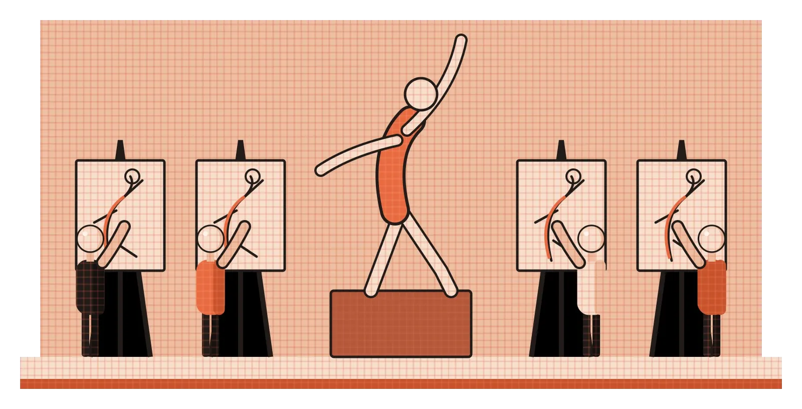
That quality is called gesture, and for animators it's everything. A character in a film has to feel alive in every frame, and that sense of life comes from movement and intention, not from detail. A drawing that's anatomically perfect but stiff will look like a statue. A rough, scribbly drawing with strong gesture will look like someone about to move. Gesture drawing is the practice of catching that energy quickly, before the details get in the way. Its partner, contour drawing, works almost the opposite way, slowly tracing edges with close attention. Between them, they train two different kinds of seeing, and both turn out to be useful far beyond figure drawing.
Gesture: drawing the action, not the outline
Gesture drawing was given its classic description by Kimon Nicolaides, the art teacher whose book The Natural Way to Draw, published in 1941, I mentioned in the post on line. Nicolaides told his students not to draw what a model looked like, but what the model was doing. Is the person pushing, leaning, twisting, resting? Where is their weight? Which way is the body moving, or about to move? He asked students to make very quick drawings, sometimes just a few seconds each, letting their pencil move continuously and freely over the page as their eyes moved over the figure. The drawings often look like messy scribbles, but the good ones have an unmistakable sense of energy and direction.
Animators and illustrators often simplify this into a single idea called the line of action. Before drawing anything else, you draw one curved or straight line that sums up the main movement of the whole figure, from head to foot. A person throwing a ball might be one long curve bent backwards like a bow. A tired person slumped in a chair might be a soft, sagging curve. Once that line is in place, the rest of the body is built along it. If the line of action is strong and clear, the pose reads instantly. If it's weak or confused, even a detailed drawing will look stiff.
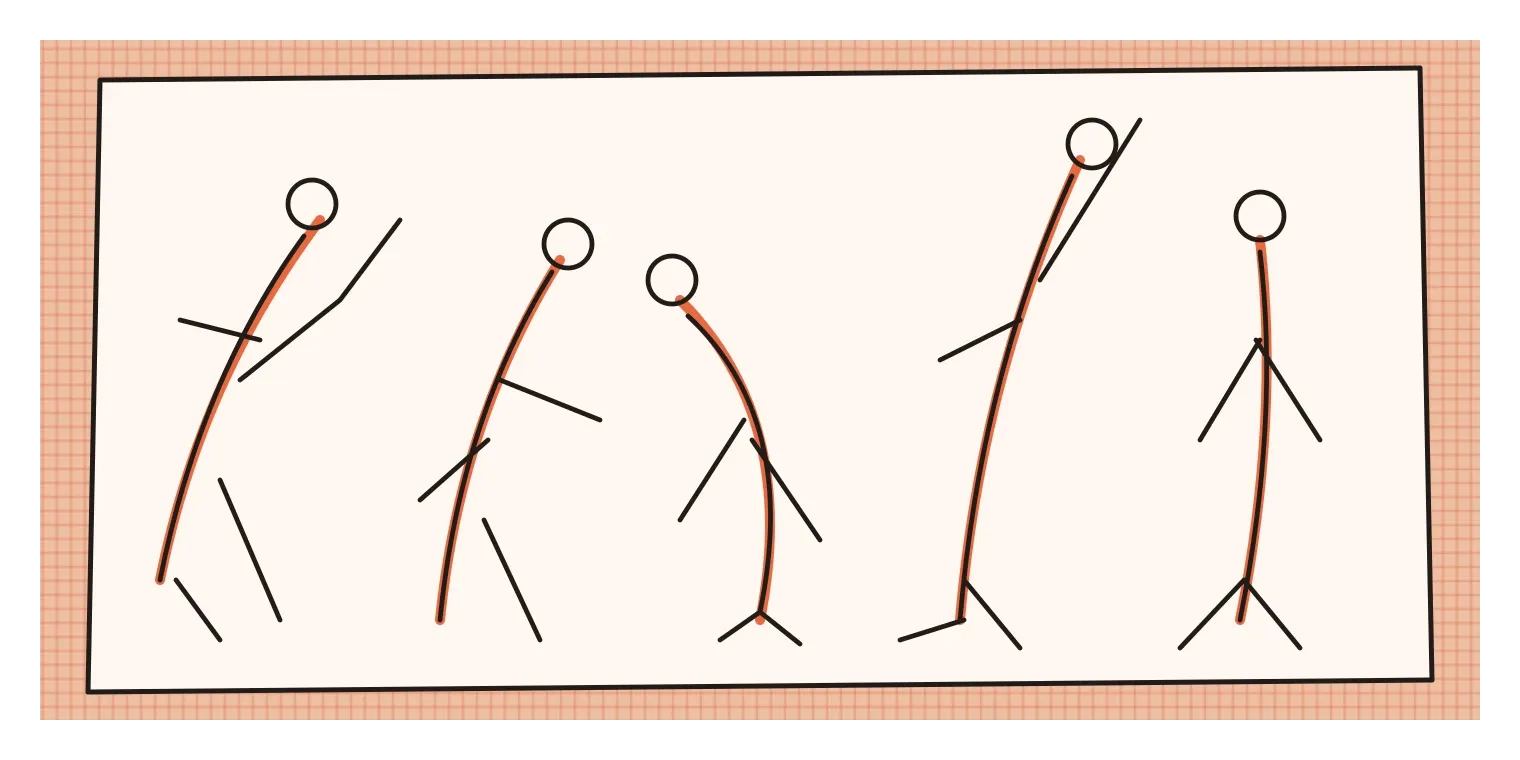
What makes gesture drawing valuable is that it forces you to prioritise. With only thirty seconds, you can't draw fingers, eyelashes or clothing folds. You have to decide what matters most about the pose and get that down first. It's a bit like writing a one-line summary before writing a full essay. The detail can come later, but if the summary is wrong, no amount of detail will save it. That habit of capturing the essence first turns out to be useful in almost every kind of design work.
Contour: following the edges slowly
If gesture is fast and loose, contour drawing is slow and careful. A contour is the edge of a form, the line where an object turns away from you or meets something else. In the post on line, I described the blind contour exercise that Nicolaides made popular: you look only at your subject, never at the paper, and let your pencil slowly trace its edges as your eye travels around them. The results usually look strange and distorted, with lines that don't quite join up. But that's not the point. The exercise forces your eye and hand to move together at the same slow pace, and it breaks the habit of drawing from memory or from symbols.
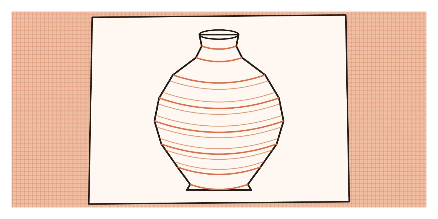
There are a few variations. In modified contour drawing, you mostly look at the subject but allow yourself quick glances at the paper to keep things roughly in place. This produces more recognisable drawings while keeping much of the close attention. Cross-contour drawing is different again. Instead of drawing only the outer edges, you draw lines that wrap around the surface of the form, like the lines of latitude on a globe or the stripes on a striped shirt. These lines bend and curve as they travel over bumps and dips, which makes even a simple line drawing look solid and three-dimensional. Product designers use cross-contours constantly to show the curvature of a surface, such as the gentle bulge of a mouse or the curve of a car door.
Contour drawing also teaches line quality, which I wrote about in the post on line. A good contour line isn't uniform. It gets slightly heavier where a form turns sharply away or sits in shadow, and lighter where it catches light or where one shape overlaps another. Learning to vary the pressure and thickness of a line as you follow a contour is one of the simplest ways to make a drawing look more alive and more convincing.
Horses in a few strokes, and figures for fashion
One of the most recognisable uses of gesture in Indian art is the horse paintings of M. F. Husain, one of the founders of the Progressive Artists' Group in the late 1940s and among the best-known Indian painters of the twentieth century. Horses appear again and again in his work, and they're rarely drawn with careful anatomy. Instead, a few bold, sweeping strokes suggest a neck stretched forward, legs mid-gallop and a tail flying out behind. Some details are left out entirely, and some lines are exaggerated. But the energy of a running horse comes through instantly. It's gesture at full volume, a reminder that sometimes leaving things out is what makes a drawing feel alive.
Fashion design relies on gesture in a very practical way. Fashion designers sketch their ideas on figures called croquis, quick, simplified drawings of the human body used as a base for showing clothes. Croquis are usually stylised, often much taller and slimmer than real proportions, partly to give more room for showing the garment and partly as a long-standing convention of fashion illustration. That stylisation has rightly been criticised for promoting unrealistic body ideals, and many designers now work with more varied and realistic figures. Either way, the pose matters enormously. A garment sketched on a stiff, straight figure looks flat. The same garment on a figure walking, turning or shifting weight shows how fabric swings, drapes and moves, which is often the whole point of the design. Good fashion sketches capture the gesture of the body and the gesture of the clothing together.
Both examples show the same thing from different angles. Gesture isn't only about drawing people. It's about drawing intention and movement, whether that's a galloping horse, a swirling skirt or anything else that's meant to feel like it's going somewhere.
Objects have gesture too
It might seem strange to talk about gesture in objects that don't move, but designers do it all the time, especially in car design. Car designers often talk about a car's stance, the way it sits on its wheels, and its gesture, the main flowing lines that give it character. A sports car might have a low, crouched stance with lines that sweep forwards, as if it's about to pounce. A family car might have a more upright, relaxed stance. Early car sketches are often drawn very quickly, with exaggerated proportions and a single confident line running along the side, because designers are trying to capture the feeling of the car first. Only once that gesture feels right do they refine it into something that can actually be engineered and built.
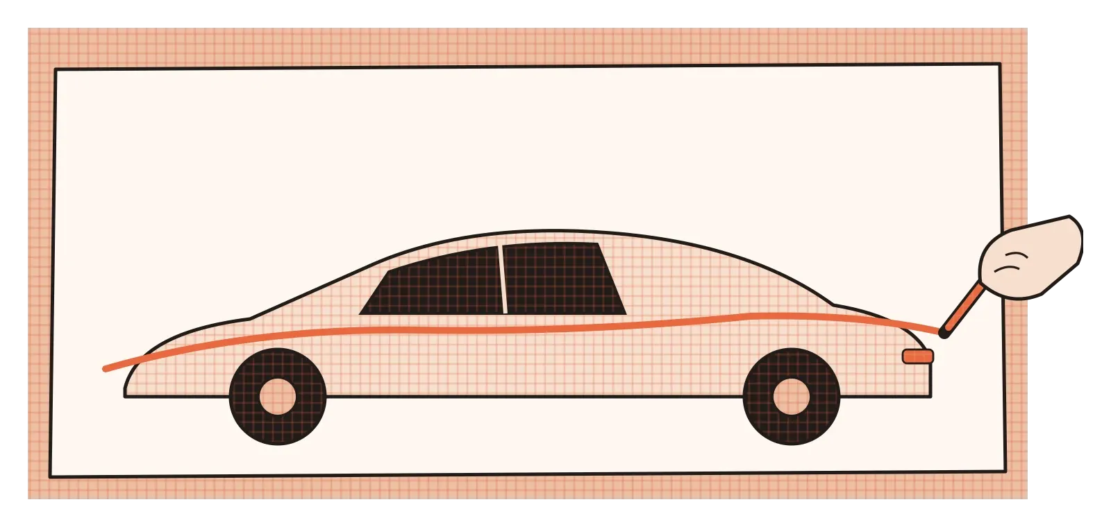
The same thinking applies to everyday products. A kettle can look like it's leaning forward eagerly to pour, or sitting back calmly on its base. A desk lamp can seem to bend attentively over a book. A chair can look welcoming and relaxed, or alert and formal. These impressions come largely from the main lines and the balance of the form, which is exactly what gesture drawing trains you to see and control. When designers sketch an object quickly, with one or two strong lines that sum up its character, they're doing for a product what Nicolaides asked his students to do for a figure: capturing the essence before the details.
Contour drawing has its own place in product work. Once the gesture is set, designers use careful contour lines and cross-contours to describe the actual surfaces of the object, where a curve tightens, where an edge softens, where one surface flows into another. In that sense, the two kinds of drawing match two stages of design. Gesture is for finding the idea. Contour is for understanding and refining its form.
Fast to find it, slow to understand it
Gesture and contour drawing are often taught as warm-up exercises, the things you do at the start of a drawing class before the "real" work begins. I think that undersells them. Between them, they train two of the most important habits a designer can have. Gesture teaches you to grasp the essence of something quickly, to decide what matters most and get it down before you get lost in detail. Contour teaches you to slow down and pay patient attention to how a form really behaves, edge by edge and surface by surface. Most good design work needs both: a fast, confident sense of the overall idea, and a slow, careful understanding of the details that make it work.
If you want to practise, the simplest routine is to alternate between the two. Spend five minutes doing very quick gesture drawings, thirty seconds each, of people around you, a pet, or even yourself in a mirror, focusing only on the line of action and the main movement. Then spend ten minutes doing a slow contour drawing of a single object, like a shoe, a bag or a plant, following every edge without lifting your pencil too often. Try a few cross-contours on something rounded, like a fruit or a bottle. You don't need special materials, and it doesn't matter if the drawings look messy. What matters is the way you're looking.
Walt Stanchfield's animators were already brilliant draughtspeople, and he still made them draw quickly and loosely, again and again, because he knew that skill in detail is worthless without life underneath it. That lesson applies to every kind of design. Find the gesture first. Then take the time to understand the contours. In that order, the work usually ends up both alive and well made.
Further reading: Kimon Nicolaides, The Natural Way to Draw (1941) · Walt Stanchfield, Drawn to Life (2009) · Scott Robertson and Thomas Bertling, How to Draw (2013)