Itten's Colour Contrasts
How a Bauhaus teacher sorted the ways colours push against each other into seven practical tools.
Itten's Colour Contrasts
A colour course that began with breathing
When the Bauhaus opened in Weimar in 1919, new students began with an introductory course, the Vorkurs, and for its first few years that course was run by a Swiss painter named Johannes Itten. His classes didn't look much like art school. Itten often started with breathing and loosening exercises, getting students to stand, swing their arms and relax before they picked up a pencil, so that a drawing would come from the movement of the whole body rather than from a stiff, careful hand. He was a follower of Mazdaznan, a religious movement built around breathing, diet and purification. He shaved his head, wore a loose robe he had designed himself, and for a time the school canteen served the vegetarian, garlic-heavy food his beliefs called for. Some students copied his look. Others found it faintly ridiculous.
Walter Gropius, who had founded the school, grew uneasy. He wanted the Bauhaus to work with industry and design things that could be manufactured, while Itten seemed to be leading students towards something closer to a spiritual retreat. In 1923 Itten left. His course passed to László Moholy-Nagy, with Josef Albers, one of Itten's former students, teaching part of it.

It would be easy to remember Itten only for the robe and the garlic. But under the mysticism, he was a serious and careful teacher of colour, and decades later he set out that teaching in a book, Kunst der Farbe, published in 1961 and in English the same year as The Art of Color. Its most lasting idea is a simple list. He argued that there are seven distinct ways colours can contrast with one another, and that if you understand each of them, you can understand, and deliberately build, almost any colour effect.
I mentioned the seven contrasts briefly in the post on contrast. This post goes through them properly, because they're still one of the most practical ways to think about what colours are doing in a design.
Seven ways two colours can differ
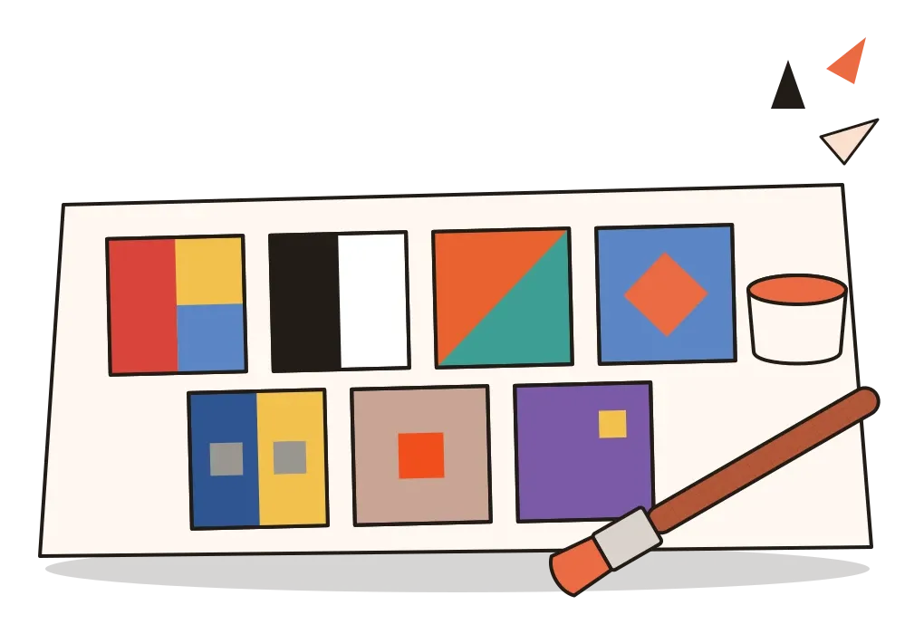
Itten didn't invent all of this from nothing. Before the Bauhaus, he had studied in Stuttgart with the painter Adolf Hölzel, who taught his own theory of colour contrasts, and both of them drew on earlier writers like Goethe, whose plus and minus sides of colour I described in the post on colour temperature. What Itten did was organise these ideas into a clear set, with exercises for each one. The seven are contrast of hue, light-dark contrast, cold-warm contrast, complementary contrast, simultaneous contrast, contrast of saturation and contrast of extension.
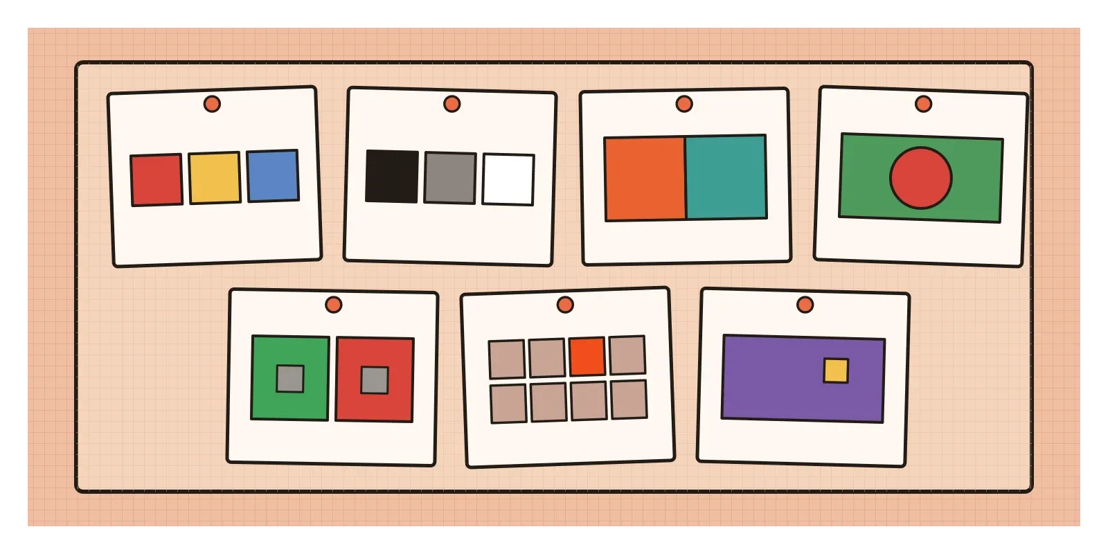
Contrast of hue is the simplest. It's what you get when you put clear, strong hues side by side at full intensity. Itten saw yellow, red and blue together as its strongest form, with the effect weakening as the colours move away from those three. It's loud, cheerful and direct, the contrast of folk art, toys and signage. Its danger is that, with every colour shouting, nothing leads.
Light-dark contrast is the contrast of value, which I wrote about in the post on value. Itten treated black and white as its strongest form and had students make careful grey scales and then match coloured hues to the greys of equal lightness. It does most of the work of making shapes readable.
Cold-warm contrast sets warm colours against cool ones, the subject of the previous post. Itten placed its two poles at red-orange, the warmest, and blue-green, the coldest. In The Art of Color he even reported that people in a workroom painted blue-green felt cold at a noticeably higher temperature than people in one painted red-orange, a claim that later studies have only partly supported. The visual effect is much clearer: warm against cool creates depth and atmosphere.
Complementary contrast pairs colours that sit opposite each other on the colour wheel, such as orange and blue, red and green, or yellow and violet. They come up in more detail in the post on colour harmonies, so I'll keep to Itten's practical point. Placed side by side, complementaries make each other look more intense. Mixed together, they cancel out into a grey or a muddy brown. The same two colours can energise a design or deaden it, depending on whether they touch or blend.
Three contrasts that depend on context
The last three contrasts are subtler, and they're where colour starts to behave in ways that surprise people.
Simultaneous contrast is the eye's habit of shifting a colour towards the opposite of whatever surrounds it. Put a neutral grey square on a bright green background and it takes on a faint reddish tinge. Put the same grey on red and it looks slightly greenish. Michel Eugène Chevreul, whom I mentioned in the post on colour harmonies, described it carefully in 1839, after complaints at the Gobelins tapestry works in Paris that some of its dyes looked weaker than they should. The problem, he realised, often wasn't the dye at all, but the colours woven next to it. Itten described it as the eye demanding balance and producing the missing complement on its own. It's also the doorway to the work of Josef Albers, which I'll come to in the next post.
Contrast of saturation sets pure, intense colours against dull, diluted ones. You can dull a colour by mixing it with white, black, grey or its own complement, and each gives a slightly different result. White makes it chalky and pale, black makes it heavier, grey simply softens it, and the complement greys it while keeping a certain depth. A single saturated colour among muted ones looks more brilliant than it would alone.
Contrast of extension, sometimes called contrast of proportion, is about how much of each colour you use. Itten took it from Goethe, who gave the main hues rough numbers for their brightness: yellow 9, orange 8, red and green 6, blue 4 and violet 3. Itten turned those into proportions for balance. Because yellow is about three times as bright as violet, a balanced pairing needs roughly three times as much violet as yellow. Orange needs about half the area of blue, and red and green balance in equal amounts. The numbers aren't sacred, but the principle is sound: a bright, light colour goes a long way, while a dark, quiet one needs more area to hold its own. And if you deliberately break the balance, giving a small patch of a strong colour to a large field of its opposite, the small patch becomes the focal point.
Gold silk on a dark red ground
One of my favourite places to see Itten's contrasts at work is phulkari, the embroidery tradition of Punjab, practised on both sides of what is now the border between India and Pakistan. The name means something like flower work. Traditionally, women embroidered it onto handspun, hand-woven cotton called khaddar, often dyed a deep red, rust or brown, using untwisted silk floss in golden yellow, orange, white, magenta and green. The stitch is a darning stitch worked from the back of the cloth, so that long, glossy floats of silk lie on the front and build up geometric motifs: diamonds, stars, stripes and stylised flowers.
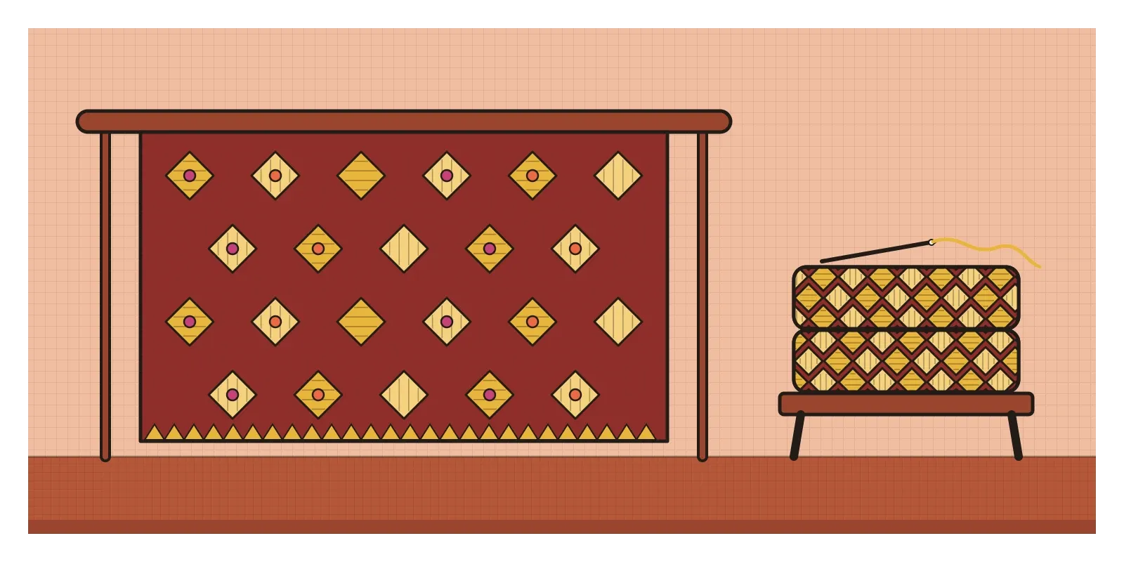
Read through Itten's list, a phulkari is almost a textbook. Golden silk on dark red cotton is a strong light-dark contrast, and glossy, saturated floss against a matt, earthy ground is a contrast of saturation. The most interesting one, though, is extension. In many phulkaris the motifs are scattered, so small patches of bright silk sparkle against a large dark field. In the kind called bagh, which means garden, the embroidery covers almost the whole surface, and the red ground survives only as thin lines between the motifs. The balance flips, and with it the whole character of the cloth. There's even a play of contrast inside a single colour. Because embroiderers changed the direction of their stitches from one area to the next, the same golden floss catches the light differently, and one thread can look like two or three shades of gold.
None of this came from colour theory. It came from generations of women working at home, often for weddings and family occasions, passing patterns and judgement from one to the next. What Itten's list offers is a vocabulary for describing why such work holds the eye, and it's a humbling one to apply, because it shows how much of what design schools teach as theory was already being done with confidence, by hand, long before the Bauhaus.
Seven contrasts on a screen
Itten's list translates surprisingly well to interface design, where each contrast tends to have its own job. Light-dark contrast carries readability and hierarchy, as I wrote in the post on value, and it's the one accessibility checks actually measure. Contrast of hue separates categories, like the lines on a chart or the labels for different projects. Contrast of saturation sorts the important from the routine. In most good interfaces, backgrounds, borders and text are low in saturation, and saturated colour is saved for status and action, such as an error, a warning or a primary button. Contrast of extension is why that primary button can be so small and still dominate the screen. The 60-30-10 rule of thumb from the post on colour harmonies is really contrast of extension written as numbers. Cold-warm contrast often sets the tone, with cool neutrals for calm, functional areas and warm colours for things that need attention.

Chart libraries quietly encode the same ideas in the kinds of palette they offer. Categorical palettes, for unrelated groups, change mainly in hue. Sequential palettes, for quantities that run from low to high, change mainly in lightness and saturation. Diverging palettes, for data that runs in two directions from a middle point, often use cold-warm contrast, such as blue for below average and orange or red for above. Choose the wrong kind of contrast and a chart can mislead. A rainbow of hues used for a simple low-to-high quantity makes people see sharp boundaries in the data that aren't really there.
Simultaneous contrast is the one that catches designers out. The same grey text can look warmer on a blue card than on a beige one, and a brand colour picked on a white artboard can look quite different on a dark background. When a status colour is meant to look the same everywhere, it's worth checking it on every background it will actually appear on, not just the one it was designed on.
Keep the contrasts, leave the mysticism
Not all of Itten's ideas have aged well. His twelve-part colour wheel, built on red, yellow and blue as primaries, is still printed in countless textbooks, but it doesn't match how light mixes on a screen or how printing inks mix on paper, which is the subject of the post on additive and subtractive colour. He also believed that each person has subjective colours tied to their personality and appearance, an idea that is often traced into the seasonal colour analysis later popular in fashion, and that has little scientific support. But the seven contrasts have lasted, I think, because they aren't really a theory at all. They're a checklist of the ways colours can differ, and you can check every one of them with your own eyes.
For an exercise this week, you need a pile of old magazines, scissors and glue. Make seven small collages, each about the size of your palm, one for each contrast. For hue, glue down three strong, clear colours. For light-dark, find one hue in a very light and a very dark version. For cold-warm, set an orange against a blue-green. For complementary, a pair of opposites. For simultaneous contrast, cut two identical grey squares and place one on a strong colour and the other on its complement. For saturation, put one vivid scrap among dull ones. For extension, a tiny patch of yellow on a large field of violet. Then look at a design you're working on and ask which of the seven it uses, and which it ignores.
Itten's students began his course by breathing and swinging their arms, which sounds a long way from a list of contrasts. But I think the two belong together. He wanted students to feel a colour before they analysed it, and only then to name what they had felt. The seven contrasts are what came out of that naming, and they're most useful in the same spirit, not as rules to apply blindly, but as words for something your eye has already noticed.
Further reading: Johannes Itten, The Art of Color (1961) · Johannes Itten, Design and Form: The Basic Course at the Bauhaus (1964) · Frank Whitford, Bauhaus (1984)