Josef Albers and the Interaction of Colour
Why a colour almost never looks the same twice, and how Albers taught people to see it.
Josef Albers and the Interaction of Colour
A teacher who came to open eyes
In late November 1933, a German painter and his wife arrived at a brand new college in the hills of North Carolina. Josef Albers had spent more than a decade at the Bauhaus, first as a student and then as a teacher, until the school closed under pressure from the Nazis earlier that year. Anni Albers was a weaver who had trained in the Bauhaus textile workshop. Black Mountain College had only just been founded, and the architect Philip Johnson, then a curator at the Museum of Modern Art in New York, had recommended Josef for a job there. When the invitation came, the couple warned that Josef spoke almost no English. They were told to come anyway. Soon after he arrived, a student asked him what he planned to teach. His answer, in a few words of halting English, became the motto of everything he did afterwards: to open eyes.
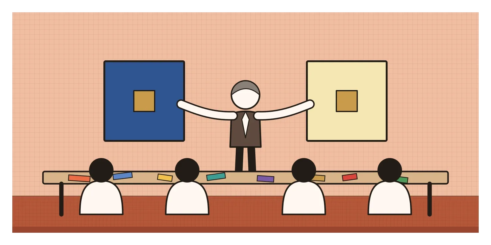
It's a good summary of what he spent the next forty years doing. Albers taught at Black Mountain until 1949 and then went to Yale, where from 1950 he led the department of design. Over those years he developed a way of teaching colour that started not with theory but with looking, and in 1963 Yale University Press published it as Interaction of Color.
I mentioned the book briefly in the post on colour, along with one of its best-known exercises, making one colour look like two. This post is about the book itself and the idea at its heart. Albers called colour "the most relative medium in art". A colour, in his view, is almost never seen as it physically is. It's always changed by the colours around it, by how much of it there is, by the light it's seen in, and by our own memory and expectations.
Practice first, theory afterwards
Albers had been one of Johannes Itten's students at the Bauhaus, and after Itten left he taught part of the same preliminary course, so it's interesting how differently the two approached colour. Itten, whose seven contrasts I wrote about in the previous post, arrived with a system to explain. Albers wanted students to discover effects with their own eyes first and only then talk about why they happened. His book says plainly that it reverses the usual order of theory and practice.
His other unusual choice was paper. Instead of mixing paint, his students worked with sheets of coloured paper, often the Color-aid papers sold to designers, along with scraps cut from magazines, advertisements and packaging. Albers had practical reasons. Paper gives a flat, even colour that can be cut, moved and swapped in seconds, and matched exactly with another piece of the same sheet. Mixing the same paint twice never quite gives the same result. Paper also forces a kind of honesty. You can't keep fiddling until it looks right. You have to find the right colour among the ones that already exist.
He began with memory. If you say the word red to a room of fifty people, he pointed out, you can expect fifty different reds in their minds, and even a red everyone thinks they know, like the red of a famous soft drink, is remembered differently by each of them. We're poor at remembering exact colours. We remember names and associations, not hues. That's partly why designers are so often surprised by their chosen colour once it's printed. We never really held on to what it looked like.
Tricks that aren't really tricks
Most of Interaction of Color is a sequence of exercises, each built around an effect you can see but might not quite believe until you make it yourself. Making one colour look like two is the famous one. Its reverse is harder and more instructive. You take two genuinely different colours and try to make them look the same, by finding backgrounds that push each one towards the other. Students usually struggle with it for a long time, and the struggle is the point. It trains the eye to notice how much the background contributes.
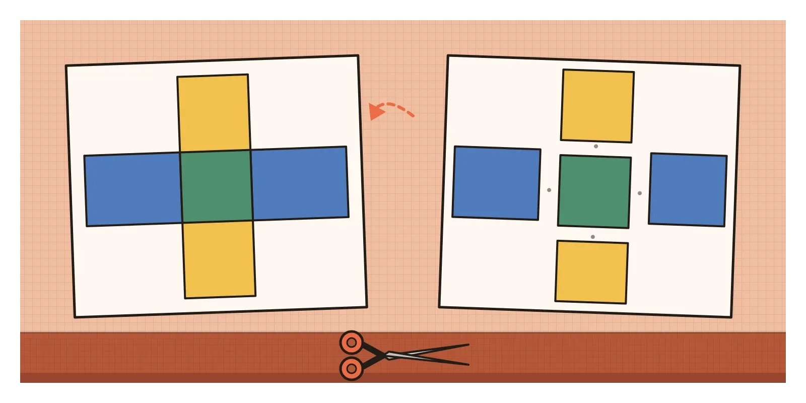
Another exercise creates the illusion of transparency. Students cut pieces of opaque paper and arrange them so that they look like overlapping sheets of coloured glass. Lay a strip of blue across a strip of yellow, and where they cross, use a third piece of paper of exactly the right greenish colour, and the eye reads the whole arrangement as one see-through sheet lying over another. Choose the middle colour slightly closer to the blue and the blue seems to lie on top. Choose it closer to the yellow and the yellow seems to come forward. Choose it badly and you just have three pieces of paper.
There are many more. One chapter deals with the Bezold effect, named after the German meteorologist Wilhelm von Bezold, who noticed that changing a single colour in one of his rug designs changed the look of the whole thing. In a fine pattern, colours don't push away from each other as they do in simultaneous contrast. They blend towards each other, so the same red looks darker when it's surrounded by fine black lines and lighter when it's surrounded by white. Another chapter looks at vibrating boundaries, where strongly contrasting hues of about the same lightness seem to shimmer along the edge where they meet, and at vanishing boundaries, where colours of nearly equal lightness seem to melt into one another so the edge almost disappears.
Each of these is a small lesson in the same idea. A colour on a page isn't a fixed fact. It's something that happens between colours, and it changes every time the neighbours change.
The same squares, over and over
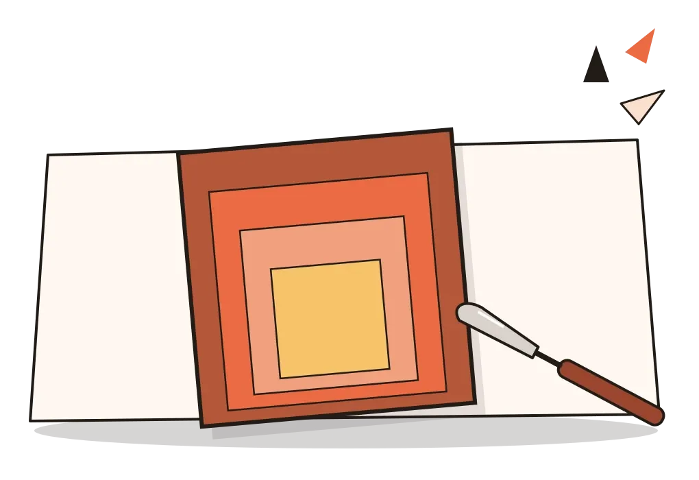
In 1950, the year he moved to Yale, Albers began the series he's best known for, Homage to the Square. Every picture in it uses the same simple format: three or four squares nested inside one another, not centred, but shifted downwards, so the bands of colour are narrower at the bottom than at the top. He kept that arrangement fixed for the rest of his life, which meant the only thing that changed from one picture to the next was colour. He usually painted on hardboard panels, spreading paint straight from the tube with a palette knife rather than mixing it, and often noted on the back which paints he'd used. By the time he died in 1976, the series ran to well over a thousand paintings and prints.
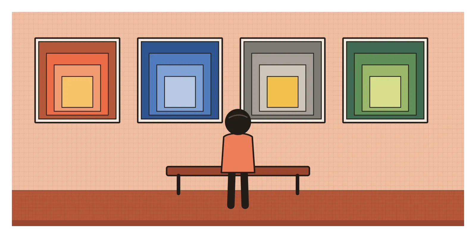
What makes the series fascinating is how much variety comes out of one fixed format. In some, the inner square seems to glow as if lit from behind. In others it seems to sit on top of the outer squares, or to sink into a hole cut through them. Squares that are completely flat appear to step forwards or backwards depending on whether their colours are warmer or cooler, lighter or darker, which links back to the post on colour temperature. Because the format never changes, none of these effects can be credited to composition. It's all colour, acting on colour.
The series made Albers famous well beyond the classroom. In 1971, the Metropolitan Museum of Art in New York gave him a retrospective, the first it had devoted to a living artist.
Two colours in one cloth
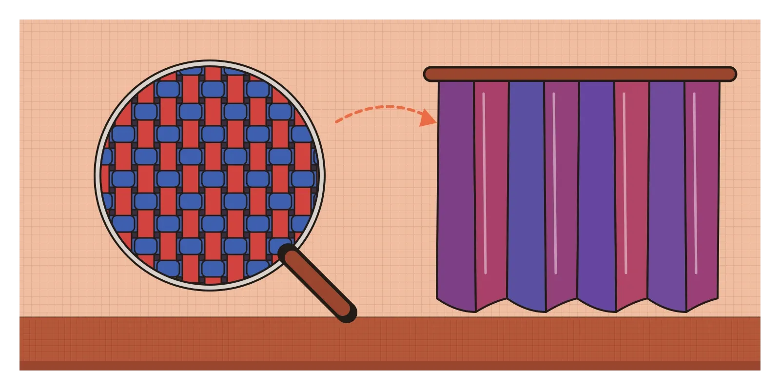
Some of the best illustrations of Albers' ideas I know of are far older than his book, and they come from Indian looms. Dhoop-chhaon, which roughly means sunshine and shade, is the Indian name for what English calls shot silk. It's woven with one colour in the warp, the threads that run along the length of the cloth, and a different colour in the weft, the threads that run across it. A sari woven like this, say with a red warp and a blue weft, doesn't look like either colour from most angles. It looks like a third colour that neither thread actually has, and as the cloth moves and the light catches the warp and the weft differently, that colour shifts from one towards the other. It's an optical mixture, one of the effects Albers explored on paper, produced on the loom by weavers who needed no theory at all.
Block-printed cloth shows the Bezold effect just as clearly. In ajrakh, the printed and resist-dyed textile made in Kutch in Gujarat and across the border in Sindh, the classic colours are deep indigo and madder red, with fine black outlines and small white details. Look closely and the same red can seem quite different in different parts of the pattern, depending on whether it sits among thick black lines or a scatter of tiny white dots, because in a fine pattern the colours blend towards each other in our eyes. Effects like these were understood through generations of practice long before anyone gave them names.
There's a link back to the Albers household too. Anni Albers, whose weaving was the other half of the couple's work, thought about exactly this kind of problem for most of her life: how threads of different colours, crossing each other, combine into the single colour we see when we look at a cloth.
Every colour on a screen has neighbours
Interfaces make Albers' lessons urgent, because the same colour almost never sits on just one background. A brand colour might appear on a white page, on a dark mode background, over a photo and inside a tinted card, and it will look different in each. That's one reason mature design systems don't define a colour once and use it everywhere. They define colours by role, like primary button, link or error, and often give each role a different actual value in light mode and dark mode, chosen so that it looks consistent rather than measures consistent. A blue that looks calm and confident on white can look dull and murky on near-black, so the dark mode version is usually a little lighter and softer.
Size changes colour too. A colour chosen from a large swatch almost always looks less vivid when it's used for thin text or a fine icon line, because small areas of colour are harder for the eye to read, and colours that were easy to tell apart as big patches can become hard to tell apart as small ones. In charts, the same shade in a heatmap cell can look lighter or darker depending on the cells around it, which can quietly mislead people reading the data.
Design tools don't help much here, because a colour picker shows each colour on its own, on a neutral square, which is exactly the situation in which a colour is never actually seen. The practical answer is Albers' answer: judge colours in context. Put the real colour next to its real neighbours, at its real size, on the real backgrounds, before deciding anything. In 2013, for the book's fiftieth anniversary, Yale University Press released Interaction of Color as an app, letting people move coloured squares around on a screen, which is a neat way to practise the exercises in the medium most of us now design for.
Look at colours in pairs, never alone
If there's one idea to take from Albers, it's that you never see a colour on its own. You see it against something, next to something, in some amount and under some light. That's why choosing colours from swatches so often disappoints, and why the most useful colour skill is noticing what colours are doing to each other.
His exercises are still the best way to build that skill, and you don't need special paper. This week, collect a small stack of coloured scraps: magazine pages, packaging, paint charts from a hardware shop. Cut a few small squares about the size of a postage stamp and a few larger rectangles to use as backgrounds. Then try two things. First, take one small square and find two backgrounds that make it look like two different colours. Second, take two small squares that are slightly different and find backgrounds that make them look the same. Keep the attempts that don't work, because they teach as much as the ones that do. In the next post, on colour psychology and culture, I'll move from what colours do to each other to what they mean to us.
When Albers said he had come to Black Mountain to open eyes, he meant it quite literally. He didn't want to hand his students a theory of colour. He wanted them to notice that the colours in front of them were constantly changing, and to enjoy it. Once you've seen it, it's hard to stop seeing it, which is exactly what he hoped would happen.
Further reading: Josef Albers, Interaction of Color (1963) · Anni Albers, On Weaving (1965) · Mary Emma Harris, The Arts at Black Mountain College (1987) · Frederick A. Horowitz and Brenda Danilowitz, Josef Albers: To Open Eyes (2006)