How the Eye Sees
Why your eyes take in far less than you think, and how the brain quietly fills in the rest.
How the Eye Sees
One painting, many journeys for the eye
In the 1950s and 1960s, a Soviet scientist named Alfred Yarbus found a way to record exactly where a person's eyes went while they looked at a picture. His method was uncomfortable. A tiny suction cap carrying a mirror was attached to the surface of the eye, and a beam of light bounced off the mirror onto photographic paper, tracing every movement. In his most famous experiment, a viewer looked at Unexpected Visitors, a painting by the Russian artist Ilya Repin that shows a man walking into a room where his family clearly weren't expecting him. Yarbus recorded the viewer several times, each time with a different question in mind. Look freely. Estimate how wealthy the family is. Guess the ages of the people. Remember their clothes. Work out how long the visitor has been away.
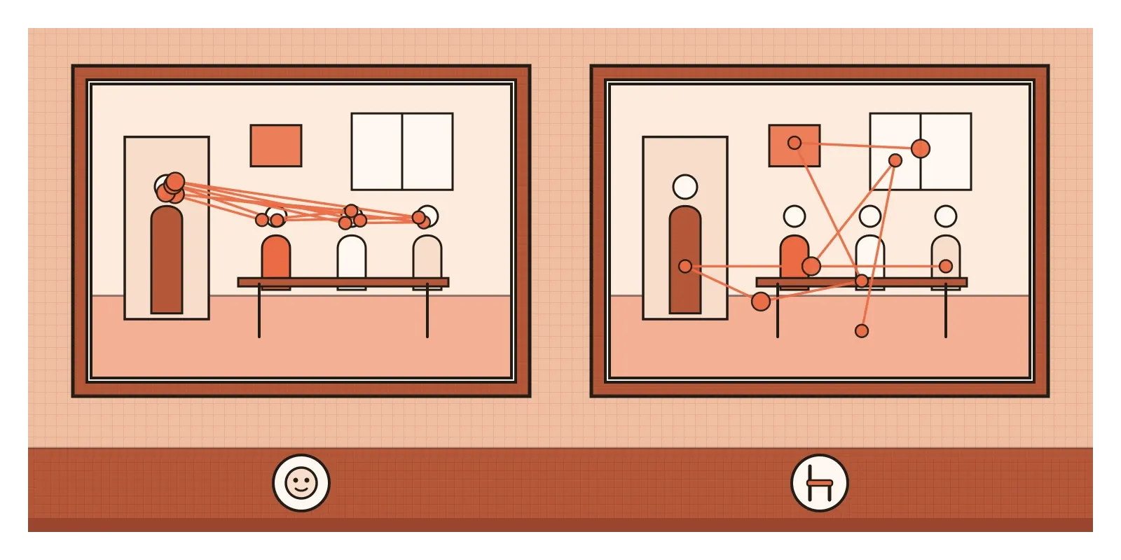
The recordings, published in his book Eye Movements and Vision, which appeared in Russian in 1965 and in English in 1967, look like tangled scribbles over the painting, and every one is different. Asked about wealth, the eyes roamed over the furniture and the clothes. Asked about ages, they jumped from face to face. Asked how long the man had been away, they shuttled between his face and the faces of the family, as if reading their reactions. The painting never changed. What the viewer saw did. Later studies with modern eye trackers have found the same basic pattern. That's the most important thing to understand about how we see. The eye isn't a camera passively recording a scene. It's an active searchlight, steered by what we want to know, and the brain builds a picture out of the small pieces it gathers. For designers, whose whole job is to show people things, that changes almost everything.
Your eye is not a camera
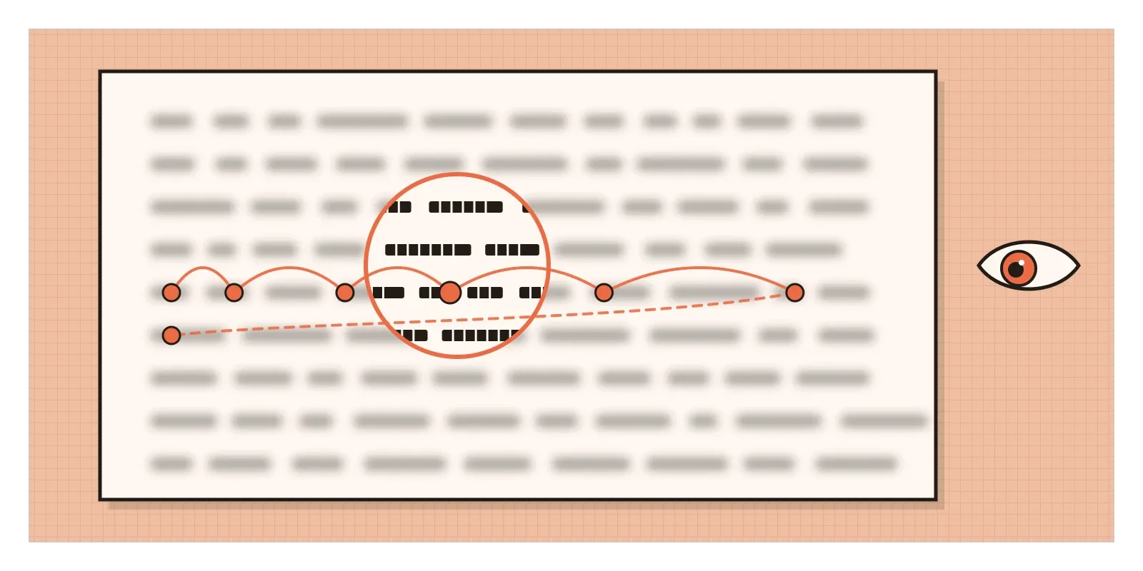
Hold your arm straight out in front of you and look at your thumbnail. The patch of the world covered by that thumbnail, roughly two degrees of your field of view, is about all you can see in sharp detail at any moment. It falls on a tiny pit at the back of the eye called the fovea, which is packed with cones, the colour-sensitive cells I described in the post on colour. Outside the fovea, the retina has fewer cones and many more rods, cells that work well in dim light but don't see colour or fine detail. A human retina has something like 120 million rods and only about 6 million cones. So the sharp, colourful, detailed world you think you're seeing is mostly an illusion. Only a small spot is ever in focus.
To make up for this, the eye jumps. Several times a second, it makes a quick movement called a saccade, landing briefly on one spot, a fixation, then leaping to the next. Saccades are among the fastest movements the body makes, and during each one your brain largely ignores the blurred input, which is why you never notice the world smearing as your eyes move. You can test this with a mirror. Look at your own left eye, then your right, then back again. You won't see your eyes move, even though anyone watching you will.
There's also a hole in each eye's view. Where the optic nerve leaves the retina, there are no light-sensitive cells at all. The French physicist Edme Mariotte described this blind spot in the 1660s, and it surprised people because nobody had ever noticed it. The brain simply fills in the gap with whatever surrounds it, and the other eye usually covers it too.
The blurry periphery isn't useless, though. It's very sensitive to movement and good at picking up big shapes, light and dark, which tells the eye where to jump next. The neuroscientist Margaret Livingstone has suggested this is part of the mystery of the Mona Lisa's smile. The smile depends on soft shadows that are easier to pick up in peripheral vision, so it seems clearest when you look at her eyes and fades a little when you look straight at her mouth.
The brain builds the picture
If the eye only gathers scraps, something has to assemble them. In 1959, two young researchers, David Hubel and Torsten Wiesel, were recording from single nerve cells in the visual part of a cat's brain, trying to find what made them respond. For hours, the dots they projected on a screen did very little. Then, by their own account, a cell suddenly fired as they slid a glass slide into the projector, and the faint edge of the slide swept across the screen. That cell didn't care about spots. It responded to a line at a particular angle. Hubel and Wiesel went on to show that the visual cortex is full of cells tuned to edges, orientations and movement, and that more complex shapes are built up from these simple pieces. They shared the Nobel Prize in 1981.
Long before anyone could record from brain cells, the Gestalt psychologists in Germany had noticed that we see whole patterns, not separate pieces. In the post on figure and ground, I promised to come back to their ideas. In a paper published in 1923, Max Wertheimer described several principles of grouping. Things close together seem to belong together, which is proximity, an idea I touched on in the post on unity and variety. Things that look alike seem to be related, which is similarity. The eye prefers to follow smooth lines and curves, which is continuity. And it completes shapes that are only partly drawn, which is closure. These aren't rules anyone learns. They're the shortcuts the brain uses to turn scattered fixations into objects, and designers lean on them every time they group a label with its field or let a few dots suggest a circle.
The flip side is that we miss a great deal. In a famous experiment published in 1999, the psychologists Daniel Simons and Christopher Chabris asked people to watch a short video and count how many times players in white passed a basketball. Partway through, a person in a gorilla suit walked through the middle of the scene. Around half the viewers never saw it. Their eyes had almost certainly passed over the gorilla, but their attention was elsewhere, so it never became part of the picture. Seeing, it turns out, depends on looking for something.
Eyes painted to catch the eye
Indian traditions have thought about looking for a very long time, and not only as a matter of optics. In Hindu worship, people often say they go to the temple to take darshan, which means seeing the deity and, just as importantly, being seen by it. The scholar Diana Eck explained this idea in her 1981 book Darśan: Seeing the Divine Image in India, where she argued that in this tradition, seeing is a two-way exchange rather than something one person does to another. That's why the eyes of sacred images are so often emphasised, made large, painted boldly or covered in silver. The wooden image of Jagannath at Puri, with its huge, round, unblinking eyes, is one of the most striking examples. In many consecration rituals, opening the image's eyes is one of the final and most important steps.
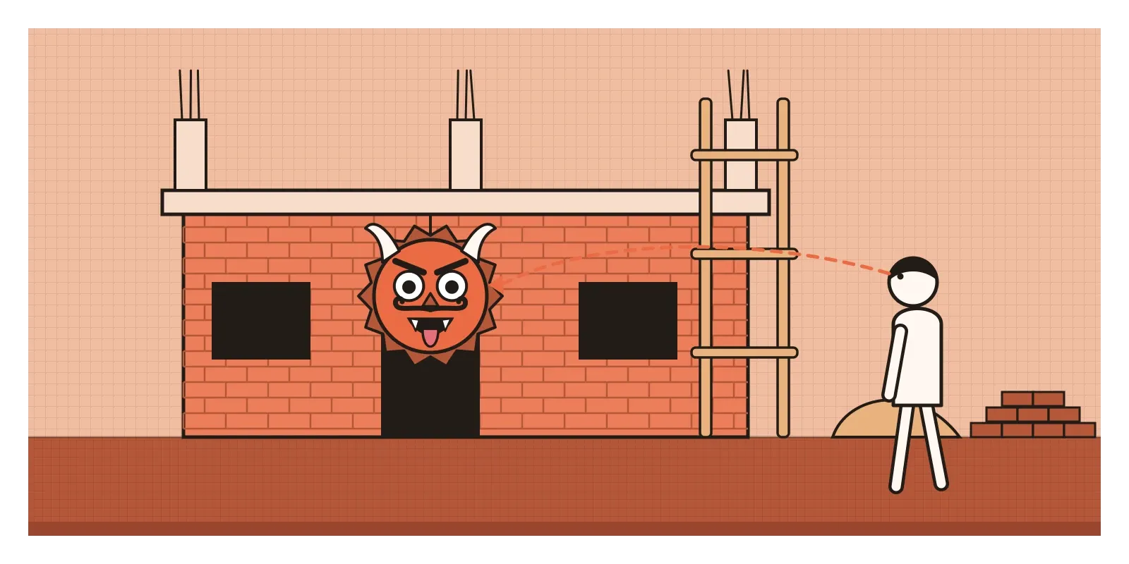
A more everyday version can be seen on building sites, especially in South India. Hanging from the scaffolding of a half-built house, you'll often find a drishti bommai, a fierce painted face with bulging eyes, sharp teeth and sometimes a lolling tongue, or a pumpkin painted in the same way. The belief behind it is about the evil eye, or drishti. An envious glance at a new house might bring bad luck, so the face is put up to catch that glance first. Lemons and green chillies strung over shop doors and on the front of trucks serve a similar purpose.
I'm not suggesting that any of this is science, and the beliefs mean different things to different families. But the visual logic is very sound. Our attention is pulled extremely quickly towards faces, and above all towards eyes. Newborn babies already turn towards face-like patterns, and in Yarbus's recordings, the eyes kept returning to the faces in the painting whatever the question. A drishti bommai is designed to win the first glance in a busy street, which is exactly what a designer is trying to do with a poster or an app icon. It uses the same instinct, just for a different purpose.
Designing for eyes that jump
Once you know that people see sharply only a thumbnail-sized patch at a time, a lot of common interface problems make sense. Take a form. Someone types their phone number, presses submit, and an error message appears in red at the very top of the screen. Their eyes are still on the button at the bottom. The message is outside the fovea, too small to read in peripheral vision, and often doesn't move, so it doesn't attract attention either. Many people simply don't see it and press submit again, then again, getting more frustrated each time. Putting the message right next to the field it refers to, where the eye already is, solves most of the problem. The interaction designer Luke Wroblewski wrote an influential article in 2009 on inline validation, checking each field as people fill it in and showing feedback beside it, and it's now standard practice in well-made forms.

The opposite problem is just as real. In 1998, Jan Panero Benway and David Lane described what they called banner blindness. In their tests, people looking for information on a web page missed a large, brightly coloured link at the top, because it looked like an advertisement and their eyes had learned to skip anything shaped like one. Being big and colourful wasn't enough. Yarbus would have recognised the effect immediately. People were looking for something specific, and their eyes went only where they expected to find it.
Movement is the other tool to use carefully. Because peripheral vision is so sensitive to motion, as I mentioned in the post on emphasis and focal point, anything that animates at the edge of a screen will drag the eye towards it, whether it deserves attention or not. That's useful for a genuine alert and exhausting for a carousel that rotates every few seconds. Eye-tracking studies, which I touched on in the post on hierarchy, are a valuable way to check designs, but they need careful reading. A place where people looked isn't necessarily a place they understood, and a place they never fixated on may still have been noticed out of the corner of the eye.
Look at how you look
The main thing I'd take from all of this is that people never see a design all at once. They see it in small, sharp pieces, a few per second, and which pieces they pick depends on what they're trying to do. So it's worth designing for the journey of the eye, not just for the whole picture. Put important information where the eye already is. Group related things so the brain can do its grouping easily. Use faces, motion and strong contrast deliberately, because they'll capture attention whether you want them to or not. And remember that a person with a task in mind may walk straight past your gorilla.
Here's a small exercise for this week. First, find your own blind spot. On a sheet of paper, draw a small cross and, about eight centimetres to the right of it, a dot. Close your left eye, look at the cross with your right eye, and slowly move the paper towards your face. At some point, the dot will vanish. Then take one screen or poster you're working on, show it to a friend for five seconds, take it away and ask what they remember. Do it again with a different friend, but this time give them a task first, like finding the price. Compare what each of them noticed.
Yarbus's tangled lines over Repin's painting are more than sixty years old, and they still say something that every designer should keep in mind. People don't simply look at what we make. They search it, with their own questions, a thumbnail's width at a time.
Further reading: Alfred Yarbus, Eye Movements and Vision (1967) · Margaret Livingstone, Vision and Art: The Biology of Seeing (2002) · Daniel Simons and Christopher Chabris, "Gorillas in our midst" (1999) · Diana Eck, Darśan: Seeing the Divine Image in India (1981) · Colin Ware, Visual Thinking for Design (2008)