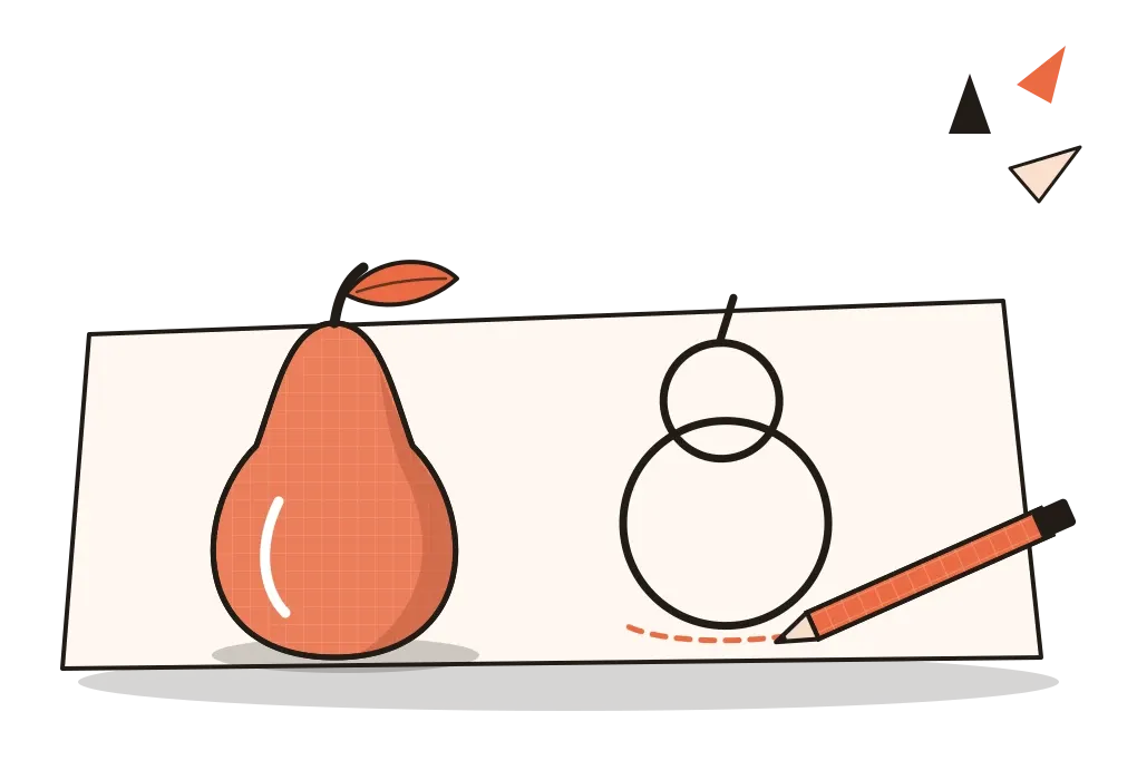
Abstraction
How leaving things out, carefully and on purpose, can make an image say more rather than less.
Abstraction
Eleven bulls, each with less in it
In the winter of 1945, a few months after the end of the Second World War in Europe, Pablo Picasso started working at the Paris print workshop of Fernand Mourlot, a master of lithography, a printing method where the image is drawn onto a flat stone. Between early December and mid-January, Picasso drew a bull on the stone and printed it, then went back and changed the drawing and printed it again, eleven times in all. The first bull is solid and fairly realistic, a heavy animal with shaded flanks and a lowered head. In the next few states he made it even heavier and darker. Then something changed. He began breaking the body into flat planes, like a map of its muscles, then into a handful of shapes, then into lines. By the final print, the bull is little more than a single continuous outline with a small head, two horns and a tail, and it's still unmistakably a bull.
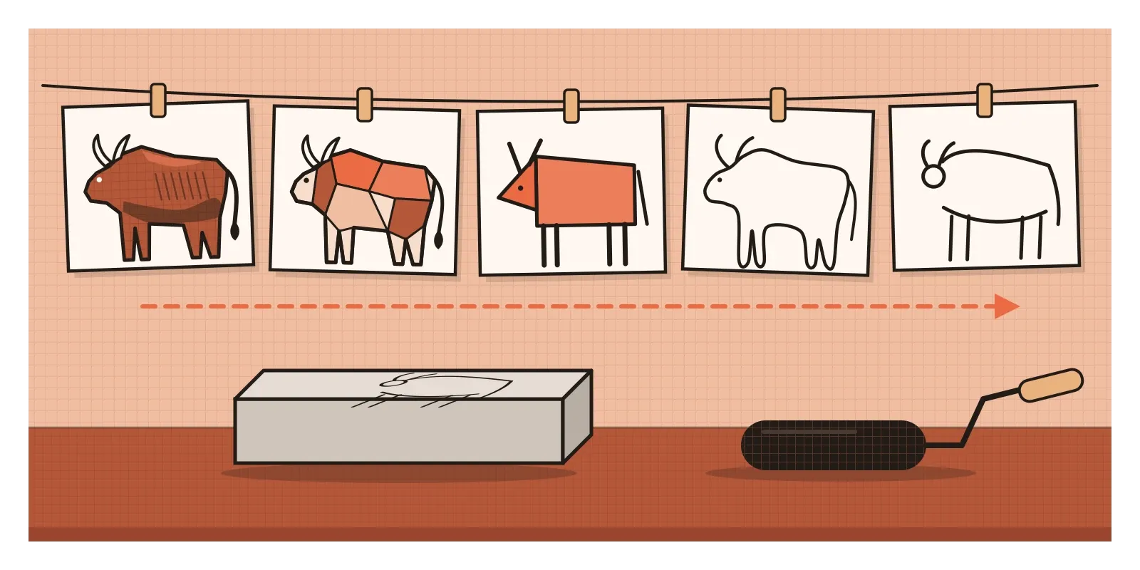
The series, now known simply as The Bull, is one of the clearest demonstrations ever made of what artists and designers mean by abstraction. Picasso didn't invent a new bull from nothing. He started with a real one and kept taking things away, testing at each stage whether what remained still carried the idea. What's left at the end isn't less of a bull. In some ways it's more of one, the essence of "bull" with nothing to distract from it. In the post on gesture and contour drawing, I wrote about capturing the essence of a pose before the details. Abstraction takes that idea further. It's the deliberate reduction of a subject to its essential form, and it's one of the most powerful tools a designer has.
Drawing away from the detail
The word comes from the Latin abstrahere, which means to draw away. An abstract image is one that has been drawn away from the appearance of things, sometimes a little, sometimes completely. It's useful to think of it as a scale rather than a switch. At one end is a photograph or a carefully observed drawing. At the other is pure shape and colour with no subject at all. Most images, and nearly all design, sit somewhere in between.
Early modern painters walked along that scale in public. In the post on form, I mentioned Paul Cézanne's advice to look for the cylinder, the sphere and the cone underneath nature. The Dutch painter Piet Mondrian, whose grid paintings I wrote about in the post on balance, arrived at those grids partly through a series of trees, painted between about 1908 and 1912. The early ones are recognisably trees, twisting and dark. In later versions, the branches flatten into a web of curved lines, then into short horizontal and vertical strokes, until the tree has almost dissolved into a pattern. You can watch a subject being drawn away from, painting by painting.
Other artists skipped the starting subject altogether. In 1915, the Russian painter Kazimir Malevich showed Black Square at an exhibition in Petrograd, hanging it high across the corner of the room, the place where an icon would traditionally hang in a Russian home. It wasn't a reduced picture of anything. It was meant to be a beginning, painting with no object at all. Art historians sometimes separate these two kinds of work, abstraction that starts from something real, like Picasso's bull, and non-objective art that never had a subject, like Malevich's square.
Abstraction has always unsettled people, and one court case shows how much. In 1926, the Romanian sculptor Constantin Brâncuși sent a polished bronze sculpture called Bird in Space, a tall, slender, gently swelling form, to the United States for an exhibition. Customs officers refused to accept that it was art, which would have entered free of duty. To them it didn't look like a bird, so they taxed it as a manufactured metal object. Brâncuși took the case to court, and in 1928 the judge ruled in his favour, accepting that a sculpture didn't need to imitate nature to be a work of art. It's a strange piece of legal history, and a reminder that leaving things out is a choice people have to learn to read.
Why a simple face can feel more like you
Abstraction isn't only an art-gallery idea. It explains why some of the most effective images in the world are also the simplest. In his 1993 book Understanding Comics, the cartoonist Scott McCloud drew a row of faces, starting with a realistic one and becoming simpler step by step, until the last was just a circle, two dots and a line. He pointed out that as a face gets simpler, it can stand for more people. A detailed portrait is one specific person. A circle with two dots and a curve could be almost anyone, including you. McCloud argued that this is why readers identify so easily with simply drawn cartoon characters. There's room to project yourself into them.
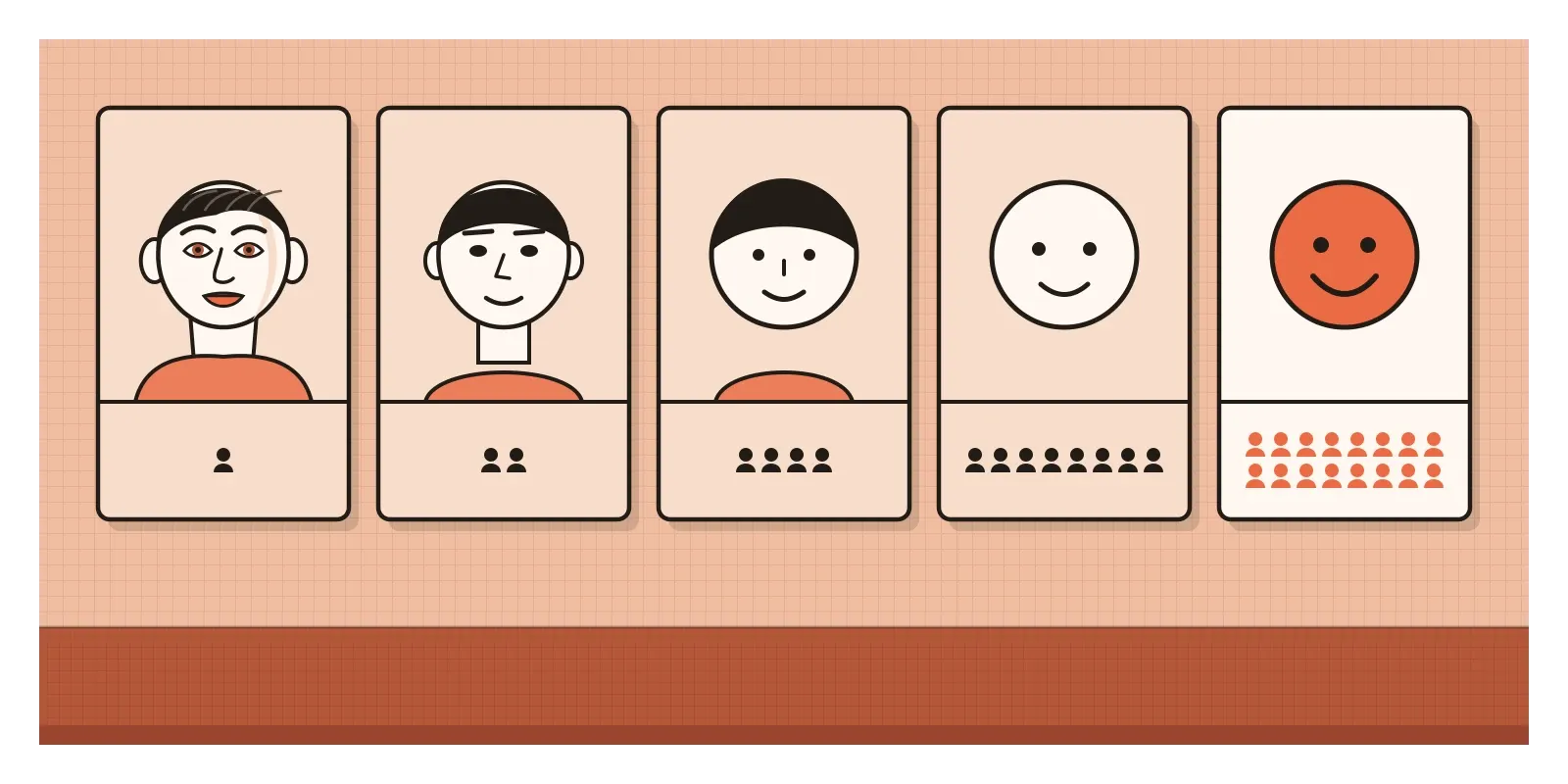
McCloud called this amplification through simplification. When you strip an image down, you don't just lose information. You focus attention on whatever remains. A simple drawing of a smiling face communicates "happy" more strongly than a photograph of a smiling person, because nothing else in the picture competes with the smile. That's the same thing Picasso's bull does. Once the shading and muscles are gone, the horns, the hump and the stance carry the whole idea, and they carry it more clearly.
This also connects to the last post, on how the eye sees. Our visual system is constantly building objects out of edges, outlines and a few key features, so a well-chosen handful of lines can trigger recognition almost as fast as a full picture. The skill of abstraction is knowing which features those are. Leave out the wrong ones and the bull becomes a dog, or just a scribble.
Two triangles and a circle
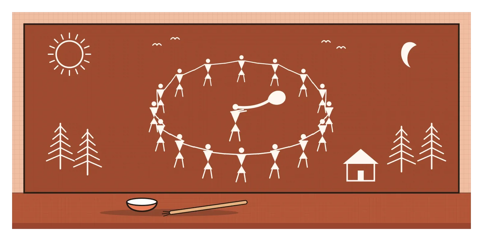
One of the most beautiful abstract visual languages I know comes from the Warli, an Adivasi community living in and around the Palghar district of Maharashtra, north of Mumbai. Warli paintings were traditionally made by women on the walls of their homes for weddings and harvest celebrations. The walls are prepared with mud, cow dung and red earth, and the painting is done in white, using a paste of rice flour and water, applied with a thin bamboo stick chewed at one end to make a brush.
The whole language is built from a few basic shapes. A person is a circle for the head and two triangles joined at their points for the body, with stick-like arms and legs. The circle is often linked to the sun and moon, the triangle to mountains and pointed trees, and the square to a sacred enclosure, which is the centre of the traditional wedding painting. With just these shapes, Warli painters show farming, hunting, festivals, animals, trees and whole villages. One of the best-known scenes is the tarpa dance, where dancers holding hands form a great spiral around a musician playing the tarpa, a wind instrument made from a dried gourd.
In the 1970s, the artist Jivya Soma Mashe began painting Warli scenes on paper and canvas as his own daily work, rather than for rituals, and he became known in India and abroad, receiving the Padma Shri in 2011. Since then, Warli figures have spread everywhere, onto cushions, mugs, café walls and corporate greeting cards. That popularity is complicated. It has brought income and recognition to some artists, but much of the commercial use is copied without any connection to the community, and it often reduces a living tradition with its own meanings to a cheerful decorative pattern.
It's also worth being careful with the word "abstract" here. Warli artists weren't starting with realistic figures and simplifying them the way Picasso did with his bull. Their shapes are a complete visual language in their own right, and calling them primitive misses the point. What they share with Picasso's last bull is the result: a few carefully chosen marks that carry an enormous amount of life.
Icons, menus and the right amount of detail
Interface design is largely the art of choosing the right level of abstraction. A 24-pixel icon has no room for detail, so it has to be reduced to a few strokes that people can recognise instantly. Pictograms for public spaces show how far this can go. For the 1972 Olympic Games in Munich, the German designer Otl Aicher created a set of sports pictograms in which every figure was built on a strict grid, with limbs set only at fixed angles. Each sport was reduced to its most characteristic pose, and the system was so clear that it shaped sports and wayfinding symbols around the world for decades.
Abstraction in icons has risks in both directions. Too detailed, and an icon becomes slow to read at small sizes and inconsistent next to its neighbours. Too abstract, and nobody knows what it means. The three horizontal lines of the hamburger menu are usually credited to Norm Cox, who designed them for the Xerox Star computer around 1981. For years they were so abstract that many people didn't recognise them as a menu at all, and designers still argue about whether hiding navigation behind them helps or hurts. Abstraction can also outlive its source. The save icon in many apps is still a floppy disk, an object many younger users have never held. It has become a pure symbol, cut loose from the thing it once depicted.
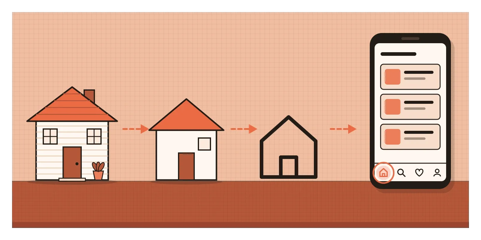
In 2014, The New York Times reported that Apple's internal training programme, Apple University, used Picasso's bull series in a class about simplicity, reportedly comparing the many buttons on a rival company's television remote with the very few on Apple's own. Whatever you think of the comparison, the lesson is a good one for anyone working with AI tools today. It's easier than ever to generate detailed, polished images and screens. Deciding what to remove, and keeping only what carries the idea, is still the designer's job.
Take one thing away at a time
The main thing I'd take from this is that abstraction is not the same as simplification for its own sake. A blank screen is simple. A bull drawn as a single wobbly line that could be anything is simple. Good abstraction keeps the essential features and removes everything else, and the hard part is working out which features are essential. That usually means starting with more detail than you need and taking things away step by step, checking each time whether the idea survives, exactly the way Picasso worked at Mourlot's workshop.
Here's a small exercise to try this week. Choose an everyday object, a cup, a scooter, a pair of scissors or a pet. On one page, draw it five times. Make the first drawing as detailed as you like. For each one after that, try to use roughly half as many lines as the drawing before. Your final version should be five lines or fewer. Then show the page to someone else and ask which drawing feels most like the object. The answer is often not the most detailed one. If you work on screens, repeat the exercise with an icon you use every day.
In the next post, on the colour wheel, we'll see that the same habit applies to colour. The wheel itself is an abstraction, a continuous rainbow simplified into a circle of a dozen or so segments so that we can reason about it. Picasso's last bull hangs in museums as a few black lines on white paper. It took him eleven drawings to find them, and every line he removed along the way made the bull a little more alive.
Further reading: Scott McCloud, Understanding Comics (1993) · Wilhelm Worringer, Abstraction and Empathy (1908) · Yashodhara Dalmia, The Painted World of the Warlis (1988) · Rudolf Arnheim, Visual Thinking (1969)