Divergent and Convergent Thinking
Why good design opens up many possibilities first, and only then narrows them down to one.
Divergent and Convergent Thinking
How many uses can you think of for a brick?
In September 1950, the psychologist J. P. Guilford stood up at Pennsylvania State College to give his address as president of the American Psychological Association, and he used it to scold his own profession. Psychologists, he said, had almost completely ignored creativity. He had looked through the index of psychology's main abstracting journal and found that, of the many thousands of books and articles listed over more than two decades, only a tiny fraction, less than one in five hundred, dealt with creative imagination. Intelligence tests of the day rewarded people for finding the single correct answer to a question. Guilford argued that this missed something important, the ability to come up with many different answers, some of them new. Over the following years, he and his colleagues built tests to measure it. The most famous asks you to list as many unusual uses as you can for an ordinary object, such as a brick.
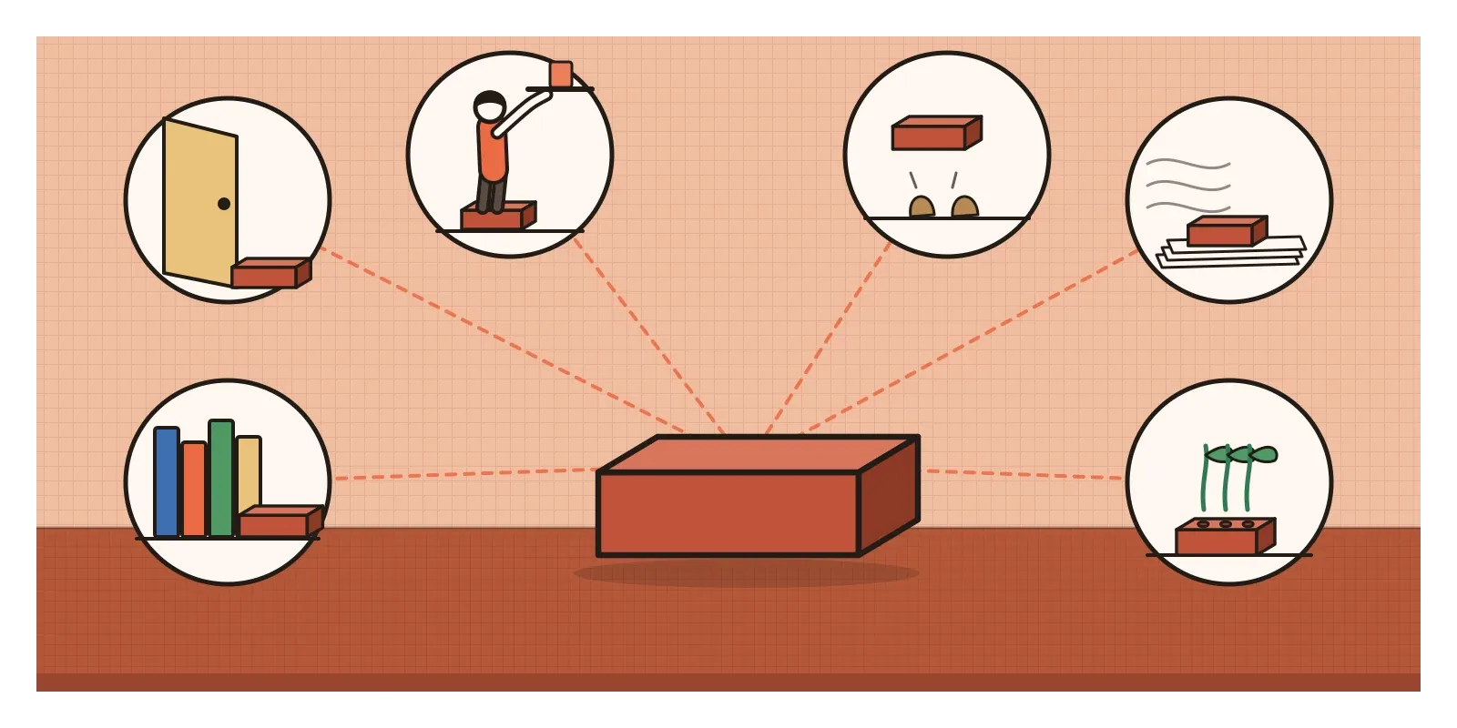
Try it for a minute. Most people start with the obvious: build a wall, prop open a door, hold down papers. Then the answers get stranger. A brick could be a bookend, a step for a short person, a nutcracker, a pillow for a very tough night, a weight for pressing flowers, or ground into red powder for a painting. Guilford called this kind of thinking divergent production, the ability to spread out in many directions from one starting point. He contrasted it with convergent production, the ability to narrow down to the one answer that best fits. Today we usually just say divergent and convergent thinking.
Every design process uses both, and the rhythm between them is one of the most important things to understand about creative work. In the previous post, on ideation techniques, I wrote about ways to generate lots of ideas. This post is about why that generating needs to be kept apart from choosing, how the two kinds of thinking work together, and what goes wrong when they get mixed up.
Two kinds of thinking, both of them creative
Divergent thinking is the expanding kind. You're trying to come up with many possibilities, not to decide between them. Researchers who study it usually score it on four things, an approach shaped by Guilford and refined by the educational psychologist E. Paul Torrance, whose Torrance Tests of Creative Thinking, first published in 1966, are still widely used. Fluency is how many ideas you produce. Flexibility is how many different kinds of idea you produce. Using a brick as a doorstop, a paperweight and a bookend is three ideas but really one category, things that hold other things in place. Originality is how unusual your ideas are compared with other people's. Elaboration is how much detail you add.
Convergent thinking is the narrowing kind. You compare options against what you need, spot weaknesses, combine the strongest parts and commit to one. It's often described as the logical, critical half of the pair, and it can sound like the boring part. But convergent thinking can be creative too. In 1962, the psychologist Sarnoff Mednick created the Remote Associates Test, which gives you three words, such as cottage, Swiss and cake, and asks for a fourth word that links them all. There's only one right answer, cheese, but finding it often takes a sudden leap of insight rather than step-by-step reasoning.
The psychologist Arthur Cropley made this point in a 2006 paper with the deliberately provocative title "In praise of convergent thinking". He argued that research and teaching had become so focused on divergent thinking that they'd forgotten what it's for. Generating lots of ideas is only useful if someone can then recognise which ones are good, test them and develop them into something real. A person who produces a hundred unusual ideas and can't tell the brilliant one from the ninety-nine silly ones isn't much use on a project. Creativity, in Cropley's view, needs both kinds of thinking working in turn.
Why mixing them goes wrong
If both are needed, why not do them at the same time, generating and judging as you go? Because each one gets in the way of the other. Judgement switched on too early kills ideas before they've had a chance to develop. A strange suggestion that might have led somewhere is dismissed in seconds because it's obviously impractical in its first form. This is why Osborn's first rule of brainstorming, which I described in the previous post, was to defer judgement. And generating new options when you should be deciding is just as harmful. A team that keeps adding ideas at the point where it needs to commit never finishes anything.
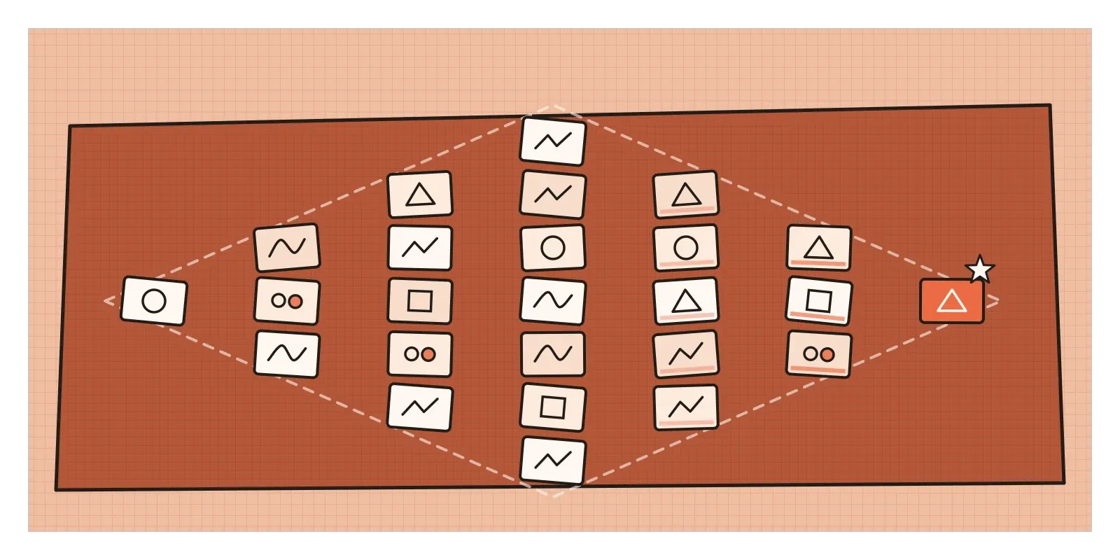
The Double Diamond, which I wrote about in the post on solving the problem or finding it, is built on this rhythm. Each diamond opens out, which is divergent, and then closes in, which is convergent, first for understanding the problem and then for designing the solution. But the diagram makes the middle of each diamond look like a neat point where opening simply becomes closing. In practice, that moment is uncomfortable.
The facilitator Sam Kaner and his co-authors gave it a name in their 1996 book Facilitator's Guide to Participatory Decision-Making. They drew a diamond too, with a divergent zone on one side and a convergent zone on the other, and in the middle they put what they called the groan zone. It's the stage where a group has lots of ideas and different points of view on the table, and has to wrestle with them before agreeing on anything. People get frustrated, misunderstand each other and feel that the discussion is going nowhere. Kaner's point was that this is normal, not a sign of failure. Groups that try to skip it, usually by letting the most senior person decide, often end up with decisions nobody really supports.
More than three thousand entries for one small symbol
A good Indian example of the two kinds of thinking at work on a national scale is the design of the rupee symbol. Until 2010, the Indian rupee didn't have a symbol of its own, and was usually written as Rs or INR, while currencies like the dollar, pound, euro and yen had instantly recognisable signs. In 2009, the Ministry of Finance announced an open competition for a new symbol. The brief asked for something that reflected Indian culture and could work across scripts and keyboards. More than three thousand entries came in, from professional designers, students and members of the public. That's divergence at a scale no single design team could manage, a whole country exploring possible answers to one question.
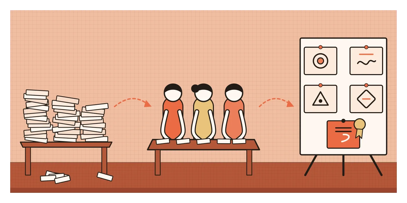
Then came the convergence. A jury narrowed the entries down to a shortlist of five, and in July 2010 the Union Cabinet approved the winner, designed by D. Udaya Kumar, a young designer who had studied at IIT Bombay's Industrial Design Centre. His symbol combines the Devanagari letter ra with the Roman capital R, with two horizontal lines at the top that suggest both the national flag and an equals sign. Within months, it had been added to the Unicode standard, which meant it could be included in fonts and typed on phones and computers, though it took years for keyboards and software to catch up everywhere.
The process wasn't free of criticism. Open design competitions ask thousands of people to do creative work for free in the hope of one prize, and many designers object to that on principle. And a jury can only choose from what it's given, so the quality of the convergence depends on how clear its criteria are. But as an illustration of the two kinds of thinking, it's very clear. A wide, generous opening, followed by a careful, accountable narrowing, produced a symbol that now appears on price tags, apps and banknotes across the country.
Opening and closing on screens
In digital product design, the risk is usually that teams converge too early. Someone sketches a layout, it looks reasonable, and within an hour it's in a design file being polished. A study I find convincing on this is by Steven Dow and his colleagues, published in 2010. They asked people to design web banner adverts. One group made one design at a time, getting feedback on each before improving it. Another group made several designs in parallel, got feedback on all of them together, and then refined. The parallel group's adverts were rated more highly by experts and got more clicks when they were actually run online. Making several options at once seemed to stop people becoming attached to their first idea, and made feedback feel like a comparison rather than a verdict.
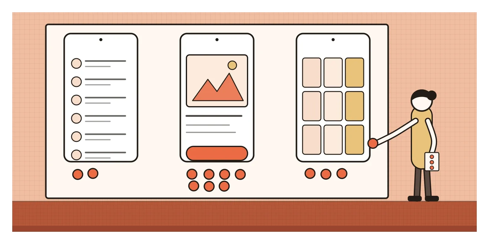
A simple habit follows from this. Before choosing a direction for any important screen or feature, make at least three that are genuinely different, not three shades of the same idea. Then converge on purpose. Write down the criteria first: what must this design do for the people using it, and what constraints does it have to respect? Many teams use quick group methods here, like dot voting, where everyone gets a few sticky dots to place on the options they think are strongest, as the design sprint process from Google Ventures recommends. Dot voting is useful for seeing where a group's instincts lie, but it isn't evidence. The strongest convergence comes from testing the leading options with real people.
AI tools have changed the balance in an interesting way. Generating options has become almost free. You can ask for twenty layouts, fifty headlines or a hundred icons and get them in a minute. That makes divergence look easy, though, as I wrote in the previous post, AI suggestions can make everyone's ideas more alike. It also makes convergence the scarce skill. Someone still has to know what the design is for, judge which options serve it, and explain why. When I worked on an agentic AI system at Rocketium, one of the questions we kept returning to was where the system should stop producing options and hand a choice back to a designer. Having more options is only useful if you have a clear way of choosing between them.
Open on purpose, then close on purpose
The main thing I'd take from this post is that divergent and convergent thinking aren't two types of people, the dreamers and the critics. They're two modes that everyone can switch between, and good work comes from switching deliberately. Open up when you need possibilities. Close down when you need a decision. And try not to do both at once.
Here's an exercise for this week. Take a small decision you're facing, a name for a project, a layout for a page, or even what to cook for a dinner party. First, set a timer for ten minutes and list at least twenty options without judging any of them, including some that are obviously silly. Then take a short break. When you come back, write down three criteria that a good answer must meet before you look at the list again. Use them to cut the list to five, then to one. Notice how different the two halves feel, and how much easier the second half is once the criteria are written down. In the next post, on mood boards, I'll look at one of the ways designers open up and then narrow down a visual direction.
Guilford's brick test is still used today, in research labs and classrooms around the world, more than seventy years after his address. It's worth remembering what made it radical. It treated the ability to imagine many answers as a skill worth measuring alongside the ability to find the right one. Design needs both. The brick that becomes a bookend, a step and a nutcracker on the list still has to become one good thing in the end, and that last step is a creative act too.
Further reading: J. P. Guilford, "Creativity" (1950) · Arthur Cropley, "In praise of convergent thinking" (2006) · Sam Kaner and others, Facilitator's Guide to Participatory Decision-Making (1996) · Steven Dow and others, "Parallel prototyping leads to better design results, more divergence, and increased self-efficacy" (2010)