Mood Boards
How a wall of carefully chosen pictures can settle what words keep leaving vague.
Mood Boards
Photographs pinned to black cloth
In 1924, the German art historian Aby Warburg began a project that he never finished. In his library in Hamburg, he set up large wooden panels covered in black cloth and started pinning photographs to them. There were reproductions of ancient sculptures and Renaissance paintings, but also astrological charts, maps, postage stamps, newspaper cuttings and advertisements. He grouped them, stepped back, regrouped them, had each arrangement photographed, and then took the pictures down and tried again. He called the project the Bilderatlas Mnemosyne, an atlas of images named after the Greek goddess of memory. When he died in 1929, the latest version had 63 panels and close to a thousand images. The panels themselves were later taken apart, and for decades all that survived were the black-and-white photographs of them.
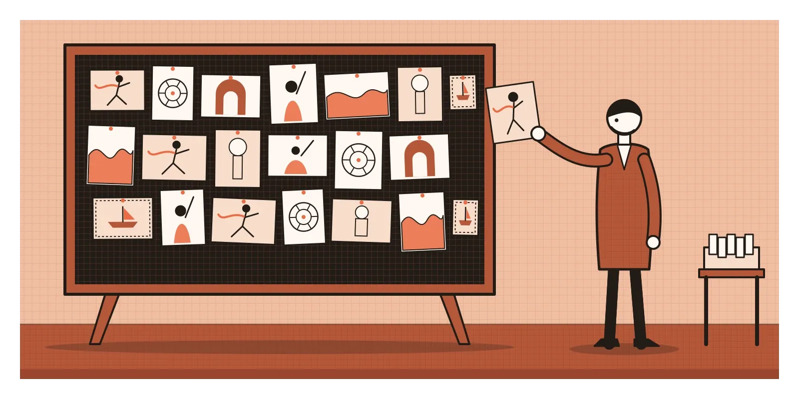
Warburg wasn't decorating a wall. He was trying to make an argument that he couldn't make in words alone. He believed that certain gestures and expressions of strong feeling, a figure running with its clothes flying out behind it, a hand raised in grief, travelled through history, turning up again in Greek reliefs, Renaissance paintings and modern posters. He called these recurring images Pathosformeln, roughly "formulas of emotion". Rather than write a long explanation, he placed the images side by side and let the connections show. The meaning wasn't in any single photograph. It was in the arrangement, in what sat next to what.
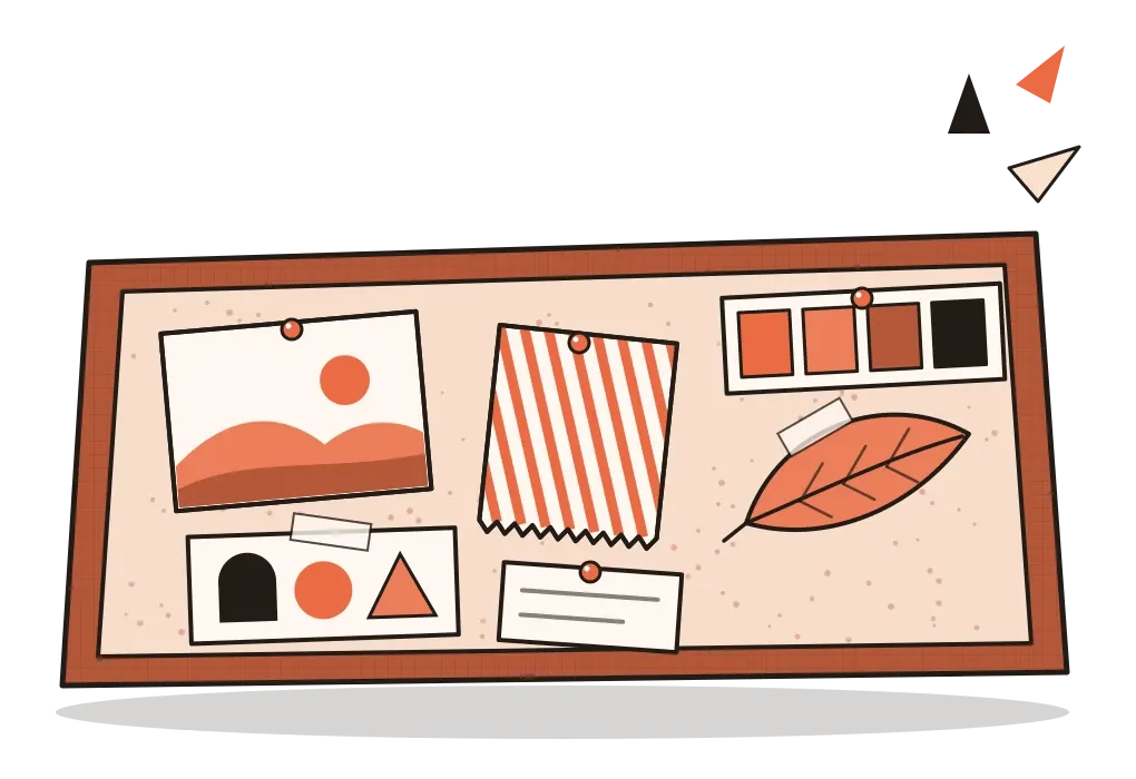
Designers do a much humbler version of this all the time. We call it a mood board: a collection of images, colours, textures, type and objects, arranged on one surface to set the visual direction of a project before the design itself exists. In the last two posts, on ideation techniques and on divergent and convergent thinking, I wrote about generating lots of ideas and then narrowing them down. A mood board is often where that narrowing first becomes visible.
Pictures instead of adjectives
The main reason mood boards exist is that words are slippery. A client asks for something "premium but friendly". A product manager wants the app to feel "fresh". A brief says "warm, modern, Indian". Everyone in the room nods, and everyone pictures something different. One person's premium is black and gold, another's is white space and a thin serif. One person's warm is terracotta and handmade paper, another's is a bright sunny yellow. The disagreement stays hidden until weeks of work have gone into screens.
A mood board replaces adjectives with pictures. Instead of debating what "fresh" means, you show twelve images and ask, is this it? People who can't describe what they want can often point to it instantly. That makes the board a tool for alignment, a shared picture a team can agree on or reject before anything is built.
Researchers who have studied mood boards in design education describe them doing a second job too. In a 2001 paper, Steve Garner and Deana McDonagh looked at how design students used them and argued that boards help designers interpret problems that are vague or poorly defined, and communicate qualities that are hard to put into words, such as how something should feel to hold or use. A few years later, McDonagh and Ian Storer called mood boards an under-researched area, despite how widely they're used in fashion, interiors, product design, branding and film. Both papers make a useful point. The board isn't just a way of explaining a direction to other people. It's a way for the designer to find the direction in the first place.
A mood board isn't a design, and it isn't a set of instructions. In the post on unity and variety, I wrote about how a design feels like one thing when its parts share colours, shapes and textures. A good mood board is where that shared family is first assembled.
Collect widely, cut hard, then arrange
Most good mood boards are made in three stages. The first is collecting, and it should be generous. Start with the brief and a few words that describe the feeling you're after, then gather anything that seems to carry that feeling: photographs, packaging, a fabric, a leaf, a page from a magazine, a screenshot, a colour you saw on a wall. Don't only collect finished designs in your own field. A board for a banking app made only of other banking apps will produce another banking app. This is also where a visual journal, which I wrote about earlier in the series, pays off, because the best material is often something you noticed months ago and kept.
The second stage is cutting, and it should be harsh. Thirty images that all feel roughly right will say nothing in particular. Nine that agree with each other will say something clear. Take out anything that contradicts the main feeling, anything that's only there because it's pretty, and anything that's a near-copy of an existing design. Cutting is where a board stops being a collection and starts being a decision.
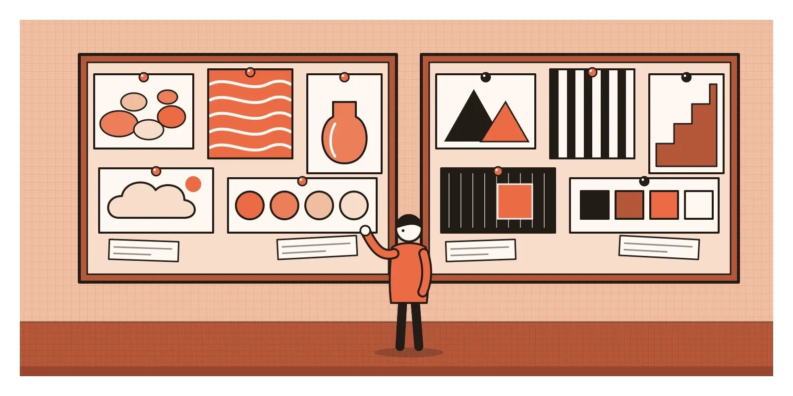
The third stage is arranging, and this is where Warburg's lesson matters most. The same nine images can say different things depending on how they're placed. Make the most important image the largest, as I described in the post on hierarchy, and the board will have a clear centre. Put a rough texture next to a smooth one and both become more noticeable. Let a colour repeat in three corners and it starts to feel like the board's main colour, even if it covers only a small area. Many designers also pull a small palette of swatches and a type sample or two from the images, which anchors the feeling to things that can actually be used.
Finally, write on it. A short note beside each image, "this softness", "this amount of empty space", "this grain, not this colour", tells everyone what to take from the picture and what to ignore. Without notes, people latch onto the wrong detail, and a photograph of a misty hillside becomes a request for hillsides.
It's also worth making more than one board. Two or three contrasting directions for the same brief, shown side by side, turn a vague conversation into a real choice. People find it far easier to say "more like the left one, but calmer" than to describe a direction from nothing.
Paintings that gave each melody a mood
India has a long tradition of gathering images to evoke a precise mood, and the most beautiful example I know is Ragamala painting. The word means a garland of ragas, the melodic frameworks of Indian classical music. From roughly the late sixteenth century to the nineteenth, painters in Rajput, Pahari, Deccani and Mughal workshops made sets of paintings in which each raga or ragini, its female counterpart, is shown as a scene. A set often ran to around three dozen pages, frequently with a short verse written at the top.
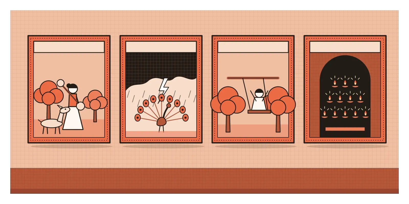
Each scene is built to carry a feeling, using exactly the kind of ingredients a designer puts on a mood board. Todi ragini is usually painted as a woman playing a veena in a forest, with deer drawn close by the music, calm and a little wistful. Hindola raga is often a swing scene, with figures swaying between trees. Megha Malhar brings dark rain clouds, lightning and dancing, the mood of the monsoon. Dipak raga, associated with fire, is often shown with lamps. Colour, setting, season, time of day and gesture all work together to carry the character of the music.
It's worth being careful not to make these paintings sound like a neat design system. There was no single rulebook. Different texts organised the ragas differently, and the way a particular raga was pictured could change considerably between regions and painting schools. Scholars still debate how closely the paintings were connected to actual musical performance, as opposed to poetry and courtly culture. But that variation is part of what makes them interesting. Each workshop had to decide which images, colours and gestures best captured a feeling, which is exactly the decision a mood board asks of us. The idea that a work of art should aim at a particular emotional flavour has deep roots in Indian aesthetics, and it's the subject of a post coming up shortly, on rasa theory.
Boards for screens, and the trouble with borrowed taste
In digital product design, mood boards often feel too abstract on their own. A photograph of a mountain lake doesn't tell an engineer how big a button should be. So web and interface designers developed formats that sit between a mood board and a finished screen. In 2012, the designer Samantha Warren popularised style tiles, a single page showing fonts, colours, buttons, icons and textures together, to agree on a visual language for a website without designing whole pages. The same year, Dan Mall described element collages, loose arrangements of real interface pieces, a header here, a card there, a few form fields, that show how a style might work in practice.
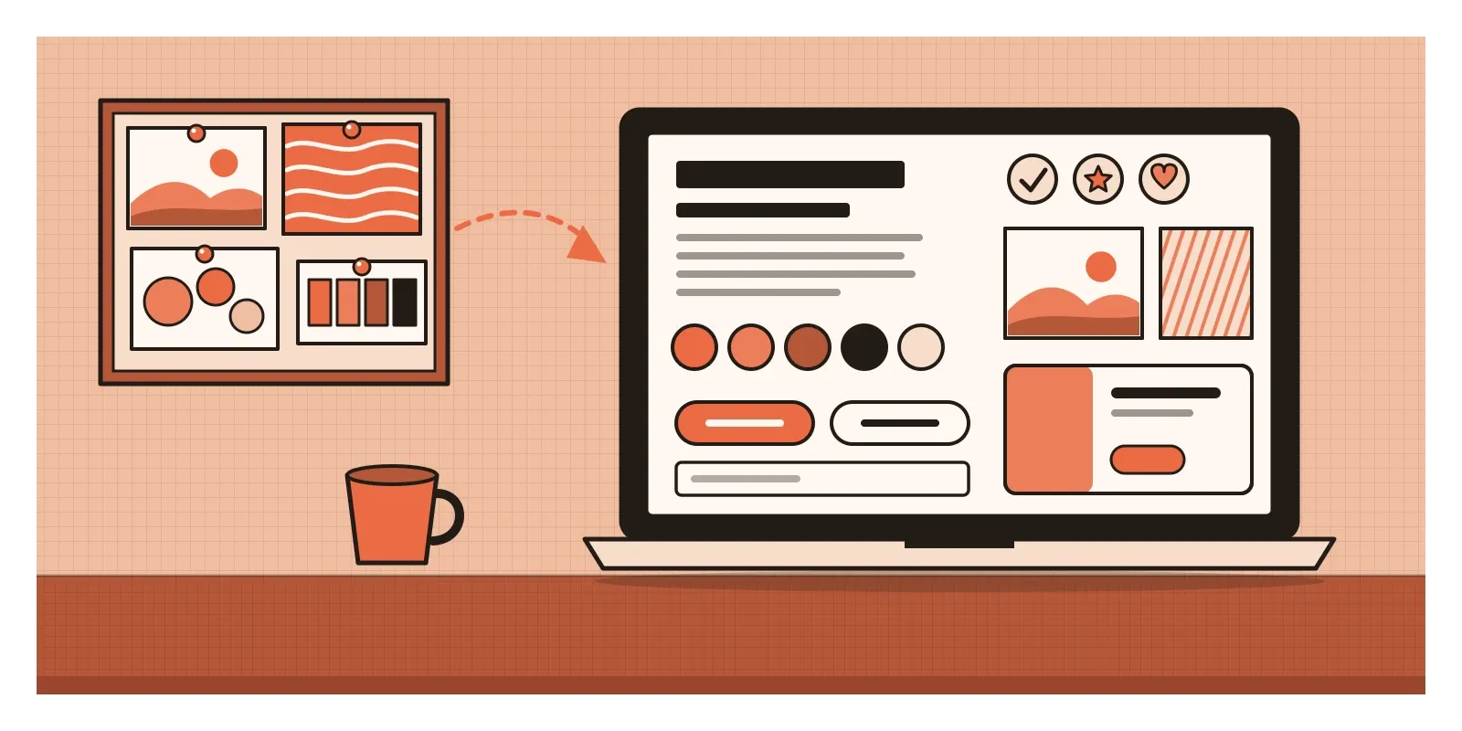
These formats lead naturally into design systems. The colours on a style tile can become colour tokens, the type samples become a type scale and the buttons become components. Seen that way, a mood board is the earliest, loosest version of a design system, the point where a team first agrees on the family of things the product will be built from.
For interfaces, I'd add two things that static boards often miss. The first is behaviour. How something moves, responds and sounds is part of its mood, so a product board can include short screen recordings, an animation that feels right or a sound that sets the tone. The second is an anti-board, a small set of images showing what the product should not feel like. Naming the opposite often clarifies a direction faster than anything else.
There's also a real risk in how most of us collect images now. Platforms like Pinterest are built to show you more of whatever you've just looked at, which quietly narrows your taste towards what's already popular. AI image generators make this sharper. You can generate a polished board in a minute, but it will be assembled from patterns in images that already exist, and it can create the feeling that a direction has been chosen when nobody has really chosen anything. Austin Kleon's advice in Steal Like an Artist is useful here. Collect from many sources, not one, and transform what you take rather than copying it. A board built from your own photographs, from materials and from places far outside your field will usually lead somewhere more personal than the top results of a search.
Make two, cut hard and write on them
The main thing I'd take from this post is that a mood board is a decision made visible. Collecting images is the easy part. The value comes from cutting them down, arranging them so they speak to each other, and writing down what each one is for. A good board should still be useful weeks later, when you hold a finished screen next to it and ask whether you've stayed true to it.
If you want to try it, pick something small, a poster for an event, the home screen of an app you use, or even a new look for your desk. Write down three words for the feeling you want. Spend thirty minutes collecting at least thirty images from as many different sources as you can, including some photographs you take yourself. Then cut them to nine, arrange them with the most important one largest, and write a few words beside each. Make a second board for a different direction, and add three images to an anti-board. Show both boards to a friend without telling them your three words, and ask them for theirs. If their words are close to yours, the board is working. In the next post, on iteration, I'll write about what happens after the direction is set, when you make, test and remake.
Warburg's panels were never finished, and in a way that suits them. He kept rearranging because each new arrangement showed him something the last one hadn't. A mood board works the same way. It isn't a picture of the answer. It's a wall you can keep looking at until the answer starts to appear.
Further reading: Aby Warburg, Bilderatlas Mnemosyne: The Original, edited by Roberto Ohrt and Axel Heil (2020) · Steve Garner and Deana McDonagh, "Problem Interpretation and Resolution via Visual Stimuli: The Use of 'Mood Boards' in Design Education" (2001) · Deana McDonagh and Ian Storer, "Mood Boards as a Design Catalyst and Resource: Researching an Under-Researched Area" (2004) · Austin Kleon, Steal Like an Artist (2012)