Colour
Hue, saturation and value, and why no two people see colour quite the same way.
Colour
Blue and black, or white and gold?
In February 2015, a slightly washed-out photo of a striped dress split the internet in half. Some people looked at it and saw a white dress with gold stripes. Others saw a blue dress with black stripes, and couldn't understand how anyone could see anything else. Friends argued, couples argued, and scientists started writing papers about it. The actual dress, it turned out, was blue and black. But the people who saw white and gold weren't wrong about what they saw. Their brains had simply made a different guess about the light in the photo.

The explanation that vision researchers settled on goes something like this. The photo was taken in confusing lighting, and the brain had to decide whether the dress was in bluish shadow or in warm, yellowish light. People whose brains assumed bluish shadow mentally subtracted the blue and saw white and gold. People whose brains assumed warm light subtracted the yellow and saw blue and black. Same pixels, two completely different experiences. It's the same kind of correction that makes the two squares in Adelson's checkerboard look different, which I wrote about in the post on value. The dress turned a quiet fact about vision into a global argument: colour isn't something that sits on the surface of an object. It's something our brains build, and they don't all build it the same way. For designers, that's both the magic and the danger of working with colour.
Colour is light, eyes and a brain working together
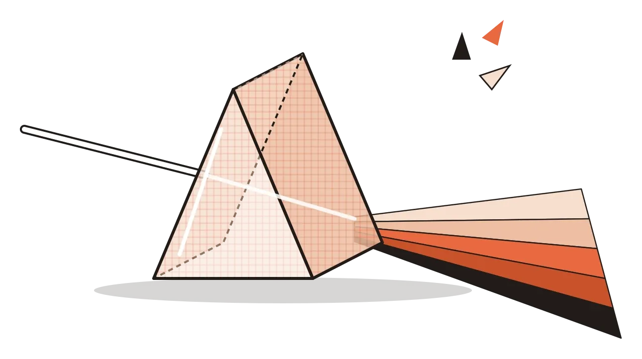
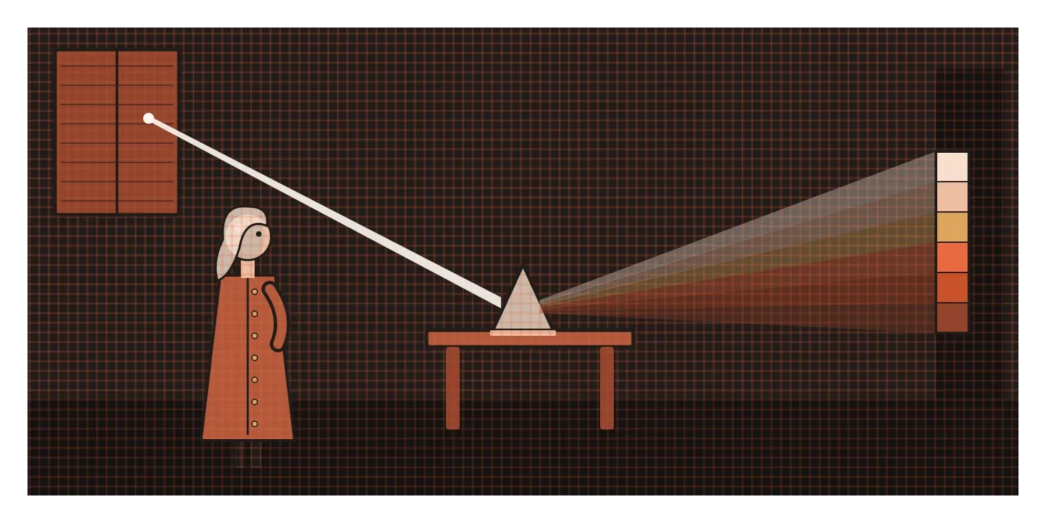
For a long time, many people believed that white light was pure and that colours were created when light was somehow altered or darkened. In 1666, a young Isaac Newton began experimenting in a darkened room with a glass prism. He let a narrow beam of sunlight through a small hole in a window shutter, passed it through the prism and watched it spread into a band of colours on the opposite wall. Then he did the clever part. He used a second prism to recombine the colours, and they turned back into white light. His conclusion, published in full in his book Opticks in 1704, was that white light is actually a mixture of all the colours. He named seven of them, red, orange, yellow, green, blue, indigo and violet, partly because he liked the idea of matching the seven notes of a musical scale, which is why indigo is still on the list even though many people struggle to see it as a separate colour.
The second half of the story is in our eyes. The back of the human eye contains light-sensitive cells, and the ones responsible for colour are called cones. Most people have three types, each most sensitive to a different range of light, roughly corresponding to short, medium and long wavelengths, often loosely described as blue, green and red. Every colour we see comes from the brain comparing how strongly each type of cone responds. With just three types of sensor, a typical person can tell apart an enormous number of colours, with estimates commonly put at around a million.
The third piece is the brain, which is where things get interesting for designers. As the dress showed, the brain doesn't simply report what the cones detect. It interprets it, constantly adjusting for lighting, surroundings and expectations so that a banana looks yellow whether you see it at noon or under a tube light at night. That adjustment is called colour constancy, and it's usually helpful. But it also means that the same colour can look noticeably different depending on what's next to it, how it's lit and who is looking.
Every colour has three parts
When designers talk about colour as an element, they usually break it into three properties. The first is hue, which is what most people mean when they say "colour": red, orange, yellow, green, blue, purple and everything in between. Hue is the position of a colour around the colour wheel. The second is saturation, sometimes called chroma or intensity, which describes how pure or vivid a colour is. A fully saturated red is bright and strong, like a fire engine. As you lower the saturation, the red becomes duller and greyer, moving towards dusty rose or brick. The third is value, the lightness or darkness that I wrote about in the previous post. A red can be light like a pale pink or dark like a deep maroon, while keeping roughly the same hue.
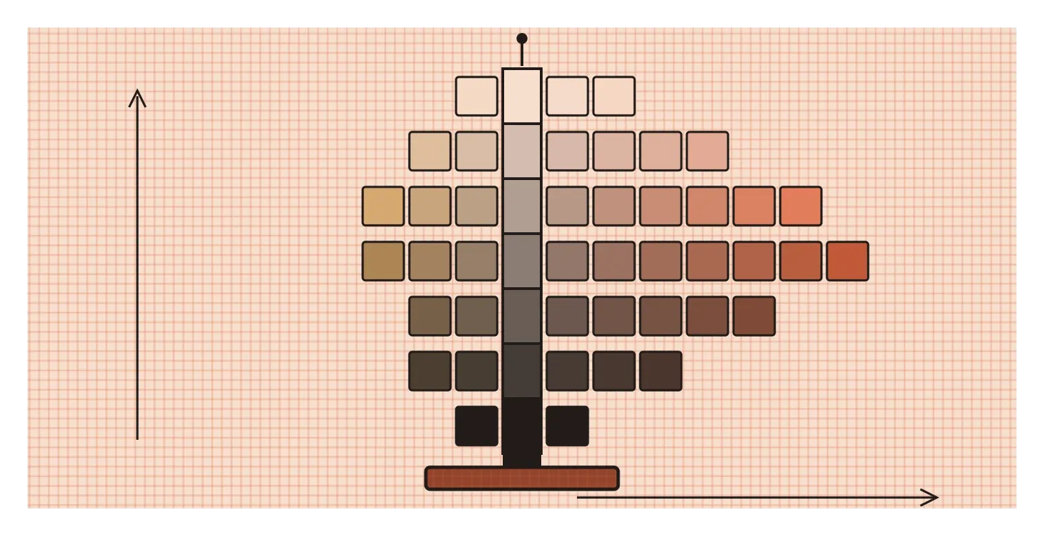
The American painter Albert Munsell, whose value scale I mentioned last time, was one of the first people to organise colour around these three dimensions systematically. In his 1905 book A Color Notation, he described colour as a kind of three-dimensional space. Hue runs around a circle, value runs up and down a vertical pole from black at the bottom to white at the top, and chroma runs outwards from the centre, so the further a colour is from the pole, the more vivid it is. An important insight in his system was that different hues reach their most vivid point at different values. The most intense yellow is quite light, while the most intense blue is much darker. That's why his model looks lopsided rather than like a neat sphere, and it's one reason why simply putting every colour at "full brightness" never quite works.
Thinking in these three dimensions is incredibly practical. When a colour palette feels wrong, the problem is often not the hues but the saturation or value. Five colours all at full saturation will scream at each other, while the same five hues softened and given clear value differences can feel calm and organised. Many experienced designers choose one or two strong, saturated colours for the things that matter most, and keep everything else quieter, which brings us to how colour actually gets used.
The same colour never looks the same twice
Because our brains judge colour by comparison, the same colour changes depending on what surrounds it. A grey square looks slightly warm next to blue and slightly cool next to orange. A mid-toned green can look bright and fresh on a dark background and dull on a white one. The Bauhaus teacher Josef Albers built an entire course around this idea, getting students to make one colour look like two different colours, or two different colours look like the same one, using nothing but careful choices of surroundings. I'll write a full post about his work later in this series. For now, the main lesson is simple: a colour chosen in isolation, from a swatch on its own, will almost never look the same once it's placed in a real design.
Language seems to play a part too. In 1969, the anthropologist Brent Berlin and the linguist Paul Kay published Basic Color Terms, a study of colour words across dozens of languages. They found that languages differ in how many basic colour words they have, and argued that these words tend to appear in a fairly predictable order as languages develop, starting with dark and light, then red, then green and yellow, then blue, and so on. Their work has been debated and refined since, but it opened up a fascinating question: does having a word for a colour change how you see it? A later study offers a hint. Russian has two separate everyday words for light blue and dark blue, goluboy and siniy, rather than treating them as shades of one colour. In 2007, a team led by Jonathan Winawer found that Russian speakers were slightly faster than English speakers at telling apart two blues that fell on opposite sides of that boundary.
And then there's culture. In much of India, red is the colour of brides, celebration and good fortune, while in many Hindu communities white is associated with mourning and widowhood. In many Western countries, the associations are almost reversed, with white for weddings and black for funerals. Neither is more correct. But it means a colour choice that feels joyful to one audience can feel wrong, even upsetting, to another. Colour carries meaning, and that meaning is learned.
What colour actually does in a design
In practice, colour does a few big jobs. The first is attention. A single saturated colour in an otherwise quiet design pulls the eye immediately, which is why so many apps use one bright accent colour for their main buttons and keep everything else neutral. The second is grouping and meaning. Colour can show that things belong together, like all the items in a category sharing one colour on a chart, and it can carry familiar signals, like red for errors or danger and green for success or "go". The third is identity. Brands spend a lot of effort owning a colour, because a consistent colour can make a product recognisable from across a supermarket aisle before anyone reads the name. Some companies have gone to court to protect their colours. Cadbury, for example, spent years in a legal fight in the UK over its particular shade of purple for chocolate wrappers, and in 2013 the Court of Appeal ruled against its attempt to register the colour as a trademark in the way it had described it.
The fourth job, and the one I think matters most, is supporting understanding without becoming a barrier. As I mentioned in the post on value, a meaningful share of people have some form of colour vision deficiency. The accessibility guidelines most products follow are clear that colour should never be the only way information is shown. A form field with an error shouldn't just turn red. It should also show an icon and a short message saying what went wrong. A chart shouldn't rely only on colour to tell lines apart. It can also use labels, patterns or different line styles. Designing this way doesn't just help people with colour blindness. It also helps anyone looking at a screen in bright sunlight, on a cheap display, or printed in black and white.

A useful rule of thumb follows from all this. Decide what colour is for in your design before choosing any specific colours. If a colour isn't doing a job, like drawing attention, showing a group, carrying a meaning or expressing identity, it's probably decoration, and decoration is the first thing that turns a palette into noise.
Fewer colours, chosen on purpose
The palette for this blog is deliberately small: cream, a soft peach, a burnt orange and black. When I was choosing it, the temptation was to add more, a blue for links maybe, a green for highlights, something bright for variety. But every colour I considered adding made the illustrations and pages feel less like one family and more like a collection of separate things. Keeping the palette restrained means the burnt orange can do a clear job. It's the colour that says "look here", and because almost nothing else competes with it, it actually works. Most of the rest of the work is done by value, the contrast between dark lines, light backgrounds and the mid-tones in between.
That's the approach I'd suggest to anyone starting out with colour. Begin with value, so the design works in greyscale. Choose a small number of hues, give each one a clear job, and use saturation carefully, saving the most vivid colour for what matters most. Then test it in context, on real screens and in real lighting, with real content, because colours never behave the same on a swatch as they do in a finished design. And always check that nothing important depends on colour alone.
The dress is a funny story, but it carries a serious lesson for anyone who works with colour. The colours we pick are only half the story. The other half happens inside the heads of the people looking, shaped by their eyes, their lighting, their surroundings, their language and their culture. We can't control all of that, but we can design with it in mind, using colour to guide and support people rather than assuming everyone will see exactly what we see.
Further reading: Isaac Newton, Opticks (1704) · Albert H. Munsell, A Color Notation (1905) · Brent Berlin and Paul Kay, Basic Color Terms (1969) · Josef Albers, Interaction of Color (1963)