Balance
How designs feel stable, tense or alive, and why perfect symmetry isn't the only answer.
Balance
The one thing out of place in the Taj Mahal
The Taj Mahal is probably the most famous example of symmetry in the world. Built in Agra by the Mughal emperor Shah Jahan as a tomb for his wife Mumtaz Mahal, mostly between the 1630s and early 1650s, it is mirrored almost perfectly along a central line. The great dome sits in the middle, four minarets stand at the corners, a long water channel runs straight towards the main gate, and even the buildings on either side of the tomb are matched: a mosque on one side and, on the other, a near-identical building whose main purpose seems to have been to keep the composition even. Stand at the gateway and look down the gardens, and the whole complex feels calm, still and complete.
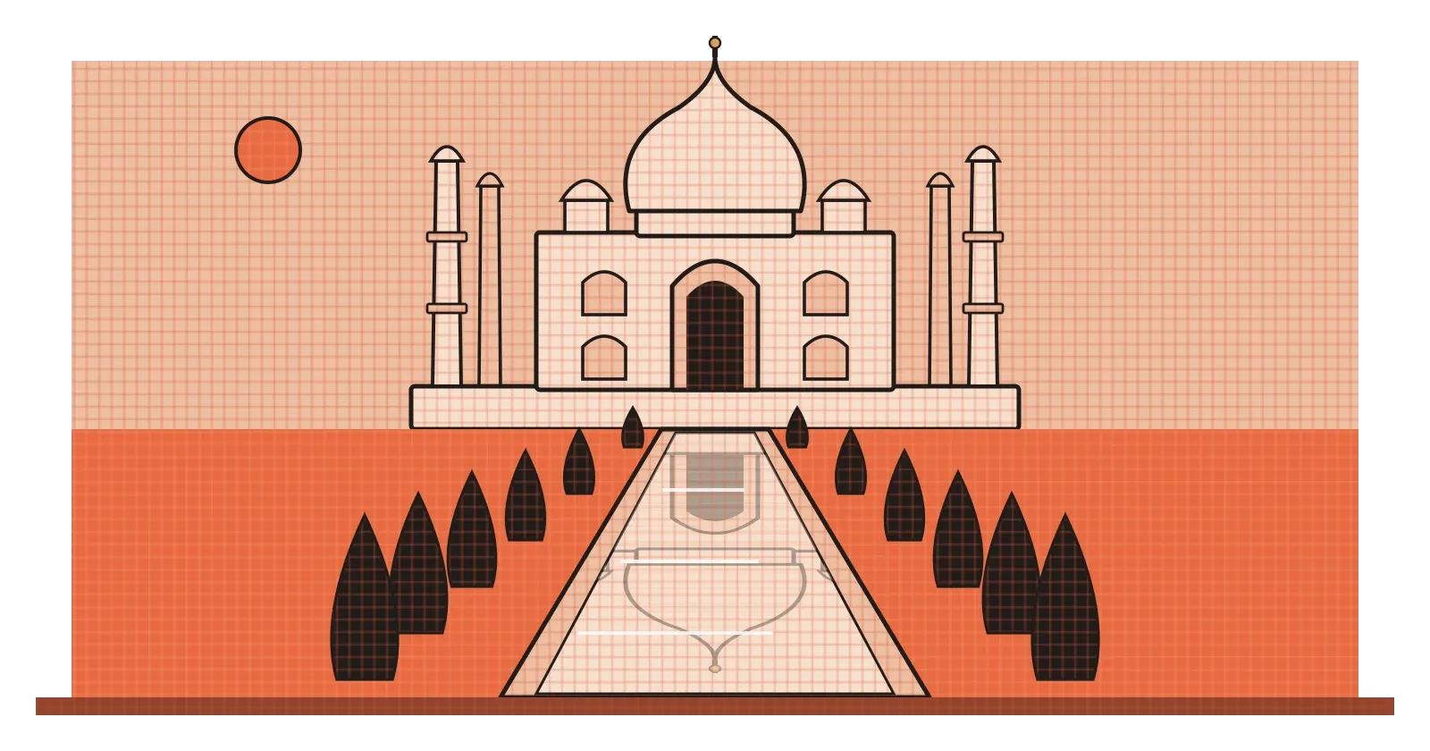
And yet, inside the main chamber, there's one thing that breaks the pattern. Mumtaz Mahal's cenotaph sits exactly at the centre, but when Shah Jahan died, his own cenotaph was placed next to hers, slightly off to one side. It's the only significant element in the whole design that isn't symmetrical, and it's there because the original plan simply didn't leave room for him. I find that detail oddly moving. It shows how strongly symmetry shapes our experience of a place, because the one moment where it's broken is the one people remember and talk about. It also opens up the topic of this post. Symmetry is only one way to make something feel balanced, and the interesting part of design is learning when to use it, when to break it, and how to keep things feeling stable when you do.
Every element has a weight
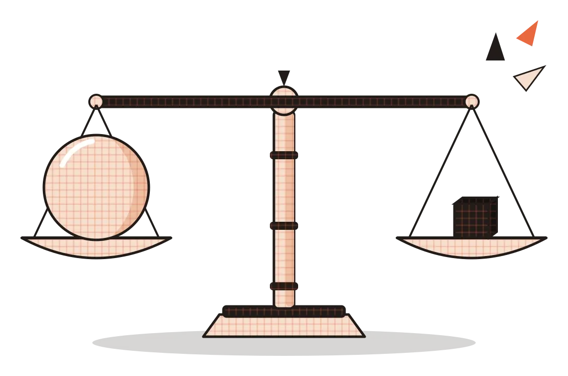
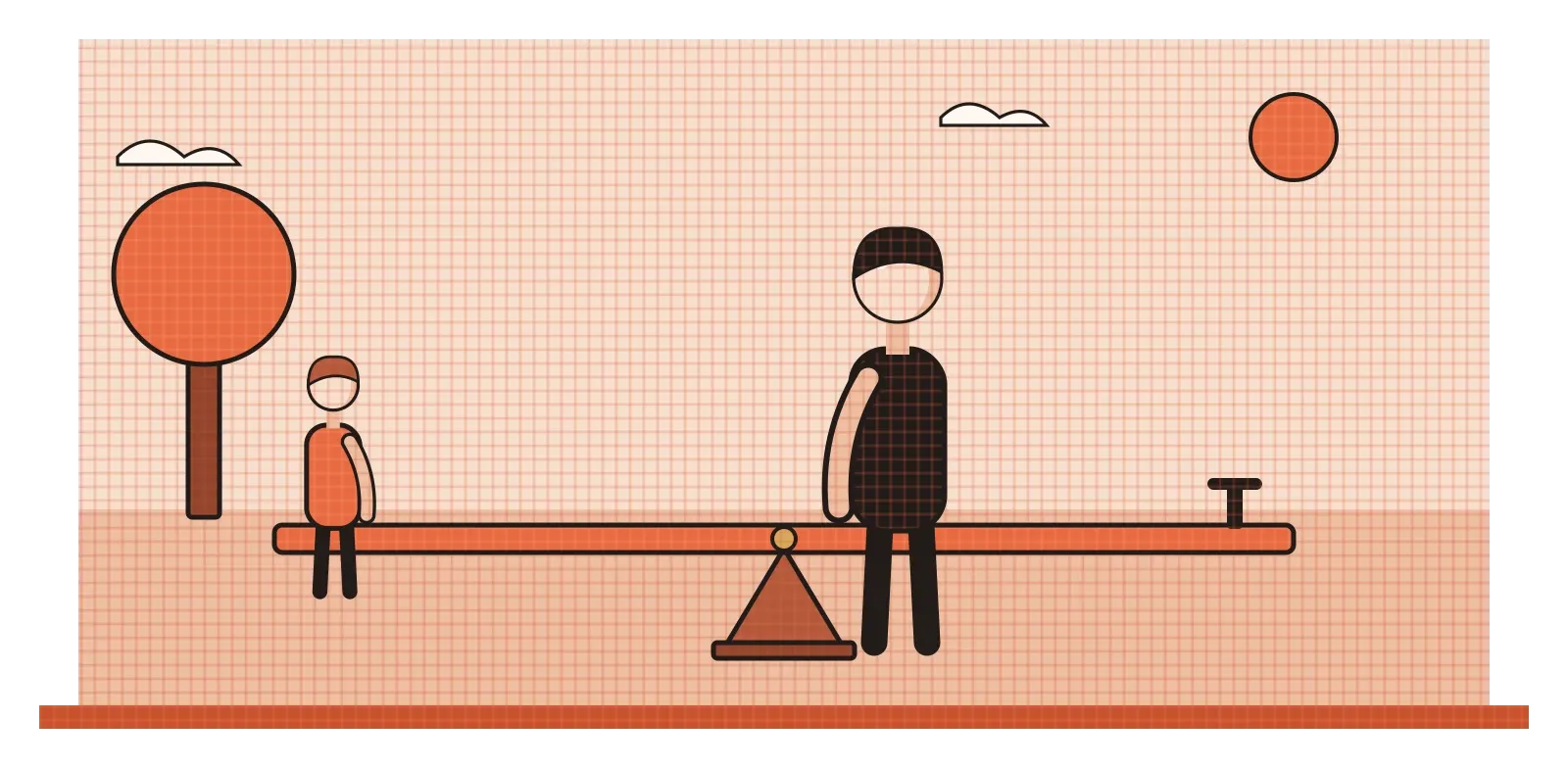
The easiest way to think about balance in design is to imagine a seesaw in a playground. If two children of the same size sit at the same distance from the middle, the seesaw stays level. If an adult sits on one end and a small child on the other, it tips. But move the adult closer to the middle and the child further out, and it can balance again. Design works in a surprisingly similar way, except that what's being balanced is visual weight, how strongly each element pulls the eye.
Several things give an element visual weight. Size is the most obvious: a large shape feels heavier than a small one. Value matters too, so a dark shape feels heavier than a light one of the same size, which links back to the post on value. Saturated colours feel heavier than muted ones, and warm colours like red and orange tend to feel heavier than cool blues and greens. Texture and detail add weight, so a busy, patterned area pulls more attention than a plain one. Isolation adds weight as well. A small object sitting alone in a large empty space can feel surprisingly heavy, because there's nothing around it to compete for attention. And anything with built-in interest, a human face, a pair of eyes, a word, tends to grab more than its size would suggest.
Position matters, just like on the seesaw. An element near the edge of a frame tends to exert more pull than the same element near the centre, so a small, strong shape far from the middle can balance a large, quiet one close to it. In the post on point, I mentioned Rudolf Arnheim's experiments with a single disc inside a square, and how it feels restless when it's slightly off-centre. Balance is really the same idea scaled up. We feel whether a composition is stable or about to tip, even when we can't say why, and designers can either settle that feeling or deliberately play with it.
Symmetry: calm, formal and sometimes a little stiff
Symmetrical balance is the simplest kind. Draw a line down the middle of a design, and the two halves mirror each other, like a butterfly's wings or a human face. Designers sometimes call it formal balance, because it tends to feel orderly, official and serious. That's why so many government buildings, courts, temples, palaces and banks are symmetrical. Rashtrapati Bhavan in New Delhi, designed by the British architect Edwin Lutyens and completed in 1929, follows a strongly symmetrical plan with a central dome, and the long ceremonial avenue in front of it runs straight down the central axis. The message is clear: this place is stable, important and in control.
Symmetry also feels natural to us, partly because so much of the living world is roughly symmetrical. Faces, animals, flowers and leaves tend to be mirrored along a central line, and research on attractiveness has generally found a mild preference for more symmetrical faces, though the effect is smaller and more complicated than popular articles often suggest. Wedding invitations, book covers, certificates and luxury brand logos often lean on symmetry because it signals tradition, elegance and care.
The weakness of symmetry is that it can feel static. When everything is perfectly mirrored, there's often nowhere for the eye to go except the centre, and after that first look, the design can start to feel predictable or even rigid. That's why skilled designers often use near-symmetry instead, a layout that's broadly mirrored but with small, deliberate differences, like a single heading off to one side or an image that breaks the central line. Those small breaks add life without losing the sense of stability. The Taj Mahal's off-centre cenotaph wasn't planned that way, but it works the same way on visitors: a single difference inside a perfect pattern immediately becomes the most noticeable thing in the room.
Asymmetry: balanced, but alive
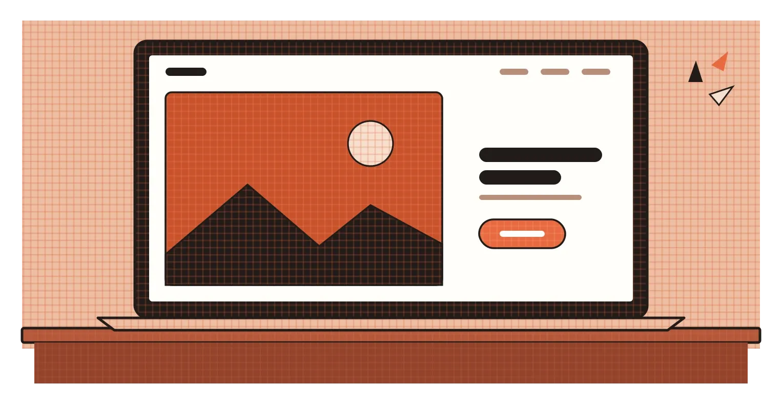
Asymmetrical balance is harder to achieve and, for many designers, more interesting. The two sides of a design don't match, but their visual weights still even out, like the adult and child on the seesaw. A large photograph on the left might be balanced by a small block of dark text and a bright button on the right. A big area of empty space can balance a small, intense object. The result usually feels more dynamic and modern than symmetry, because the eye has to move around to take everything in, and that movement makes the design feel alive.
In graphic design, one of the strongest arguments for asymmetry came from the German typographer Jan Tschichold. In his 1928 book Die neue Typographie, or The New Typography, he argued that centred, symmetrical layouts were a leftover from the past, and that modern printed material should use asymmetrical layouts built on clear function and contrast. His ideas helped shape modernist graphic design for decades. What I find interesting is that Tschichold himself later changed his mind. By the 1940s he had returned to classical, centred typography for many projects, and he criticised the rigidity of his earlier position. It's a good reminder that neither approach is simply right. They're tools with different effects.
Painters had been exploring this kind of balance too. The Dutch artist Piet Mondrian's well-known grid paintings, with thick black lines and blocks of red, yellow, blue and white, are almost never symmetrical. A large white rectangle on one side might be balanced by a small, intensely coloured square near the opposite corner. Japanese traditions offer even older examples. Ikebana, the art of flower arranging, typically avoids perfect symmetry, using stems of different heights and directions to create a balance that feels natural rather than mirrored. In all of these, balance comes from careful judgement rather than measurement. You can't fold the design in half to check it. You have to feel whether it settles.
Radial balance: everything spinning out from a centre
The third kind of balance is radial. Instead of mirroring along a line, elements repeat around a central point, like spokes on a wheel, petals on a flower or ripples spreading across water. Radial designs almost always pull the eye straight to the centre first and then outwards, which gives them a strong sense of focus and energy.
India has some extraordinary examples. The Sun Temple at Konark in Odisha, built in the thirteenth century, was designed as a giant stone chariot for the sun god Surya, pulled by carved horses and resting on twenty-four huge wheels. Each wheel is covered in intricate carving, with spokes radiating from a central hub and smaller medallions arranged around the rim. The wheels are so carefully balanced and detailed that they have become one of the most recognisable images of Indian architecture. A simpler radial form sits at the centre of the Indian national flag. The Ashoka Chakra, a wheel with twenty-four evenly spaced spokes, comes from the Lion Capital of Ashoka at Sarnath, and its regular, outward-reaching shape gives the flag a natural visual centre.

Radial balance appears across many cultures, often in places meant to inspire focus or reverence. The great rose windows of Gothic cathedrals in Europe, like those at Notre-Dame in Paris, spread stained glass out from a central medallion. Mandalas in Hindu and Buddhist traditions use radiating patterns as aids to meditation, drawing the eye inward towards a centre. Everyday design borrows the same structure for more practical reasons. Clock faces, dials, circular progress rings on fitness apps and pie charts all use radial balance, because a centre with things arranged around it is a very natural way to show a cycle, a whole made of parts, or a position on a scale.
Balance on screens, and a test you can always use
On screens, balance shows up in almost every layout decision. A landing page with a large image on one side and a short headline with a button on the other is a classic asymmetrical layout. A login screen with everything centred is symmetrical, which suits a simple, single-purpose moment. Dashboards often need careful balancing, because a single large chart can easily make one side feel heavy and the rest feel like an afterthought. Even small choices matter. A row of buttons with one bright, filled button and one plain outlined button is unbalanced on purpose, so that the important action carries more weight than the secondary one.
The most useful test for balance is the same one I suggested for value: step back, squint and see whether the design feels like it's tipping. If one corner feels heavy or one side feels empty, try adjusting visual weight rather than moving everything. Make a heavy element a little smaller or lighter, give a light element more contrast, or use empty space as a counterweight. You can also flip the design horizontally. Our eyes get used to a layout quickly, and seeing it mirrored often makes imbalances jump out immediately.
It's also worth remembering that imbalance can be a choice. A poster for a thriller might be deliberately unbalanced to create unease, and an off-centre composition can suggest movement or surprise. What matters is that the imbalance is intended and that it helps the message, rather than happening by accident.
The Taj Mahal's single off-centre tomb has been talked about for centuries because everything around it is so carefully balanced. That's the lesson I'd take from it. Balance gives people a sense of calm and order, and that calm is exactly what makes a well-placed break so powerful. Learn to create balance first, and you'll know how to break it in a way that people notice for the right reasons.
Further reading: Rudolf Arnheim, Art and Visual Perception (1954) · Jan Tschichold, The New Typography (1928) · Ellen Lupton and Jennifer Cole Phillips, Graphic Design: The New Basics (2008)