Colour Temperature
Why oranges seem to step forward, blues drift back, and light itself has a temperature.
Colour Temperature
The same stone at every hour of the day
In February 1892, Claude Monet went to Rouen in Normandy, set himself up in upstairs rooms across the square from the cathedral and began painting its west front over and over again. He came back the following spring and did it again. The subject never changed: a tall Gothic facade of grey stone, crowded with pointed arches, carved niches and towers. What changed was the hour. He kept several canvases on the go at once, switching between them as the light moved across the stone. By the time he had finished them in his studio at Giverny, there were around thirty. In 1895 his dealer, Paul Durand-Ruel, showed twenty of them together in Paris.
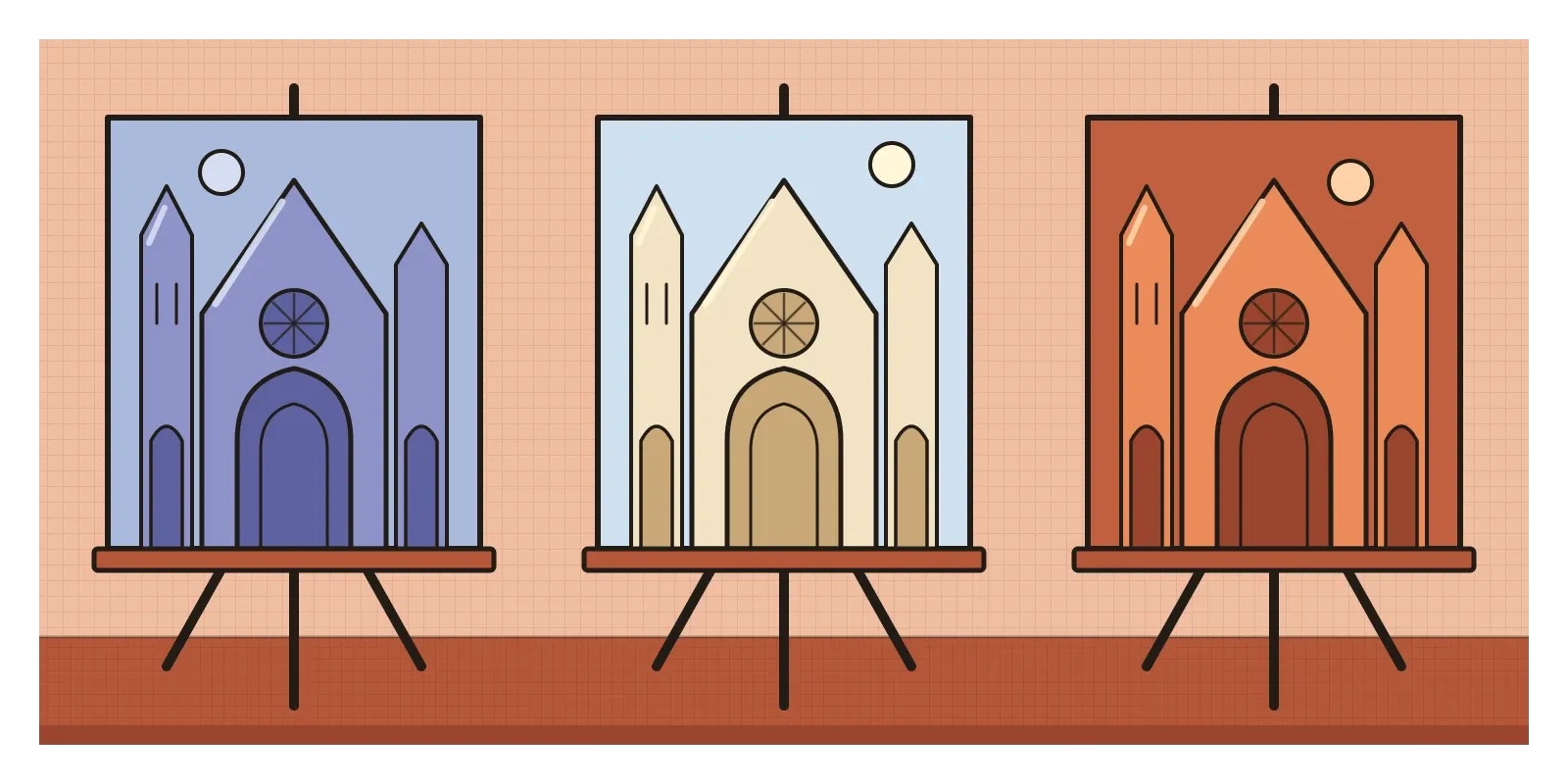
Seen side by side, they hardly look like the same building. In the early morning versions, the stone is wrapped in blues and soft violets. In full sun it turns pale and chalky, edged with gold, and one of those versions, now in the Musée d'Orsay in Paris, carries the subtitle Harmony in Blue and Gold. Towards evening, the same facade glows in oranges and rusty pinks. Monet wasn't really painting a cathedral. He was painting the light falling on it, and the most obvious thing that light did through the day was change its warmth.
That's the subject of this post. Colour temperature means two related things. One is the way we feel some colours as warm and others as cool. The other is a physical measurement of the colour of light itself. Designers use both, and they behave in some surprising ways.
Warm and cool are a feeling, and a relative one
Ask almost anyone to sort a box of colours into warm and cool, and they'll do it the same way. Reds, oranges and yellows go on the warm side. Blues, blue-greens and blue-violets go on the cool side. On the colour wheel, which has its own post in this series, a line from roughly yellow-green to red-violet splits the circle into a warm half and a cool half. Warm colours are the colours of fire, sunlight and ripe fruit. Cool colours are the colours of water, sky, shade and ice.
Goethe, whose circle of colours I described in the post on the colour wheel, also divided colours into what he called a plus side and a minus side. Yellow and the reddish yellows were on the plus side, which he described as lively, active and striving. Blue and the reddish blues were on the minus side, which he connected with restlessness, softness and longing. He was wrong about the physics of light, but his observations about how colours feel have stayed influential with painters.
Whether warm colours actually make us feel warmer is much less clear. The idea is sometimes called the hue-heat hypothesis, and experiments testing it, by putting people in rooms or under lights of different colours and asking how warm they feel, have produced mixed results. The link is strong in our language and imagination, but its effect on our bodies seems small, if it exists at all.
The most useful thing to understand is that warmth is relative. A colour isn't simply warm or cool. It's warmer or cooler than something else. Every hue has warmer and cooler versions. A tomato red, leaning towards orange, is a warm red. A crimson, leaning towards blue, is a cool one. Greens and violets sit on the border and can tip either way. Even greys have a temperature. A grey with a touch of brown or orange in it feels warm, like stone in sunlight, while a grey with a touch of blue feels cool, like slate. When painters talk about temperature, they mean which way a colour leans compared with the colours around it.
Warm colours step forward, cool colours step back
Put a patch of orange and a patch of blue of similar lightness on a page and look at them for a moment. For most people, the orange seems slightly closer, as if it's sitting on top of the paper, while the blue seems to sink a little into it. Warm colours are said to advance and cool colours to recede, and it's one of the oldest ways of creating depth in a flat picture.
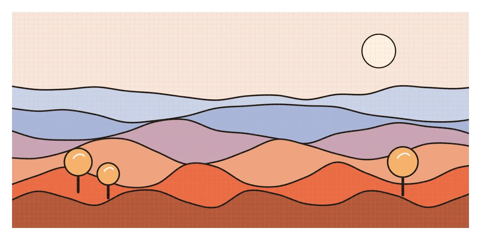
Part of the reason is learned from the world around us. In the post on space, I mentioned atmospheric perspective, the way distant hills look paler and bluer because of all the air between them and us. We've seen that pattern all our lives, so a cool, faded colour reads as far away and a warm, strong one reads as near. Landscape painters exploit it by keeping their foregrounds warm and detailed and letting their distances cool and soften. Interior designers use the same idea indoors, painting the far wall of a long, narrow room a warm colour to pull it closer.
There's also something physical going on inside the eye. The lens bends different wavelengths of light by slightly different amounts, so red and blue light coming from the same flat surface don't come into focus in quite the same place. On a dark background, many people see strongly saturated red shapes floating in front of blue ones, an effect called chromostereopsis. It isn't the same for everyone, and some people see the blue in front instead. It's also part of the reason bright red text on a saturated blue background seems to shimmer, which I mentioned in the post on contrast as something to avoid.
The important caveat is that temperature is only one of the clues the eye uses for depth, and it isn't the strongest. Value and saturation usually win. A pale, greyish orange will happily sit behind a deep, saturated blue. Temperature works best as a finishing touch on top of a sound value structure, the same advice I gave in the post on value.
A blue city and a golden one
Rajasthan has two cities that are almost a lesson in colour temperature on their own. In the old part of Jodhpur, below the walls of Mehrangarh Fort, many of the houses are painted in shades of blue, and from the fort the old town looks like a scatter of blue cubes. A few hundred kilometres to the west is Jaisalmer, whose fort dates back to the twelfth century and is built, like much of the town around it, from the local yellow sandstone. It's often called the Golden City, and in the evening the whole place seems to glow.
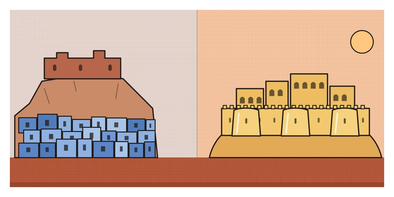
Nobody seems entirely sure why Jodhpur turned blue. Common explanations are that blue once marked the homes of Brahmin families, that the blue limewash helped keep houses cool in the desert heat, or that copper sulphate mixed into the wash kept termites away. None is settled. The cooling story interests me most, because it mixes up the two meanings of colour temperature. Blue looks cool, but in physical terms a wall stays cooler by reflecting more sunlight, and a pale limewash does that because it's light, not because it's blue. A white wall would reflect even more. What the blue certainly does is make the old town feel cooler to look at, which in a desert may be worth something in itself.
Jaisalmer works the other way round. Its warmth isn't painted on. It's the stone itself, and the effect changes through the day much as Monet's cathedral did. Under a hard midday sun, the sandstone looks pale and sandy. In the low, orange light of late afternoon, it turns a deep honey gold. Together, the two cities show that the temperature we see depends on the material, the light falling on it and what we expect a colour to do.
Light has a temperature, and so does your screen
The second meaning of colour temperature comes from physics. If you heat a lump of metal, it glows dull red, then orange, then yellow, then white, and if it could get hot enough, a bluish white. Physicists describe the colour of a light source by the temperature at which an idealised glowing object, called a black body, would glow in the same colour. The temperature is given in kelvin, the scale named after the physicist William Thomson, Lord Kelvin, who proposed an absolute scale of temperature in 1848. A candle flame comes out at roughly 1,900 kelvin. A traditional household bulb is around 2,700. Direct midday sunlight is around 5,500, an overcast sky is nearer 6,500, and the light in open shade on a clear day, lit mostly by blue sky, is bluer still.
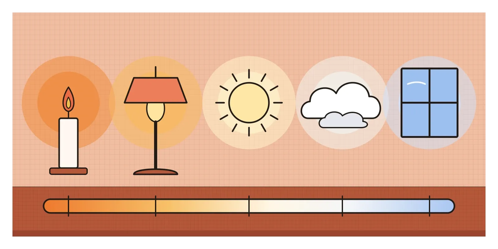
The odd thing is that in this system, the warm-feeling light has the lower number and the cool-feeling light has the higher one, because a bluish glow belongs to a hotter object than an orange one. So when a shop sells one bulb as warm white at 2,700 kelvin and another as cool daylight at 6,500, the words describe how the light feels and the numbers describe the physics, and they run in opposite directions. Many Indian homes have both, the bluish-white glow of a tube light in one room and the yellow of a bulb or an oil lamp in another.
Screens are built on these numbers. The standard white for most displays, and for the sRGB colour space that most web colours are defined in, is a daylight white of about 6,500 kelvin. Cameras have a white balance setting that decides what counts as neutral, which is why photos taken under a household bulb can come out orange. In 2016, Apple added Night Shift to iOS, which shifts the screen towards warmer colours in the evening, following f.lux, software that had done the same for computers since 2009. The idea was that bluish light at night might disturb sleep, although studies of whether these settings actually help people sleep better have been mixed. The same year, Apple introduced True Tone, which adjusts the screen's white to the light in the room, so a white page looks more like paper.
For product designers, colour temperature shows up most in neutrals. Most interfaces are largely made of greys, and those greys almost always lean one way or the other. A grey with a hint of blue feels crisp, technical and a little distant. A grey with a hint of warmth feels softer and more like paper, which suits reading and editorial products. Mixing warm and cool greys by accident is one of the quiet reasons a design system can feel slightly off without anyone knowing why. Temperature also guides accents. A warm accent on a cool, neutral screen jumps forward, which suits a primary button, and charts showing two opposite directions, like hotter and colder than average, often use a warm-to-cool palette because people read it instantly.
Notice the temperature before the hue
The habit I'd take from this is to ask which way a colour leans before asking what colour it is. When a palette feels wrong, check its temperature first. Are the neutrals all leaning the same way? Is the thing you want noticed warmer than its surroundings? Small shifts in temperature often fix problems that changing the hue never would.
For an exercise this week, take a plain white sheet of paper and photograph it in five places: by a window in the early morning, in midday sun, in open shade, under a bulb at night and beside a laptop screen in a dark room. Fix the white balance first if your camera allows it. Put the five photos side by side. The paper never changed, but some versions will look warm and others cool. Then try it on your own work. Make two copies of a screen you've designed, nudge every grey in one slightly towards orange and in the other slightly towards blue, and see how differently they feel. In the next post, on Itten's colour contrasts, warm against cool turns up again as one of seven ways colours can push against each other.
Monet's cathedral didn't change colour in all those paintings. The stone stayed the same grey. What changed was the warmth of the light, and with it the feeling of the whole building, from a cool, blue morning presence to a glowing evening one. That's the power of colour temperature. It can make the same thing feel near or far, crisp or soft, morning or evening, without changing the thing at all.
Further reading: James Gurney, Color and Light: A Guide for the Realist Painter (2010) · Margaret Livingstone, Vision and Art: The Biology of Seeing (2002) · Paul Hayes Tucker, Claude Monet: Life and Art (1995) · Kurt Nassau, The Physics and Chemistry of Color (1983)