Colour Psychology and Culture
What colours really do to us, what they only seem to do, and why meaning is mostly learned.
Colour Psychology and Culture
A prison cell painted bubblegum pink
In the late 1970s, a researcher named Alexander Schauss was testing an odd idea, that a particular shade of pink could calm people down. In small tests of his own, men seemed to lose a little strength after staring at a pink card. In 1979, the Naval Correctional Center in Seattle decided to try it. The officers in charge, Gene Baker and Ron Miller, had a holding cell painted a bright, sugary pink, made by mixing a little red paint into white. New detainees were put in the cell for short spells, and over the next few months the staff reported fewer violent incidents. The colour was named after the two officers, Baker-Miller pink, and the idea spread quickly. Police stations and prisons across the United States painted cells pink, and the University of Iowa, at the suggestion of its football coach Hayden Fry, painted the visiting team's locker room pink, hoping to take the edge off its opponents, and it's still pink today.
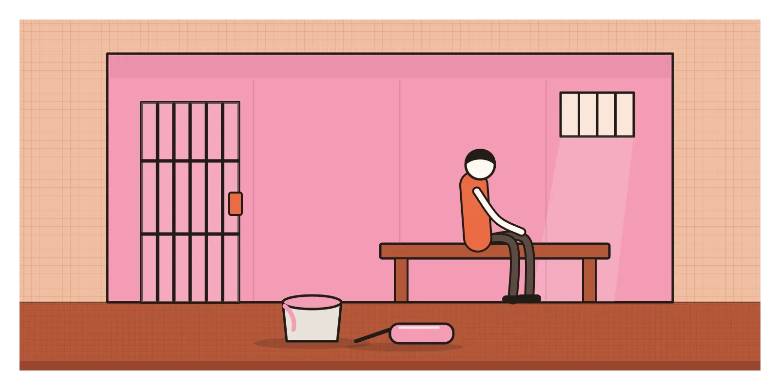
It's a wonderful story, and it's also a warning. The early results came from small studies with no proper controls, run by people who expected pink to work. Later researchers who tested the idea more carefully mostly found nothing. One of the most careful, published in 2015 by a team led by the psychologist Oliver Genschow, compared prisoners in Switzerland held in pink cells with prisoners held in ordinary grey ones and found no difference in how aggressive they were. Whatever calmed the Seattle detainees, it probably wasn't the paint.
That gap, between what colour is said to do and what it can be shown to do, is what this post is about. In the previous post, on Josef Albers and the interaction of colour, the subject was how colours change each other on the page. Here it's how colours change us, or seem to: the feelings and meanings we attach to them, where those meanings come from, and how much they vary from place to place. Colour psychology is a real field. It's just much less certain than the charts on the internet suggest.
What the research can and can't tell us
You've probably seen those colour psychology charts that do the rounds in marketing blogs. Red means energy and makes you hungry. Blue means trust. Green means calm. Yellow means optimism. Most of these claims are unsupported or too vague to test. When the psychologist Andrew Elliot and his colleague Markus Maier reviewed the field in 2014, they pointed out that much of the older research was thin and poorly controlled, and often failed to separate hue from lightness and saturation, the properties I described in the post on colour. A study comparing a bright red with a dark blue can't tell you whether people are reacting to redness or to brightness.
Elliot's own work tried to do better, and it produced some striking results. In a 2007 study, students who saw a small patch of red before a test, such as a participant number written in red ink, did slightly worse on anagrams and IQ-style questions than students who saw green or black. Elliot's explanation was that red is the colour of the teacher's pen, so it nudges people towards a fear of failure. Two years earlier, in 2005, the anthropologists Russell Hill and Robert Barton had published a short paper in Nature on the 2004 Athens Olympics. In boxing, taekwondo and two styles of wrestling, competitors are randomly given red or blue kit, and Hill and Barton found that those wearing red won more often than chance would predict.

Both findings turned out to be more complicated. A clever follow-up in 2008 by Norbert Hagemann and colleagues took videos of taekwondo bouts and digitally swapped the colours of the fighters' protective gear. Experienced referees gave more points to whichever fighter appeared to be in red, so at least part of the red advantage seems to live in the people judging. Meanwhile, attempts to repeat several of the well-known red effects with larger groups of people, including some run by Elliot's own collaborators, have often found much smaller effects than the originals, or none at all.
This doesn't mean colour has no effect on us. It means the effects that hold up tend to be modest, and they depend heavily on context. Red can signal danger, love, a teacher's correction or a sale, depending on where it appears and who is looking. Elliot and Maier call this colour-in-context theory, and it's exactly why a chart that says "red means energy" is so unhelpful.
Meanings come from what colours have been near
If colours don't carry fixed effects, where do our strong feelings about them come from? The most convincing answer I've come across is about association. In 2010, the vision scientists Stephen Palmer and Karen Schloss, whose work on colour pairs I mentioned in the post on colour harmonies, proposed what they called the ecological valence theory. They asked people how much they liked dozens of colours, and asked others what each colour reminded them of and how they felt about those things. The two lined up remarkably well. People tend to like blues and cyans, which remind them of clear skies and clean water, and tend to dislike dark yellows and olive browns, which remind them of things like rotting food and mud. In other words, we seem to like colours roughly as much as we like the things we've learned to connect with them.
Governments have used this deliberately. When Australia introduced plain packaging for cigarettes in 2012, researchers tested a range of colours to find the one smokers found least appealing. The winner, Pantone 448 C, is a murky greenish brown that people associated with dirt, tar and death. It was at first described as olive green, until the Australian olive industry objected, and it was relabelled as drab dark brown. Several other countries, including the United Kingdom, have since used the same colour. It's a colour chosen not for any built-in effect but precisely for the unpleasant things it calls to mind.
Some associations seem to be shared very widely. In 2020, a large study led by Domicele Jonauskaite asked more than 4,500 people in 30 countries to link colour words with emotions. The patterns were strikingly similar around the world. Red was linked with both love and anger almost everywhere, two very different feelings. But the study also found real differences, and countries that were closer in language and geography tended to have more similar associations. Some meanings are close to universal, probably because humans everywhere share experiences like blood, fire, sky and plants. Many others are local, learned through language, religion, history and commerce.
Red for a bride, but not every bride
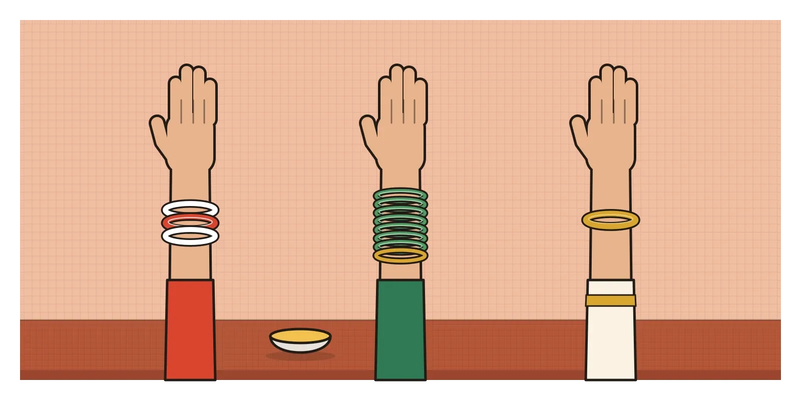
In the post on colour, I mentioned that in much of India red is the colour of brides and celebration, while white is often worn in mourning. That's true as a broad pattern, but it's worth looking more closely, because India is a good place to see how local colour meanings can be. In Kerala, many Hindu brides have traditionally worn the kasavu, an off-white cotton sari with a gold border, a colour that in other parts of the country might be associated with widowhood. In Bengal, married women traditionally wear a pair of bangles called shankha and pola, one white, made from conch shell, and one red, made from coral or lacquer. In Maharashtra, green glass bangles are a familiar sign of a married woman. And across many communities, the days before a wedding include a haldi ceremony, where the bride and groom are covered in bright yellow turmeric paste. Red, white, green, yellow and gold can all mean marriage, depending on where you are standing.
Colour meanings in India are also shaped by design decisions. One I find genuinely clever is the mark on packaged food that tells you whether it's vegetarian. Indian food regulations require a small symbol on the front of the pack: a green filled circle inside a green square for vegetarian food, and a brown mark for food that isn't. In a country where many people avoid meat, it's one of the most checked symbols on any shelf. Millions of people who have never read the regulation know exactly what the green dot means. It's a meaning that didn't exist a few decades ago and now feels completely natural, which is how most colour meanings work.
The mark also shows a weakness that a lot of colour coding shares. For years, the two symbols were the same shape, a dot inside a square, and differed only in colour. For someone with a colour vision deficiency, green and brown can be hard to tell apart, which is a real problem when the difference matters to your faith or your diet. More recent regulations have moved to give the non-vegetarian mark a different shape as well, a triangle instead of a dot. It's the principle I wrote about in the post on colour, that colour should never be the only way information is shown, and it matters even more once you start using colour to carry meaning on screens.
When red means up
Here's a fact that catches out a lot of product designers. On stock market apps in the United States, Europe and India, a share price that has gone up is shown in green, and one that has gone down is shown in red. In mainland China, Japan, South Korea and Taiwan, the convention is the other way round. Red means a price has risen and green means it has fallen. That makes sense in places where red is strongly linked with prosperity and good fortune. For a global finance product, a colour that means "you're making money" to one person means "you're losing money" to another, and that's not a small misunderstanding. Many trading apps now let people choose which way round the colours go.

The practical lesson is to separate a colour from its job. Modern design systems already encourage this. Instead of a specific red being typed into the code, the interface refers to roles with names like "error", "warning", "success" or "price up", and each role is linked to an actual colour in one place. That makes it possible to change what a role looks like for a particular market, or for dark mode, or for accessibility, without hunting through every screen. It also forces a useful question during design. What is this colour supposed to mean here, and who decided that?
A few other habits help. Test colour meanings with the people who will actually use the product, not only with your own team, who share your assumptions. Be especially careful with colours that carry religious, political or national meanings. Pair colour with a second signal, such as an icon, a word or an arrow, so the meaning survives colour blindness and cultural differences. And be suspicious of any guide that promises a colour will make people trust you or buy more. It might, for some people, in some contexts, but you'd need to test it to find out.
Treat colour meanings as a guess to be tested
If I had to sum up the research, I'd say colour does affect how we feel and what we expect, but mostly through what we've learned to connect it with, not through some fixed effect built into each hue. Red isn't exciting in itself. It's exciting because of everything red has been near in our lives: blood, fire, festivals, warnings, love letters, sale signs and a teacher's pen. That makes colour meaning both powerful and fragile, because those associations run deep and differ from person to person.
Here's a small exercise for this week. Pick one colour, say yellow, and spend a few days collecting every use of it you notice, on signs, packaging, apps, clothes, food and buildings. Next to each one, write a word for what it seems to mean there: caution, cheerfulness, cheapness, taxi, turmeric, gold. By the end you'll probably have a dozen meanings, some of them contradictory. Then ask two or three people from a different region, generation or background what yellow means to them, and compare. It's a quick way to feel how much of colour meaning is local.
This post closes the run on colour. In the next post, on ideation techniques, I'll turn to the creative process, starting with how designers come up with ideas in the first place.
The pink cells in Seattle are still a good story, just not in the way they were first told. They don't show that a colour can calm people down. They show how badly we want colours to have that kind of power, and how quickly an appealing claim about colour can spread before anyone checks it.
Further reading: Andrew Elliot and Markus Maier, "Color Psychology: Effects of Perceiving Color on Psychological Functioning in Humans" (2014) · Stephen Palmer and Karen Schloss, "An ecological valence theory of human color preference" (2010) · Russell Hill and Robert Barton, "Red enhances human performance in contests" (2005) · Domicele Jonauskaite and others, "Universal patterns in color-emotion associations are further shaped by linguistic and geographic proximity" (2020) · Adam Alter, Drunk Tank Pink (2013)