Additive and Subtractive Colour
Why screens mix red, green and blue light while printers mix cyan, magenta, yellow and black ink.
Additive and Subtractive Colour
A tartan ribbon in three colours of light
On 17 May 1861, the Scottish physicist James Clerk Maxwell gave a lecture at the Royal Institution in London on the theory of three primary colours. To make his point, he showed the audience something nobody had seen before. The photographer Thomas Sutton had taken three black-and-white photographs of the same tartan ribbon, tied in a bow, one through a red filter, one through a green filter and one through a blue filter, each filter a glass vessel of coloured liquid. In the lecture hall, the three pictures were projected onto a screen with three magic lanterns, each shining through the same colour of filter its photograph had been taken through, and lined up on top of one another. Out of three grey pictures and three coloured lights, an image of the ribbon appeared in colour. It's often described as the first colour photograph.
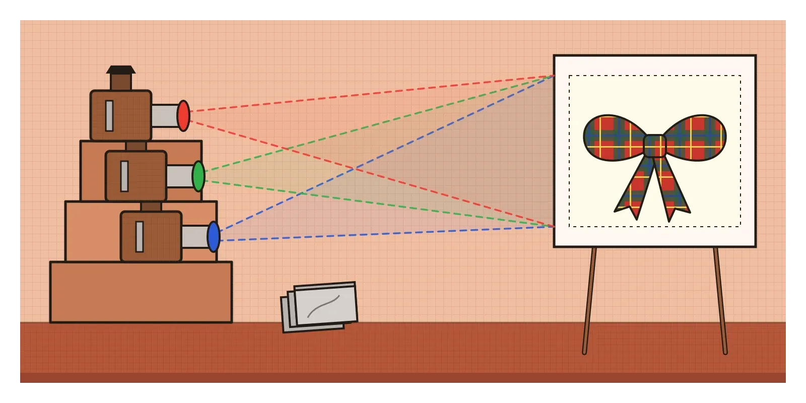
There's a twist that was only noticed a century later. In 1961, the Kodak researcher Ralph Evans pointed out that the photographic plates Sutton used were barely sensitive to red light at all. The "red" picture had mostly recorded ultraviolet light, which the red dyes in the ribbon happened to reflect, so the demonstration worked partly by luck. But the principle Maxwell was demonstrating was sound, and it's the one every phone, laptop and television screen depends on today. Colour can be built by adding coloured lights together.
It can also be built the other way, by taking light away, which is what happens with paint, ink and dye. These two systems, additive and subtractive colour, explain why your screen's primaries are red, green and blue while your printer's are cyan, magenta and yellow and why a design never looks quite the same on paper as it does on screen.
Adding light
The idea Maxwell was testing went back to the English scientist Thomas Young, who suggested around 1802 that the eye might need only three kinds of receptor, each sensitive to a different part of the spectrum, to see every colour. Hermann von Helmholtz later developed the idea, and it was eventually confirmed by the discovery of the three types of cone I described in the post on colour. So three well-chosen lights are enough to persuade the eye that it's seeing almost any colour.
Additive mixing starts with darkness. Shine a red light on a white wall and you see red. Add a green light on top and, to most people's surprise, the overlap looks yellow, because the red-sensitive and green-sensitive cones are both being stimulated, which is much the same thing yellow light from the spectrum would do. Green and blue together make cyan. Blue and red together make magenta, the colour that, as I mentioned in the post on the colour wheel, doesn't appear in the rainbow at all. All three together make white. Every light you add makes the result brighter, which is why it's called additive. Red, green and blue are the additive primaries, and cyan, magenta and yellow are the additive secondaries.
That's exactly what a screen does. As I wrote in the post on point, every image on a screen is made of pixels, and if you look closely enough, each pixel turns out to be made of even smaller red, green and blue lights, often called subpixels. A white page on your laptop is millions of tiny red, green and blue lights all switched on together. A yellow button is red and green on, with blue off. The hex codes designers use every day, like #FF6600, are simply instructions for those three lights, written as three pairs of characters in hexadecimal, a counting system in which 00 means off and FF means fully on, or 255 in ordinary numbers.
Taking light away
Paint, ink and dye work the other way round. A sheet of white paper in daylight reflects light of all colours back at you. When you put ink on it, the ink absorbs some of that light and lets the rest bounce back to your eye. Every coloured surface you see is really showing you the light it didn't absorb. That's why mixing pigments is called subtractive. Each new pigment takes more light away, and the mixture gets darker.
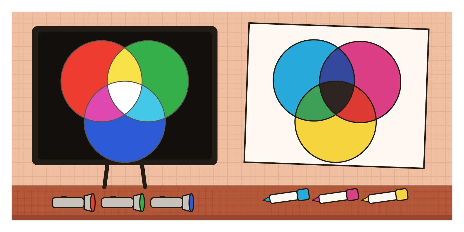
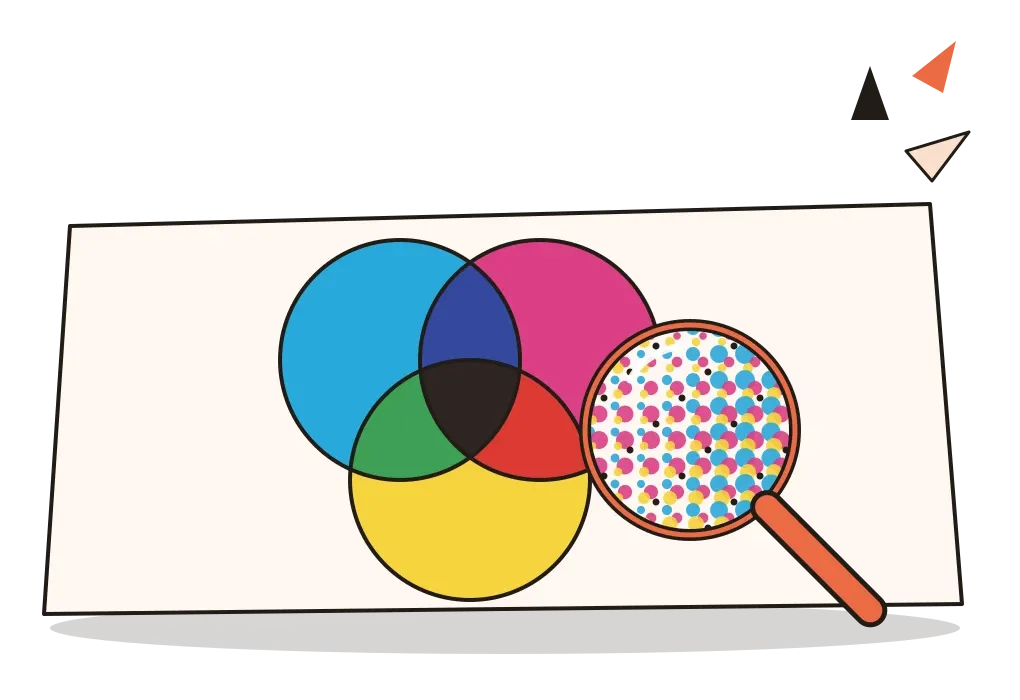
The subtractive primaries are cyan, magenta and yellow, the same three colours that were the secondaries of light, and that's no coincidence. Cyan ink absorbs red light, magenta absorbs green and yellow absorbs blue. Print cyan and yellow on top of each other and, between them, they absorb the red and the blue, leaving only green to reach your eye. Magenta and yellow leave red. Cyan and magenta leave blue. In theory, all three together absorb everything and make black. In practice, real inks aren't perfect, and the three together give a muddy dark brown. So printers add a fourth ink, black, which is the K in CMYK. The K is usually explained as standing for "key", because the black plate carried the main detail that the other colours were lined up, or keyed, against.
This also explains the puzzle from the post on the colour wheel, about why a bright violet is so hard to mix from red and blue paint. The painter's red, yellow and blue are rough stand-ins for magenta, yellow and cyan. A typical red paint already absorbs most blue and green light, and a typical blue paint absorbs most red, so together they swallow almost everything and leave a dull, dark purple. Magenta and cyan absorb less, so their mixture stays bright.
The idea of printing full colour from a handful of inks is older than you might expect. In the early eighteenth century, the German-born painter and engraver Jacob Christoph Le Blon, inspired by Newton's ideas, printed colour pictures from three separate plates, one inked in blue, one in yellow and one in red, sometimes adding a fourth in black. He was granted a British patent for the method in 1719. Modern printing combines his idea with the halftone dots I described in the post on point. Each of the four inks is printed as a grid of tiny dots, set at slightly different angles so the grids don't clash, and your eye blends them, much as it blended Seurat's dabs of paint. That kind of blending is often called optical or partitive mixing, and it sits somewhere between the two systems. Where the dots overlap, the inks subtract. Where they sit side by side, your eye averages them.
Green from indigo and yellow
Long before anyone printed with cyan ink, textile dyers in India were mixing colour subtractively by hand. Kalamkari, the painted and dyed cotton made in Andhra Pradesh, takes its name from the kalam, the pen used to draw on the cloth, and kari, meaning work. In the freehand style associated with the temple town of Srikalahasti, artisans build up a cloth in many stages over days or weeks, using mostly plant-based colours. The cloth is first treated with myrobalan, a fruit rich in tannin, which helps the colours hold. Black outlines are drawn with a fermented mixture of iron and jaggery. Reds come from painting alum, a mordant, wherever red is wanted and then boiling the cloth with a dye root, so the colour takes only where the alum was. Blue comes from indigo.
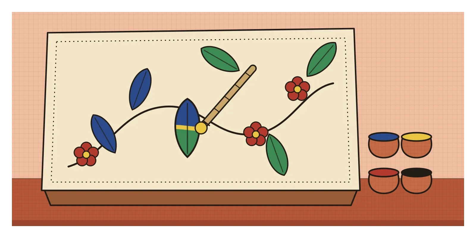
Green is the interesting one. There's no reliable natural green dye that holds fast on cotton, so dyers make it by layering. An area is dyed blue with indigo first, and then a yellow, from sources such as myrobalan flowers or pomegranate rind, is painted over the blue. The indigo absorbs most of the red and yellow light, the yellow dye absorbs most of the blue, and what survives is green. It's the same cyan-plus-yellow mix as on a printing press, done by hand with a pen and a brush. Because yellow dyes tend to fade faster than indigo, old textiles coloured this way, in India and elsewhere, sometimes show leaves that have slowly drifted back towards blue, a small, visible lesson in subtractive colour.
The same principle runs through India's printing history. In the post on light, shade and rendering, I wrote about Raja Ravi Varma's press, which reproduced his paintings by lithography. In colour lithography of that kind, each colour was usually printed from its own stone, one after another, sometimes many stones for a single picture. In the twentieth century, a great deal of the country's colour printing, from calendars and posters to matchbox labels, came to be concentrated in Sivakasi in Tamil Nadu, a town also known for its fireworks and match factories. Its offset presses print with the same four inks, cyan, magenta, yellow and black, that Le Blon's plates anticipated. The bright calendar gods and film posters on the walls of shops across India are subtractive colour at industrial scale.
Designed in light, printed in ink
For designers, the gap between these two systems causes real problems. The range of colours a device can reproduce is called its gamut, and the gamuts of screens and printers don't match. Screens, especially modern phones, can produce very saturated colours, an electric blue, a vivid green or a glowing orange, that no combination of four process inks can reproduce on paper. Design a poster on screen, send it to a printer, and those colours come back noticeably duller.
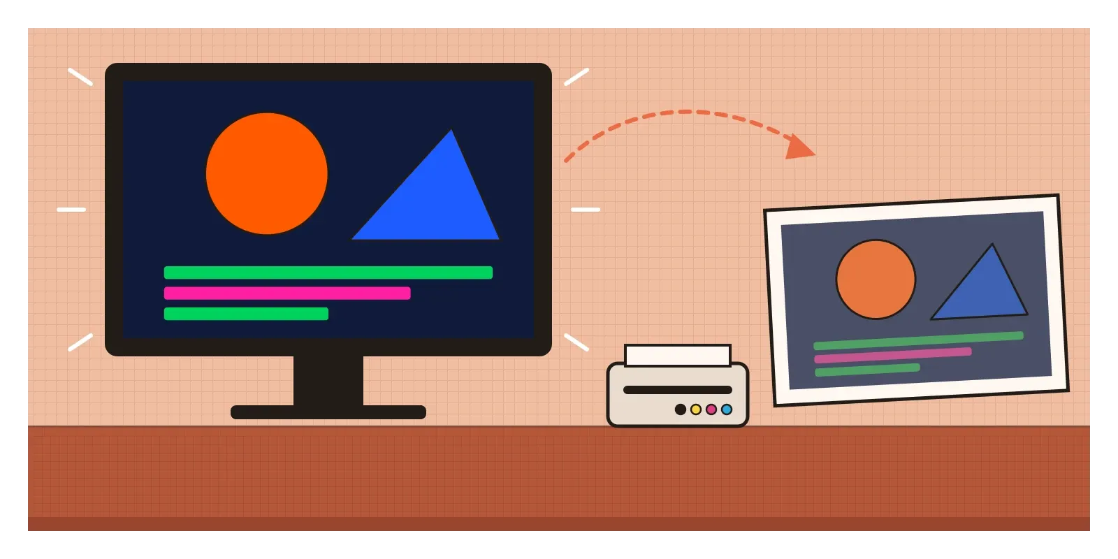
There are a few standard ways to handle this. Design tools let you set a document up in CMYK, or soft-proof it, previewing on screen roughly how the colours will look in print. Brands that care about consistency define each of their colours several ways, with a hex code for screens, a CMYK mix for ordinary printing and often a Pantone reference as well. The Pantone Matching System, introduced by Lawrence Herbert in 1963, gives each colour a number and a recipe for mixing it as a special ink, called a spot colour, which is printed on its own instead of being built from CMYK dots. That's how a company can keep a signature colour looking the same on a carton in Mumbai and a banner in Berlin.
Screens aren't consistent with each other either. The common standard for colour on the web, sRGB, was defined by HP and Microsoft in 1996, and many newer phones and laptops can show a wider range called Display P3. The same hex code can look slightly different on an old office monitor and a new phone. The practical lesson is to check your work where it will actually be seen, on a range of real devices, and on a printed proof before anything goes to the press.
Two kinds of mixing, one pair of eyes
Additive and subtractive colour can sound like a technical detail for printers and display engineers. But they explain a lot of everyday design puzzles. Why yellow on a screen is made of red and green. Why a printed brochure looks duller than the mock-up. Why the painter's colour wheel and the screen's colour wheel disagree about opposites. Why a black made from three inks never looks as deep as black ink itself. Once you know whether you're adding light or taking it away, colour stops behaving randomly.
Try two small experiments this week. In a dark room, cover three torches with red, green and blue cellophane or coloured film, and overlap their light on a white wall, to see yellow, cyan and magenta appear where the beams cross. Then take three felt pens or highlighters in yellow, pink and turquoise, the closest things most of us have to process inks, and draw overlapping circles on white paper. Compare the two sets of overlaps. Light adds up towards white, and ink adds up towards dark. Then print a small poster you designed on screen and hold the print next to the screen. Notice which colours changed most.
Maxwell's ribbon only half worked, thanks to plates that couldn't see red, but the idea behind it was sound enough to end up in every pocket. Three lights, carefully chosen and added together, can stand in for almost any colour we can see. Take light away, one ink at a time, and you get the other half of the story. Every designer works in both, often on the same day. In the next post, on colour temperature, I'll look at why some colours feel warm and others cool, and how that changes where they seem to sit in space.
Further reading: James Clerk Maxwell, "On the Theory of Three Primary Colours" (1861) · Thomas Young, "On the Theory of Light and Colours" (1802) · Ralph M. Evans, "Maxwell's Color Photograph" (1961) · Jacob Christoph Le Blon, Coloritto (c. 1725)