
Contrast
Why difference is what makes anything noticeable, and how too much of it becomes noise.
Contrast
The odd one out is the one you remember
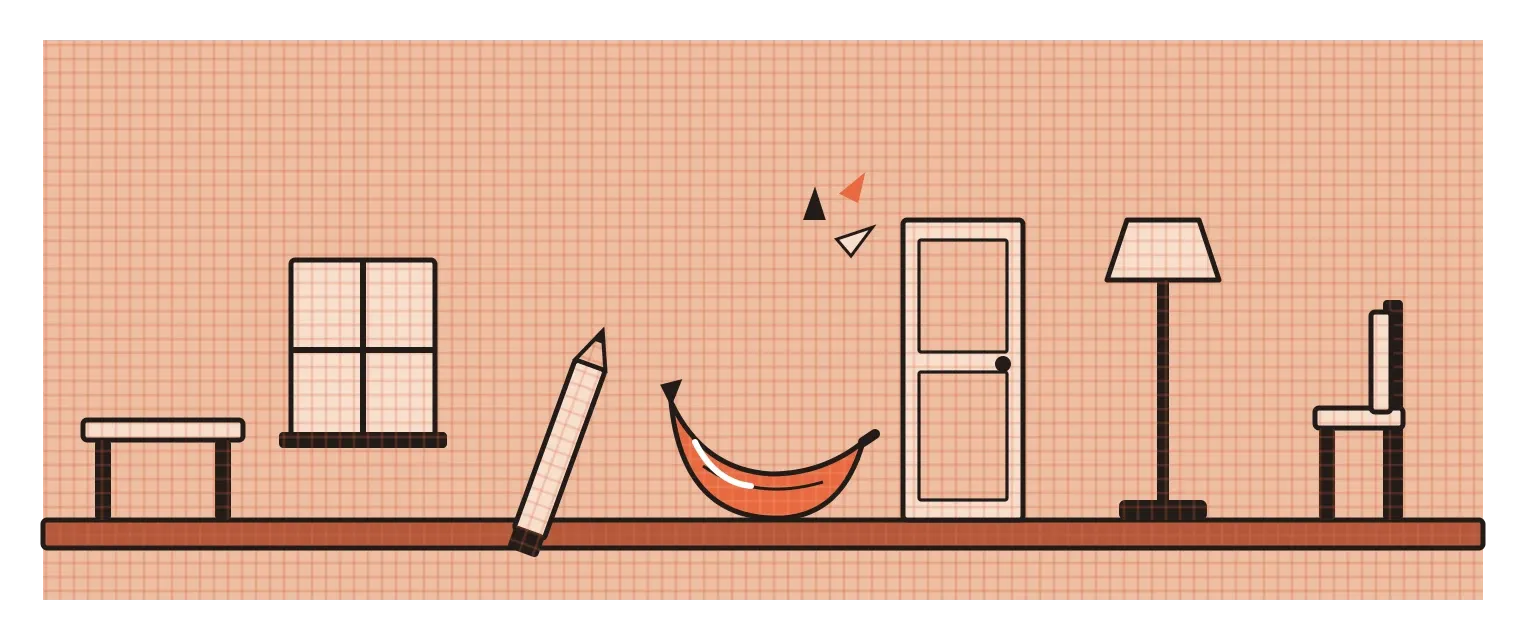
Imagine reading a list of words: table, window, pencil, carpet, banana, door, shelf. Then someone takes the list away and asks you which words you remember. Most people remember banana. It isn't a better word, and it isn't in a special position. It's simply the only food in a list of household objects, so it stands out. In 1933, the German psychologist Hedwig von Restorff published research showing exactly this pattern. When one item in a group is clearly different from the rest, people are much more likely to notice and remember it. Psychologists now call it the von Restorff effect, or the isolation effect.
Designers rely on this effect constantly, usually without naming it. It's why the one highlighted line in a textbook catches your eye, why a single red button on a grey screen gets clicked, and why the only person wearing yellow in a crowd photo is the first person you see. The underlying principle is so basic that it's easy to overlook. We don't notice things because they're there. We notice them because they're different from what's around them. That difference is called contrast, and it's probably the single most important principle in visual design. Almost everything else, hierarchy, emphasis, readability and even beauty, depends on it.
Contrast is any kind of difference
When people hear the word contrast, they usually think of light against dark, and that is the most powerful kind. I covered it in the post on value: black text on white paper, a bright button on a dark background. But contrast is much broader than that. It's any noticeable difference between elements, and nearly every element of design can create it.
There's contrast of size, where a huge headline sits above small body text. There's contrast of colour, where a warm orange sits against a cool blue, or a saturated red against muted greys. There's contrast of shape, where a single circle sits among rectangles, or a soft organic form sits next to sharp geometry, which links back to the bouba and kiki experiment in the post on shape. There's contrast of texture, rough against smooth, and contrast of weight in typography, where a bold word sits among regular ones. There's even contrast of direction, a single diagonal line among horizontals, and contrast of density, a crowded area next to an empty one. The Bauhaus teacher Johannes Itten went as far as identifying seven distinct kinds of colour contrast alone, which I'll come back to in a later post on colour theory.
What ties all of these together is that contrast is relative. Nothing is big, bright or bold on its own. It's only big next to something smaller, bright next to something duller, and bold next to something lighter. That's why the same headline can feel loud on one page and timid on another. It's also why contrast is a design decision rather than a property you can add to one element in isolation. When you make one thing stand out, you're really making a decision about everything around it.
Contrast is how a design tells you what matters
The most practical job contrast does is to create order. Look at any well-designed page and you'll see contrast sorting information for you. The headline is much larger than the text, so you know where to start. Subheadings are bolder than paragraphs, so you can scan. Captions are smaller and lighter, so you know they're secondary. The one bright button tells you what the main action is. Without these differences, every element would compete equally, and you'd have to read everything to work out what's important. With them, the structure becomes visible at a glance. That's the foundation of hierarchy, which I'll write about in its own post.
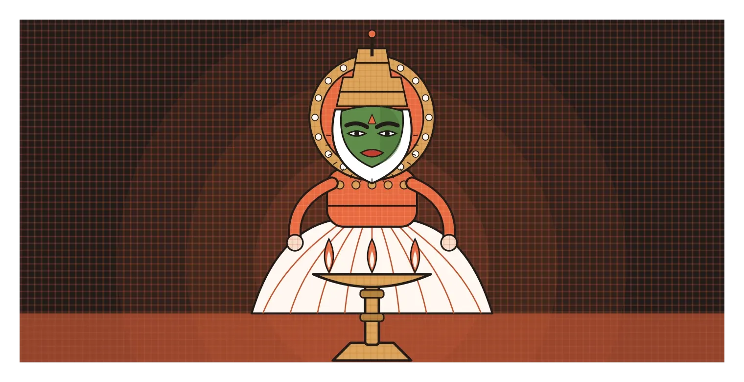
I think one of the most striking uses of contrast anywhere is in Kathakali, the classical dance-drama from Kerala. Kathakali performers wear elaborate make-up that can take hours to apply. The heroic characters known as pacha have faces painted a deep green, with bright red lips and strongly outlined eyes, framed by a stiff white border called the chutti that juts out along the jaw. Demonic or villainous characters use different colour codes, with red and black patterns. Traditionally, performances went on through the night, lit by a large brass oil lamp placed at the front of the stage.
In that flickering light, subtle make-up would simply disappear. The extreme contrasts, green against red, white against dark, sharp lines around the eyes, make every movement of the face readable from a distance, even by someone sitting far back in the audience. And because Kathakali tells its stories largely through facial expressions and hand gestures rather than spoken dialogue, that readability is essential. The contrast isn't decoration added on top of the performance. It's what allows the performance to communicate at all. That's the role contrast plays in good design too.
What happens when nothing stands out
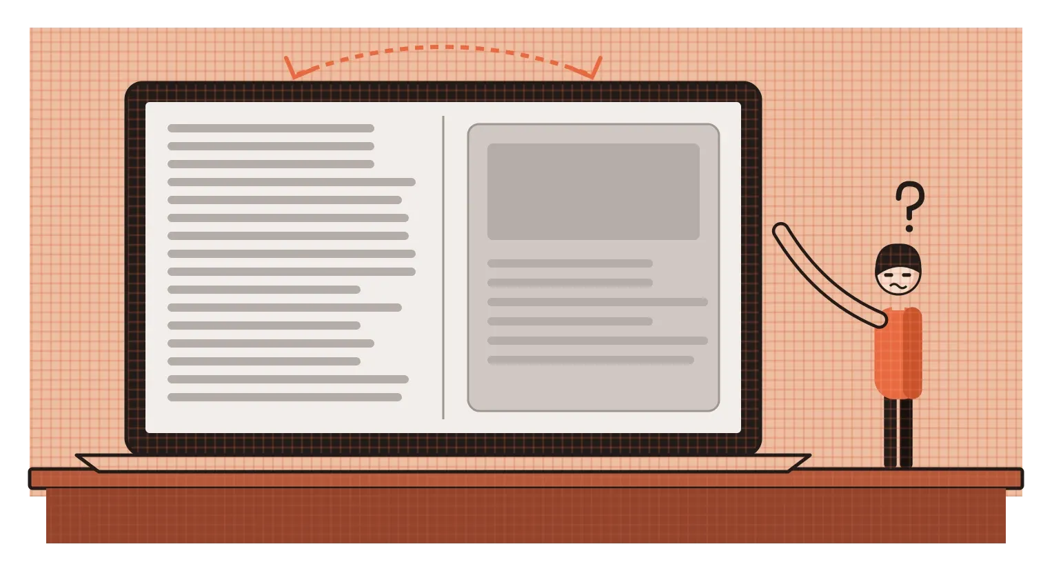
The clearest lesson I've had about contrast came from a design that didn't have enough of it in the right place. While working on an agentic AI system at Rocketium, our first version showed two very different kinds of content in the same space. One was the AI's processing output, long streams of text describing what it was doing. The other was the artifact, the actual result the designer needed to check before moving on. The first was noise for most people. The second was the whole point.
When we watched designers use it in an observed session, the problem became obvious within minutes. People read through the wall of processing text on one side, felt overwhelmed, and then clicked Proceed without properly looking at the artifact at all. Afterwards, the way I summed it up was that the thinking was noise and the artifact was the signal, but nothing in the design told them apart. Both were treated with similar visual weight, so people's attention went to whatever was biggest and loudest, which happened to be the noise.
The fixes in the second version were, in large part, about creating the right contrast. The AI's activity moved out of the conversation and into a separate view people could open if they wanted to, but didn't have to. Every response followed a clear structure, with the artifact presented as a distinct card that showed its status, such as awaiting action or done. The noise got quieter and the signal got louder. That's the lesson I took from it. Contrast isn't only about making something stand out. It's about deciding what deserves to stand out, and then making sure everything else steps back.
When everything shouts, nothing is heard
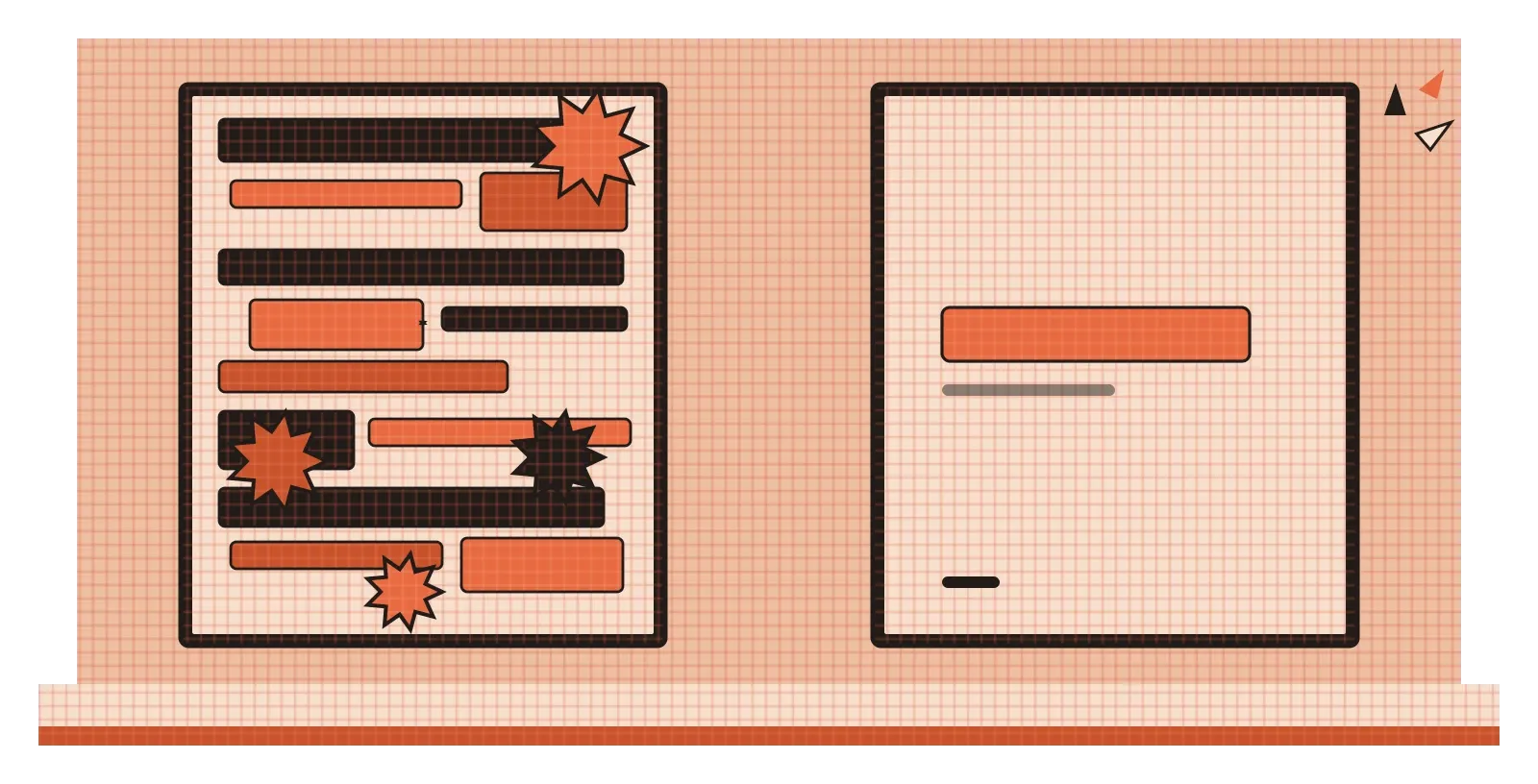
The opposite problem is just as common. If one bold word on a page draws attention, it's tempting to think that more bold words will draw more attention. But contrast only works because of what's around it. A page where every second sentence is bold, underlined or highlighted in yellow has no contrast at all, because there's no calm background for anything to stand out from. The same thing happens on websites with five brightly coloured buttons competing for clicks, or posters where every line of text is in a different large font. The von Restorff effect disappears when everything is the odd one out.
Too much contrast can also be physically uncomfortable. Two strongly saturated colours with similar lightness, like bright red text on a bright green or blue background, can appear to shimmer or vibrate where they meet, which makes the text tiring or even painful to read. Very high contrast can be a problem for long reading too. The British Dyslexia Association's style guide, for example, recommends avoiding pure white backgrounds for large amounts of text and suggests cream or soft pastel backgrounds instead, because some readers find the glare of black on bright white makes the words harder to follow. That doesn't mean low contrast is better, since faint grey text on a white background fails many readers for the opposite reason. It means the goal is enough contrast to read comfortably, not the maximum contrast possible.
A useful rule of thumb is to decide on one primary point of contrast for each screen or page, the one thing you most want people to notice, and make it clearly stronger than everything else. Then use smaller, quieter contrasts to organise the rest. If you find yourself adding emphasis to more and more elements, it's usually a sign that the design needs fewer things competing, not more ways to compete.
Decide what deserves to be different
If balance is about making a design feel stable, contrast is about making it readable. It's what lets a reader find the headline, a user find the button and an audience at the back of a lamp-lit stage see a performer's expression. It works through every element we've looked at so far in this series, size, shape, value, colour and texture, and it always works the same way: by making one thing different from what surrounds it.
The habit I'd take from this is to treat contrast as something you spend carefully, like a limited budget. Before you start styling a design, decide what the single most important thing is, and give it the strongest contrast. Then decide what comes second and third, and give them progressively less. Everything else should be calm enough to let those differences show. When reviewing your work, ask two questions. First, does the thing that matters most actually stand out the most? Second, is there anything standing out that doesn't deserve to? The second question is often the more useful one, because unnecessary contrast is one of the most common reasons a design feels busy or confusing.
Hedwig von Restorff's experiment showed nearly a century ago that people notice and remember the thing that's different. That's an incredible power for designers to have, and like most powers, it works best when it's used sparingly. Make one thing clearly different, and everyone will see it. Make everything different, and you're back to a list where nothing stands out at all.
Further reading: Hedwig von Restorff, "Über die Wirkung von Bereichsbildungen im Spurenfeld" (1933) · Johannes Itten, The Art of Color (1961) · British Dyslexia Association, Dyslexia Style Guide · Ellen Lupton and Jennifer Cole Phillips, Graphic Design: The New Basics (2008)