Affordances
Every surface, handle and button quietly offers you something to do. Here is what that idea really means, and what designers get wrong.
Affordances
A bench designed to offer almost nothing
In 2012, a new kind of bench appeared on Great Queen Street and High Holborn in central London. The London Borough of Camden had asked a company called Factory Furniture for street seating that would discourage what the council saw as anti-social behaviour, and what arrived was a long grey block of concrete weighing well over a tonne and a half. At first glance it looks like a piece of modern sculpture. Look closer and every surface has been worked out to stop you doing something.
The top is angled and ridged, so it's hard to lie down on, which keeps people from sleeping there. The edges rise and fall in height, so skateboarders can't grind along them. There are no slots or gaps where drugs or litter could be hidden. The surface has a coating that paint won't stick to. Recesses near the ground let you tuck a bag in, away from thieves. You can sit on the Camden bench for a while. That's about all you can do.
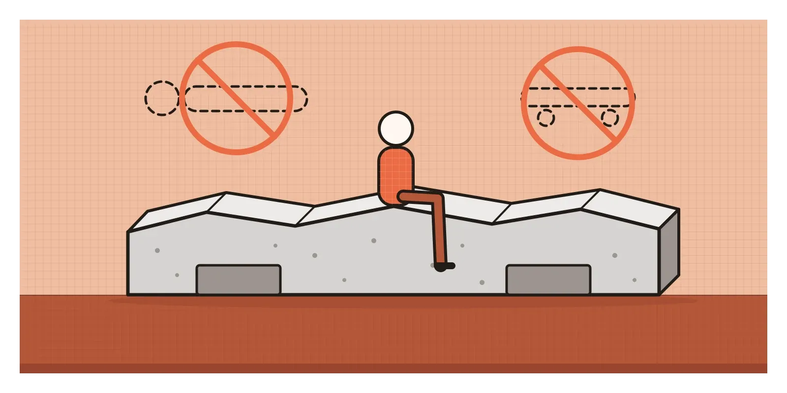
The science writer Frank Swain called it "the perfect anti-object". Critics saw it as hostile architecture, designed against rough sleepers. Its makers argued that homelessness should never be tolerated, so street furniture shouldn't be designed around it. Whatever you think of that argument, the bench makes one thing vivid. Every object we put into the world offers people a set of possible actions. A flat ledge offers lying down, a smooth edge grinding, a gap hiding. The bench's designers went through every possibility and took out all but one.
Those possible actions have a name. They're called affordances, and they're where any interaction begins. In the last post, I described interaction design as a conversation between a person and a system. Affordances are what the system says before anyone has said a word.
What the environment offers
The word was invented by the American psychologist James J. Gibson, and it came out of an unusual problem. During the Second World War, Gibson ran a research unit in the US Army Air Forces' aviation psychology programme, developing visual tests to help select pilots. Landing a plane depends on seeing the ground rushing towards you, its texture and how it flows past. Gibson came away convinced that the old laboratory way of studying vision, with a still observer staring at dots and lines, missed what perception is for. Animals and people perceive in order to move and act in a world of surfaces. In the post on texture, I mentioned his idea of the texture gradient, which grew out of the same work.
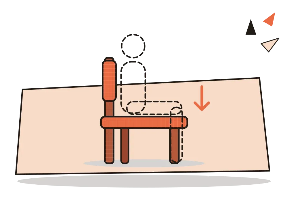
He first used the word "affordance" in 1966 and developed it in an essay in 1977 and in his last book, The Ecological Approach to Visual Perception (1979). "The affordances of the environment are what it offers the animal," he wrote, "what it provides or furnishes, either for good or ill." A firm, flat, knee-high surface affords sitting. A cliff edge affords falling. Water affords drinking, and drowning.
The crucial part of Gibson's idea is that an affordance belongs neither to the object nor to the creature alone. It's a relationship between them. A step that's easy for an adult doesn't afford climbing to a crawling baby. Gibson also insisted that affordances exist whether or not anyone notices them: a hidden trapdoor still affords falling.
Designers met the word through Don Norman, who borrowed it for his 1988 book The Psychology of Everyday Things, later renamed The Design of Everyday Things. The word spread through design teams with a slightly different meaning: a visual hint about how to use something. Norman later admitted the confusion was partly his. In a 1999 article, he wrote that his book had really been about perceived affordances, and that when he revised it he would replace "affordance" with "perceived affordance" throughout. By the revised edition of 2013, he had given the visual hints their own name, signifiers. So when a colleague says "this button needs more affordance", what they usually mean is that it needs a clearer signifier. The button already affords tapping. What's missing is a sign that it does.
Measured in leg lengths
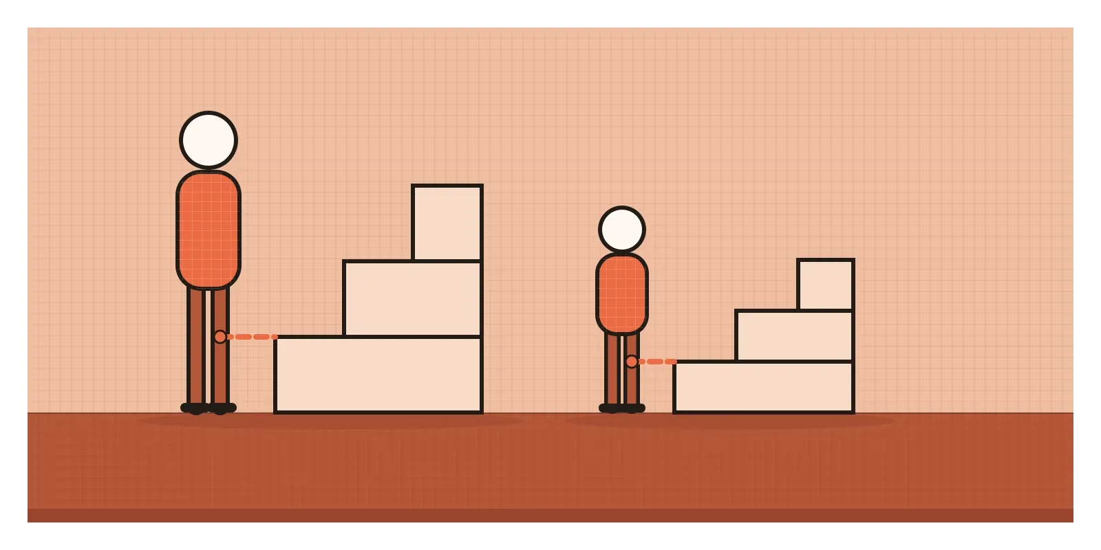
Why do affordances matter so much? Because there's good evidence that we perceive objects in terms of what our own bodies can do with them, quickly and without calculation. In 1984, the psychologist William Warren asked short and tall people to look at stairs of different heights and judge which they could climb without using their hands. The answers depended not on height in centimetres but on height relative to each person's leg length. For both groups, the point where stairs stopped looking climbable came at a riser of about 0.88 times leg length, which matched what a biomechanical model predicted. People were, in effect, seeing the stairs in units of their own legs.
Even babies perceive some affordances. In 1960, Eleanor Gibson, James's wife and a great psychologist in her own right, and Richard Walk built the "visual cliff": strong glass over a checked floor that dropped away halfway across. Most crawling babies wouldn't cross the glass above the drop, even when their mothers called. The glass afforded crawling perfectly well. What they saw afforded falling, and they believed their eyes.
That's the gap designers live in. In 1991, the researcher William Gaver, then at Rank Xerox EuroPARC in Cambridge, sorted affordances into three kinds. Perceptible affordances are actions that exist and look possible. Hidden affordances exist but give no sign, like a gesture nobody knows about. False affordances look possible but aren't, like a painted door or a chair made of cardboard. Good design keeps the first kind and removes the other two.
I should be honest about the limits of the evidence. Warren's results hold up well for bodily actions like climbing, reaching and passing through gaps. Screens are different. A grey rectangle doesn't afford tapping in the way a step affords climbing. Norman made this point himself: on screens, he wrote, conventions matter far more than physical affordances. We learn that underlined blue text is a link the way we learn a language. That's why the flat-design debate I wrote about in the post on flat design was really about signals and conventions, not physics.
A handle that a child can work
One of my favourite Indian examples of affordances is an object most of us have walked past without a second look: the India Mark II hand pump. In the early 1970s, UNICEF and the Indian government were drilling deep boreholes across drought-hit villages, and the cast-iron pumps fitted to them, designed for single families rather than hundreds of users, kept breaking. One UNICEF survey in two states found three quarters of the pumps out of action.
The Mark II was developed from the Sholapur pump, designed by the Swedish engineer Oscar Carlsson for a well-drilling project in Maharashtra, and refined with Indian engineers until field testing was completed in the mid-1970s. It became the most widely used hand pump in the world, with millions installed.
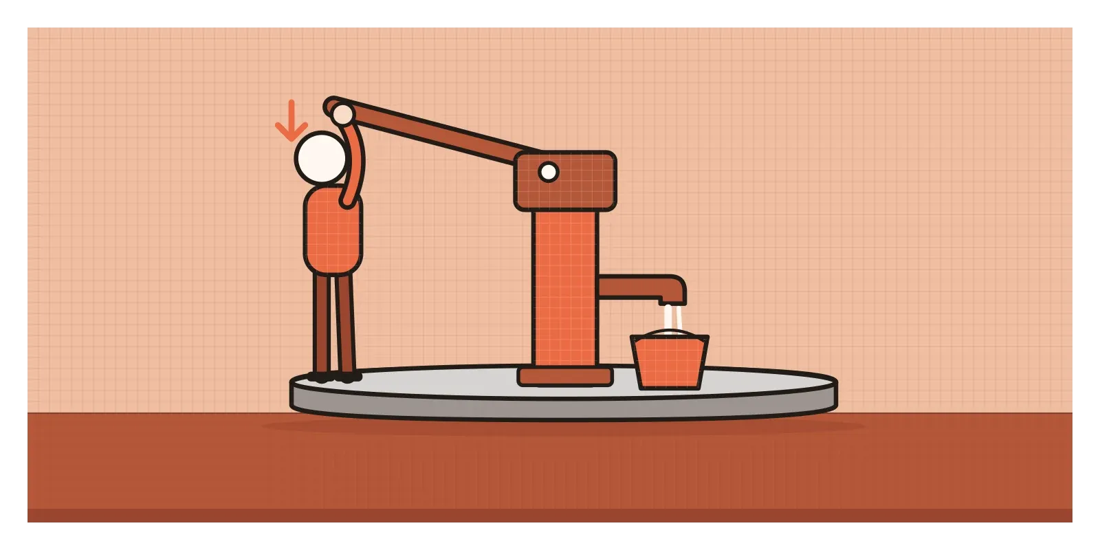
Look at it through Gibson's eyes and it's a lesson in affordances. The long handle sticks out at a height most children and adults can reach, and its length means you can use your body weight rather than just your arms, pushing down to lift water from fifty metres or more below. The spout sits just high enough to fit a bucket or a matka beneath it. The concrete platform affords standing, washing and setting things down. Nobody needs a manual.
But the Mark II also shows how affordances depend on who is looking. The pump affords pumping to a ten-year-old. It doesn't afford repair to a village. Fixing the parts at the bottom of the well meant hauling up long lengths of heavy pipe, which needed a tripod, special tools and a trained mechanic. Where those weren't available, pumps often stayed broken. Later designs, such as the India Mark III, were built so that villagers themselves could maintain them. An object's affordances include what it offers the people who look after it.
Picture a bus pass renewal screen
Picture a city bus app where students renew their monthly passes. The home screen shows a large card with the student's photo and pass details, a heading that says "Renew pass", small grey icons at the top and a list of past payments. In testing, students keep tapping the big card and nothing happens. Meanwhile "Renew pass", which is the real button, looks exactly like a heading, so many never touch it. The past payments can be swiped left to download a receipt, but nothing hints at it.
Gaver's three kinds are all here. The card is a false affordance: it looks like a big tappable object but isn't one. The heading is a hidden affordance: tappable, with no sign of it. The swipe is hidden too.
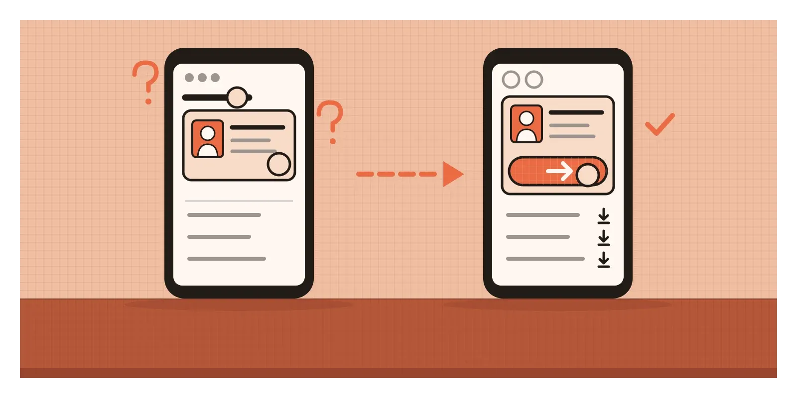
The redesign starts by making the possible actions match what people perceive. Since everyone taps the card, the card becomes the way in: the whole card opens the renewal, and a full-width orange "Renew" button sits along its bottom edge to confirm it. Headings stop being buttons. The swipe stays as a shortcut, but each payment row also gets a visible download icon. The small icons get proper touch targets, at least the size of a fingertip, because something that's too small to hit doesn't really afford tapping, whatever it looks like.
None of this is decoration. It lines up what the screen allows with what it seems to allow.
When taking an affordance away is the point
Removing affordances isn't always wrong. A child-resistant medicine cap is designed to afford opening to an adult hand and not to a small one. A cover over a fire alarm button removes the affordance of an accidental bump. Designers take affordances away all the time to keep people safe, as I'll discuss in the post on constraints.
The Camden bench shows the harder edge. Taking away the affordance of lying down doesn't remove the need to lie down somewhere. It moves people who have nowhere else to go out of sight, and it makes a choice about who a public space is for. When I see spikes on a ledge or armrests every half metre along a station bench, I ask who the object was designed against, and whether anyone asked them.
Affordances also shape who is included. Because they're relationships between objects and bodies, an object that affords something to most people may afford nothing to others. A kerb affords stepping down for many of us and is a wall for someone using a wheelchair. Designing for the "average" body, and calling the result obvious, quietly leaves people out. That's why so many of the posts on accessibility later in this section are really about affordances.
And there's a myth worth dropping. Affordance has become design jargon for making buttons look like buttons. That's useful, but it's signifiers, not affordances. Mixing them up hides the real question: what can people actually do here, with the bodies and devices they have?
How I read a screen for what it offers
When I review a design, I do two quick passes. In the first, I ignore the visuals and list every action the screen genuinely allows: every tap, swipe, long press, drag and typed input. In the second, I look at a still screenshot as if I'd never seen it and list every action it seems to allow. Then I compare. Anything on the first list and not the second is a hidden affordance. Anything on the second and not the first is a false one. Both lists should end up the same.
Here's an exercise for this week. Take a walk through your home, your office or a railway station and look for one false affordance and one hidden one: a flat panel that turns out to be a door, a button that does nothing, a lid that only opens if you know the trick. Then do the same with the apps on your home screen.
In the next post, on signifiers, I'll look at the signs that close this gap, from push plates on doors to the tiny chevrons on a screen, and at why Norman decided the word affordance needed a partner. Gibson spent the war studying how pilots read the ground. The Camden bench and the Mark II pump are both easy to read too, one offering a single brief action and the other offering water to anyone tall enough to reach its handle.
Further reading: James J. Gibson, The Ecological Approach to Visual Perception (1979) · Don Norman, The Design of Everyday Things (revised edition, 2013) · William Gaver, "Technology Affordances" (1991) · Jenny L. Davis, How Artifacts Afford (2020)
The testIn a still screenshot, does everything that looks tappable work, and does everything that works look tappable?