Material Exploration
What designers learn when they let a leaf, a length of cotton or a stone suggest the idea.
Material Exploration
A garden made from what a city threw away
In the post on proportion systems, I wrote about Chandigarh, the new capital Le Corbusier planned for Punjab in the 1950s. While the city was being built, a road inspector in its Public Works Department named Nek Chand Saini began doing something nobody had asked him to do. Riding his bicycle around the construction sites and the villages that had been cleared to make way for the city, he collected things: oddly shaped stones from the riverbeds, broken crockery, shards of tiles, glass bangles, bits of washbasins and toilets, electrical fittings, old bicycle frames. In the late 1950s, he began carrying them to a patch of forest near Sukhna Lake, on government land where no building was allowed, and working on them in secret in his spare time.
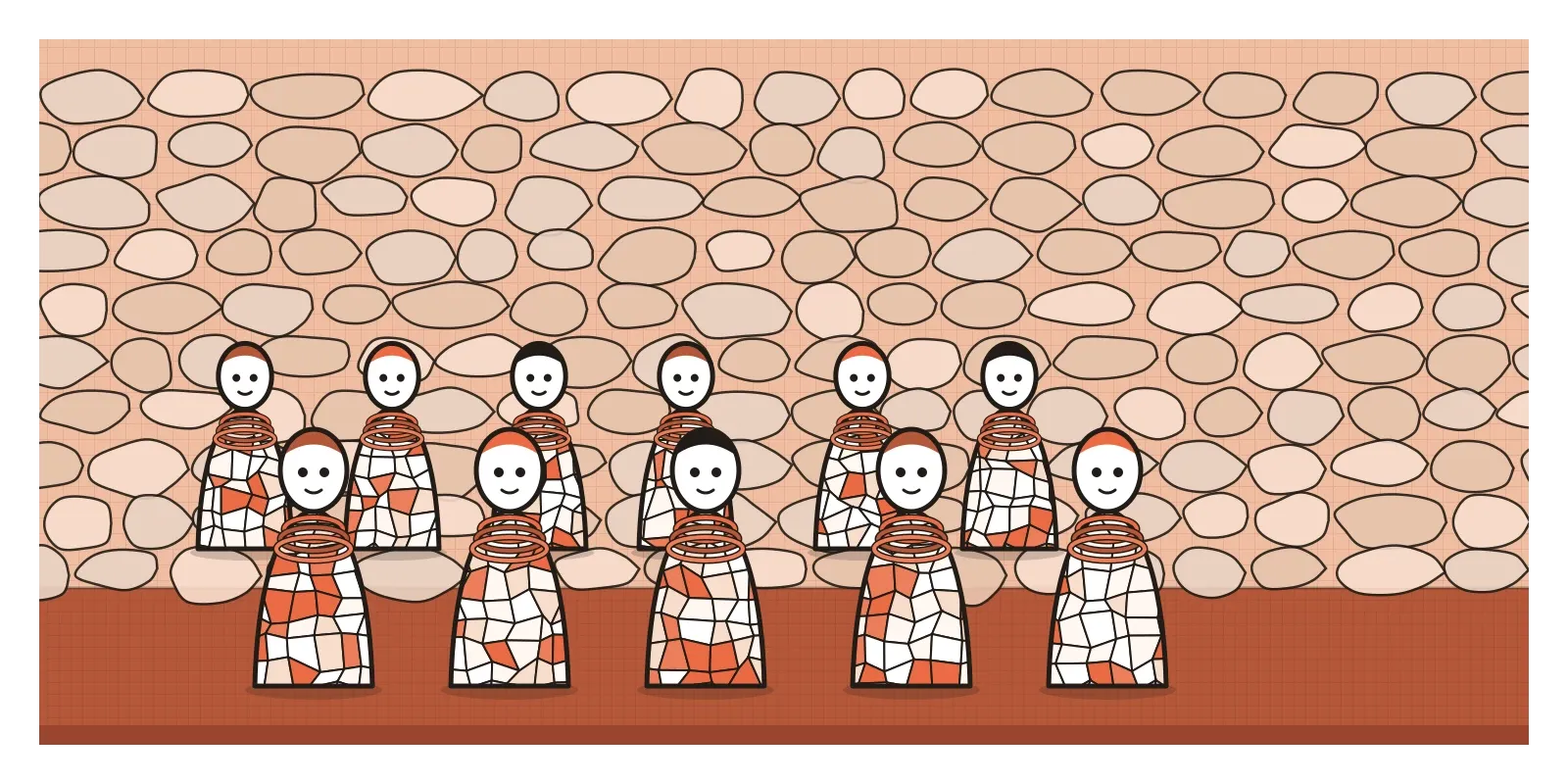
Over the next fifteen years or so, that hidden corner filled up with courtyards, walls, waterfalls and thousands of figures, dancers, animals, birds and rows of village women, their bodies covered in mosaics of broken china and their necklaces made of bangles. When officials stumbled on it in 1975, it covered several acres. Demolishing it was a real possibility, since it was technically illegal, but public opinion swung behind him, and in 1976 the Rock Garden was opened to visitors. Nek Chand was given a salary and a team of workers to keep building it, and it's now one of the most visited places in Chandigarh.
Nek Chand had no training as an artist, and he's often described as an outsider artist, a label that says more about the art world than about him. What his garden shows is a way of working that every designer can learn from. He didn't start with an idea and then look for a material to make it in. He started with the material, a pile of shattered teacups or a stone that already looked like a face, and let it suggest what it wanted to become. That's what material exploration means: using unfamiliar or unexpected materials, like leaf, cotton or stone, to discover and express ideas you wouldn't have reached any other way. This post is the last in the First Principles section, and it closes a short series on Indian aesthetics, after rasa theory and Indian aesthetic concepts.
Every material has opinions
Pick up a sheet of paper and it already has preferences. It folds cleanly in one direction and tears more easily along its grain. It curls when it's wet. Fold it into ridges and it suddenly stands up and carries weight. A cotton cloth drapes, gathers and stretches on the diagonal. A dry leaf crackles and splits along its veins, a fresh one can be stitched and folded. A stone resists almost everything, which is exactly why it lasts. Every material pushes back, and the way it pushes back is information. In the post on sketching as thinking, I described Donald Schön's idea of design as a conversation with the materials of a situation. Material exploration takes that literally. You make a move, the material answers, and you respond.
Design schools have built this into their first year for about a century. At the Bauhaus, the preliminary course taught students to handle materials before they designed anything with them. Josef Albers, whose colour teaching I wrote about in the post on Josef Albers and the interaction of colour, is remembered for exercises with plain paper, asking students to make something new from a single sheet with as little waste as possible, and to discover what folding, scoring and cutting could do to its strength and shape. Students told the story of his first lesson in slightly different versions, but the point was always the same. Don't impose a form on a material. Find out what it can do.
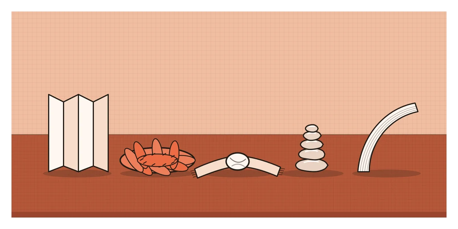
Outside design schools, artists have made whole careers out of this. The British sculptor Andy Goldsworthy, working since the late 1970s, makes pieces outdoors from whatever is around him, leaves pinned together with thorns, stones balanced into egg-like cairns, icicles fused into arcs, and photographs them before the weather takes them apart. His work depends on knowing exactly how a material behaves, when a leaf will hold a curve, how long ice will last in a particular morning's sun. The material isn't a medium for an idea he already has. It's a partner in finding one.
Leaf, cotton and stone in Indian hands
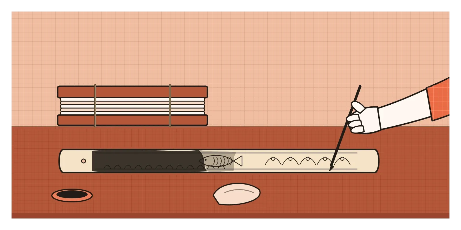
Indian craft traditions are full of people who know a single material with this kind of intimacy, and three of them correspond almost exactly to the leaf, cotton and stone of this post's title. In Odisha, especially in the crafts village of Raghurajpur near Puri, artists still make palm leaf manuscripts and pictures, sometimes called talapatra chitra. Rather than painting on the dried, treated strips of palm leaf, the artist engraves them, cutting fine lines with an iron stylus. A paste of lampblack or charcoal is rubbed over the surface and wiped off, and the black stays only in the grooves, so the drawing appears all at once, like a print. Leaves are then stitched together into panels that can fold like a fan or a concertina. The whole technique, from the way the image is revealed to the way the book opens, comes out of what a palm leaf can and can't do.
Leaves have another life in Indian kitchens and feasts. In eastern and central India, people, many of them in Adivasi communities, collect sal leaves from the forest and stitch them together with thin slivers of bamboo or twig into plates and bowls. They're cheap, strong enough for a meal, and they return to the soil afterwards. More recently, small manufacturers in South India have turned the fallen sheaths of areca palms into pressed plates that are sold as an alternative to plastic. It's a good example of a traditional material exploration feeding a modern product.
Cotton has kantha, from Bengal. Women traditionally layered old saris and dhotis, worn too thin to wear, and quilted them together with rows of small running stitches, often using thread pulled from the coloured borders of the same saris. The running stitch makes the fabric ripple, the borrowed thread brings colour, and the layering turns worn cloth into something warm and new. Kantha wasn't designed and then made. It was found in the cloth itself, in what tired fabric and a needle could become. And stone brings us back to Nek Chand, who looked at a riverbed full of rocks and saw faces and animals already waiting in them.
A material carries its own meaning
Materials don't only behave. They also mean things, and an unexpected material can change what an idea says. In the post on texture, I wrote about Meret Oppenheim's fur-covered teacup and about khadi, cloth whose texture became a political statement. The same principle runs through a lot of twentieth-century art. In 1967, the Italian critic Germano Celant gave the name Arte Povera, poor art, to a group of artists working with earth, rags, twigs, coal and other humble stuff, partly as a refusal of polished, expensive art objects. The Bengaluru-based artist Sheela Gowda has worked with cow dung, human hair and kumkum, the red powder used in worship, so that each piece carries the associations of home, labour and ritual that those materials already hold for many Indian viewers.
For designers, this is a useful warning as well as an opportunity. A map of a city carved in stone says the city is permanent. The same map stitched in cotton feels intimate and handmade. Pressed into a leaf, it feels fragile and temporary. None of these is the neutral version, because there isn't one. Choosing a material, including a digital one, is always choosing part of the message.
Finding the grain of a screen
It might seem that screens have no material at all, but anyone who has built for them knows that's not true. In 2015, the designer Frank Chimero wrote an essay called "The Web's Grain", arguing that the web has a natural grain like wood does. Web pages flow to fit any screen, from a watch to a wall, and designs that fight that flexibility, trying to fix everything at one size like a printed page, keep splintering. Designs that go with the grain stack, wrap and reflow gracefully. That's a material insight, and it can only really be learned by building in the material, resizing a browser window and watching what breaks.

The same is true of the newest materials designers work with. AI models have a grain too. They're good at some things and oddly bad at others, they respond differently to small changes in wording, and they fail in characteristic ways. When I worked on an agentic AI system at Rocketium, a lot of the early design work felt like material exploration: giving the system unusual tasks, nudging the instructions and watching where it bent and where it broke, before deciding what the interface around it should promise. You can't learn that from a specification, any more than you can learn paper from a description of paper.
That's why prototyping in the real material matters so much in digital work. A static mock-up of an app is a picture of a material, not the material itself. The moment you build it, in code or in a prototyping tool that behaves like the real thing, it starts to answer back, with awkward loading states, text that doesn't fit, gestures that feel wrong under the thumb, and those answers are where the good ideas tend to come from.
Spend an hour with one material
Material exploration asks you to reverse the usual order of design. Instead of deciding what you want and then choosing something to make it from, you start with the material and let it make suggestions. It's slower and less predictable, and it produces ideas that a blank page rarely does.
To try it this week, pick one humble material: a fallen leaf, a strip of cotton cloth or a handful of stones. Give yourself an hour and find at least twenty things it can do. Fold it, tear it, stitch it, stack it, wet it, knot it, balance it, press it into clay. Photograph each result. Then choose one idea from an earlier post in this series, rhythm, contrast, balance or emphasis, and try to express it using only that material. You'll find the material has opinions about how it should be done.
This post also closes the First Principles section of Thoughtcloud. Over forty-nine posts, we started with questions about what design is and how designers think, worked through the elements, point, line, shape, form, space, texture, value and colour, and the principles that arrange them, from balance and contrast to hierarchy and rhythm. We learned to draw by observing, gesturing and sketching, looked at how the eye sees and how colour behaves, practised ideating, iterating and critiquing, and ended with three ideas from Indian aesthetics about feeling, ornament and material. The next section, How Things Speak: The Visual Language of Design, takes those foundations into communication, into type, layout, symbols and words, and how a design says something before anyone reads it.
Nek Chand never planned a garden of thousands of figures. He planned to pick up a few interesting stones. The garden grew out of what the stones, the broken plates and the bangles suggested to someone patient enough to listen. That's not a bad way to think about design in general, and not a bad way to finish the foundations.
Further reading: Soumyen Bandyopadhyay and Iain Jackson, The Collection, the Ruin and the Theatre: Architecture, Sculpture and Landscape in Nek Chand's Rock Garden, Chandigarh (2007) · Andy Goldsworthy, A Collaboration with Nature (1990) · Tim Ingold, Making: Anthropology, Archaeology, Art and Architecture (2013) · Frank Chimero, "The Web's Grain" (2015) · Richard Sennett, The Craftsman (2008)