Form Follows Function
What Louis Sullivan really meant, and why designers still argue about it.
Form Follows Function
The man who gave us the rule covered his buildings in leaves
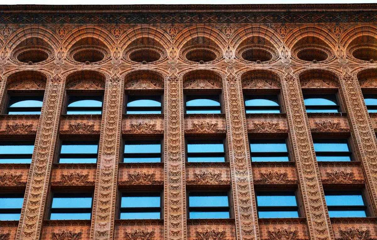
In Buffalo, New York, there is a thirteen-storey office building from 1896 called the Guaranty Building. From across the street it looks the way an early skyscraper should, with a solid base, rows of identical windows and a rounded cornice at the top. Walk up close, though, and it gets strange. Almost every surface is wrapped in reddish terracotta tiles pressed with swirling leaves, seed pods and vines, and even the narrow strips between the windows are decorated. For an office block full of clerks and filing cabinets, it is wildly ornate.
The architect was Louis Sullivan, who designed it with his partner Dankmar Adler, and in the same year it was finished he published the essay that gave design its most quoted phrase: form follows function. Most of us meet those three words early in design school, and we usually meet them as a warning. Decoration is suspicious, every line has to justify itself, and if something doesn't do a job, it goes. There's something very satisfying about it, the way strict rules often are when you're starting out. Put it next to the Guaranty Building, though, and something doesn't add up. The person who coined it clearly didn't think it ruled out decoration. That's because Sullivan meant something much wider by "function" than most of us do, and the narrow, strip-it-all-back meaning we learn today was added later, by other people. Following that shift turns out to be a very good way to understand what the phrase is actually useful for.
Sullivan was trying to work out what a skyscraper should look like
Considered", and it ran in Lippincott's Magazine in March 1896. Sullivan had a genuinely new problem on his hands. Steel frames and passenger lifts had only recently made very tall buildings possible, and nobody had a tradition for what they should look like. A lot of architects dealt with this by stacking old styles on top of each other, a Greek temple at street level, a Renaissance palace in the middle and something vaguely Gothic on top, like a building wearing three outfits at once. Sullivan thought that was silly. Instead of asking which historical style to borrow, he asked what a tall office building actually does all day.
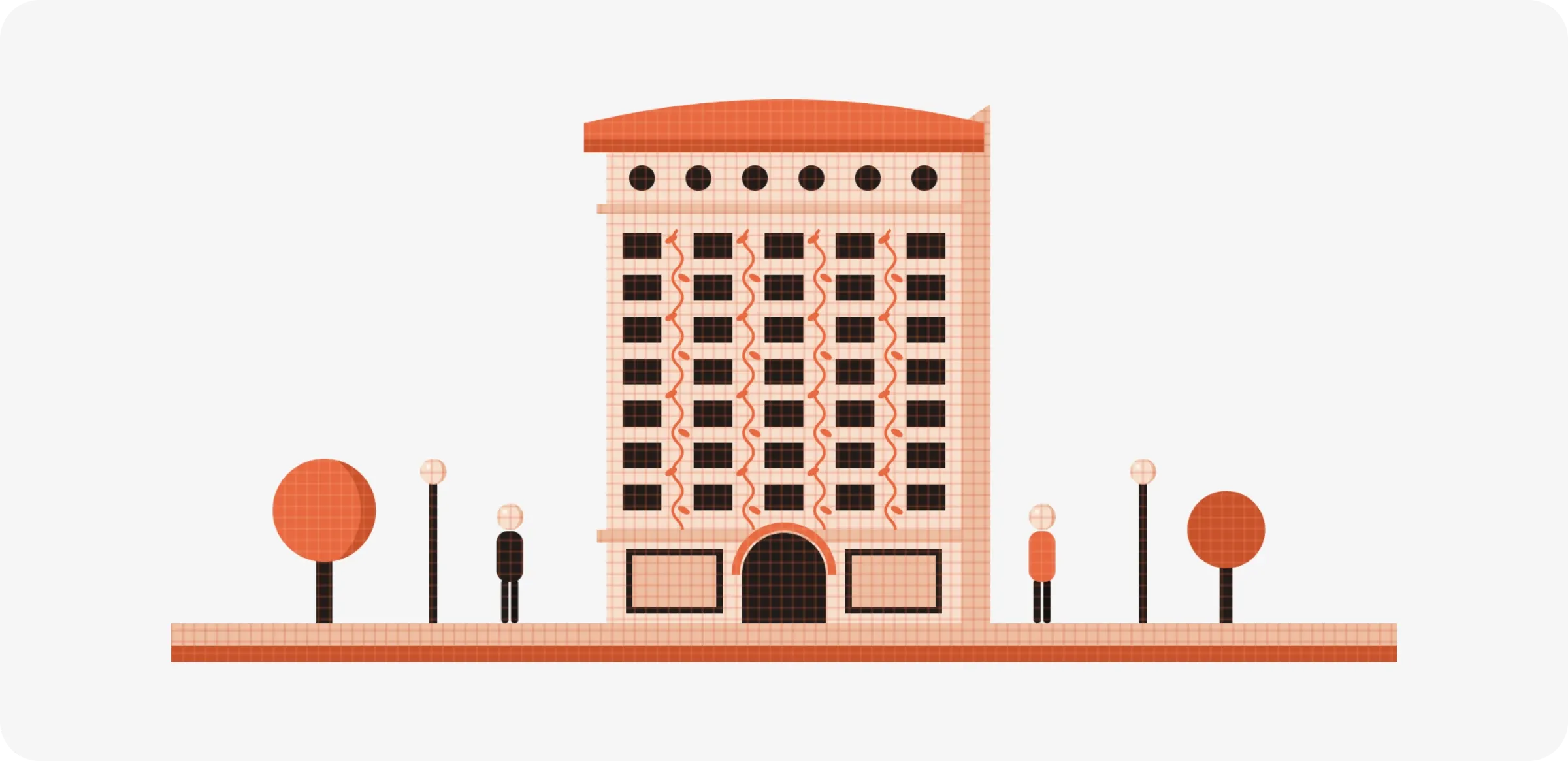
His answer was refreshingly practical. There's a basement for boilers and machinery, a ground floor for shops and banks that need big windows and easy entrances, a long stack of identical floors full of offices, and a top floor where the pipes and tanks end up. If those are the building's jobs, he argued, its appearance should say so: an open, sturdy base, a middle made of repeating windows because every office floor is the same, and a top that clearly finishes things off. Height was the whole point of a skyscraper, so it should look tall and proud rather than apologetic about it. Reading this as a product designer, it sounds a lot like the advice we give about interfaces today: work out what the thing has to do, and let the structure show it honestly.
To back himself up, Sullivan looked at nature. He pointed to an eagle in flight, an apple blossom, a working horse and an oak tree, noted that each one's shape matches the life it leads, and declared it a law that "form ever follows function". The part worth slowing down on is what he meant by function. He didn't only mean the practical job, like housing offices or carrying weight. He meant the whole purpose and character of a thing, including how it should feel to the people who see it. For a skyscraper, part of that purpose was to look modern, confident and tall, a new kind of building for a new kind of city.
Ornament fitted into that in a specific way. In an earlier essay, "Ornament in Architecture" (1892), Sullivan actually suggested that architects give up ornament completely for a few years and learn to make plain buildings with good proportions first. Only once the basic form was right should ornament come back, and when it did, it had to look as though it had grown out of the building, the way a flower grows from a plant, not as though it had been stuck on later. You can see this on the Guaranty Building. The decoration climbs the vertical strips between the windows, which makes the building feel taller and traces the steel frame hidden behind the walls. So in his mind, the ornament was there to strengthen what the structure was already saying. Whether that really counts as "function" is open to debate, and plenty of critics think his theory was more convincing than his buildings. But in Sullivan's own thinking, plain structure came first, and ornament came second as a way of expressing it.
The idea itself wasn't new. Around 25 BCE, the Roman architect Vitruvius wrote that good buildings need three things: strength, usefulness and beauty. In the 1840s, the American sculptor Horatio Greenough was already writing admiringly about sailing ships and animals whose shapes come straight from what they have to do. What Sullivan added was a phrase short enough to remember, and short phrases travel far, sometimes further than their meaning.
Somewhere across the Atlantic, the phrase lost half its meaning
The narrow version of the rule came from Europe. In Vienna, the architect Adolf Loos gave a lecture in 1910 called "Ornament and Crime" (you'll often see it dated 1908). Loos argued that decorating everyday objects wasted workers' time, materials and money, and that a modern society should grow out of it, roughly the way adults stop drawing on the walls. It was meant to provoke, and it worked. When European modernists picked up Sullivan's phrase, they read it through Loos's irritation, and form follows function slowly stopped meaning "let the shape express the purpose" and started meaning "remove anything that isn't strictly needed".
Through the 1920s, the Bauhaus and other modern schools built that idea into how designers were trained. In 1932, an exhibition at the Museum of Modern Art in New York introduced American audiences to what its curators called the International Style, and one of the three principles they listed was simply avoiding applied decoration. Ludwig Mies van der Rohe became associated with "less is more". Decades later at Braun, Dieter Rams summed up his approach as "less, but better", and his radios, shavers and calculators became the go-to examples of function shaping form, with every control sitting exactly where your hand expects it and nothing there just to look interesting. I have a lot of respect for that work, and so does most of the industry. A huge amount of what we call good product design today traces back to it.
Still, something got lost along the way. Sullivan's idea had been generous. It said a building should express everything it is for, including how it should make people feel. The modernist version was much tighter. Function came to mean the physical job, measured and reduced, and anything beyond that was treated as indulgence. By the 1960s, cities all over the world were full of plain glass and concrete boxes that claimed to be following function, and a lot of the people living and working in them found them cold, repetitive and very hard to love.
Then people started pushing back, some of them with a sense of humour
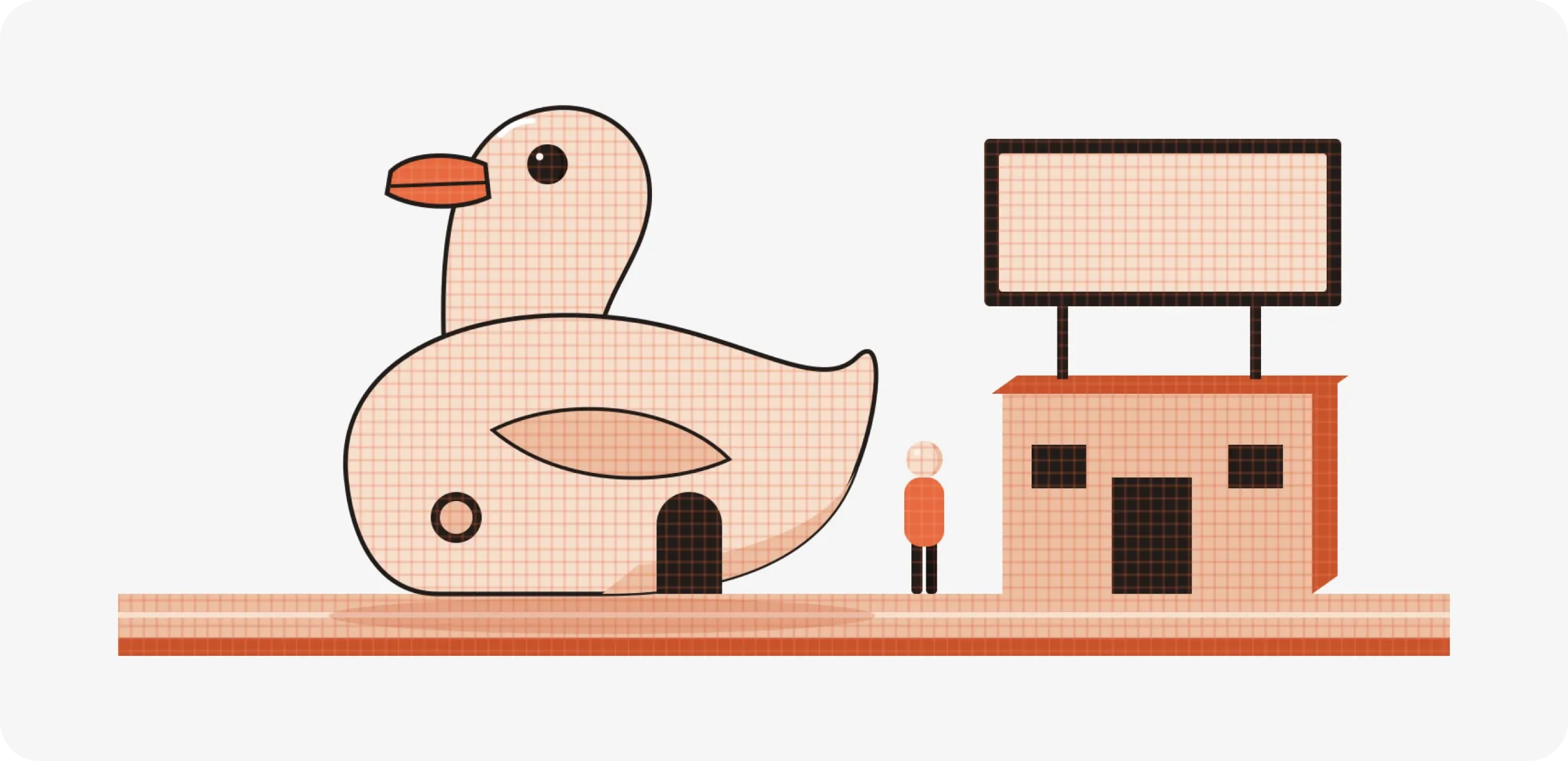
The best-known reply came from the American architect Robert Venturi. In his 1966 book Complexity and Contradiction in Architecture, he flipped Mies's line into a joke that stuck around: less is a bore. A few years later, in Learning from Las Vegas (1972), Venturi, Denise Scott Brown and Steven Izenour made a sharper point using a roadside shop on Long Island. In 1931, a duck farmer there had built a shop in the shape of a giant duck, to sell ducks and eggs. The authors used it to describe two kinds of building. A "duck" is one where the entire form is a symbol of what it does. A "decorated shed" is a plain, practical box with a sign on the front telling you what's inside. Their argument was that buildings always communicate something, and that stripping away every sign and symbol doesn't make a building more honest. It just makes it communicate badly. As someone who has spent a lot of time thinking about how products explain themselves to people, I find this one hard to argue with.
Other designers came up with their own versions of the slogan. In the 1980s, the German industrial designer Hartmut Esslinger and his studio frog became associated with "form follows emotion", the idea that people choose and keep products because of how they make them feel, not just because of what they do. The engineer and writer Henry Petroski went with "form follows failure". In The Evolution of Useful Things (1992), he traced how everyday objects like the fork changed shape over centuries. Early table forks had two prongs, which were fine for holding meat while you cut it and useless for anything small, so more prongs were added over time. In his view, objects don't follow some pure idea of function. They get better one disappointment at a time, every time an earlier version lets someone down.
And then there are objects that seem to ignore function on purpose. In 1990, Philippe Starck designed a lemon squeezer for the Italian company Alessi that looks like a tall, three-legged metal spider. It is famously messy to use, since the juice tends to go everywhere except the glass, and yet it became one of the best-known design objects of its decade. Starck has reportedly said it was never really meant to squeeze lemons, but to start conversations. You can find that annoying, and many people do. I think it's also the strongest possible case for Venturi's point, because the object does have a function. It just isn't the one written on the box.
The real question is which function you mean
Most of these arguments come down to one question that rarely gets asked out loud: which function are we talking about? Take an ordinary chair. Its obvious job is to hold up a person sitting on it. But a café owner also needs it to stack, a manufacturer needs it to ship flat or nest in a container, a parent needs it to survive children, and a boardroom needs it to quietly signal that important people sit here. A chair that does the first job perfectly and fails the rest isn't very functional at all. Once you write down every job an object has, including the quieter social and emotional ones, form follows function stops being a rule about removing things and becomes a rule about paying attention.
India has one of the most beautiful examples of decoration doing real work. The Hawa Mahal in Jaipur, built in 1799, has a pink sandstone front covered in 953 small windows, each filled with a carved lattice screen called a jaali. From the street it looks almost purely decorative, like the building is wearing stone lace. But the jaali had clear jobs to do. It let the women of the royal household watch festivals and street life without being seen, and it let breezes move through the building while softening the harsh Rajasthan sun. Here, the ornament and the function are the same thing. I'd genuinely like to know which part of it Loos would have called the crime.
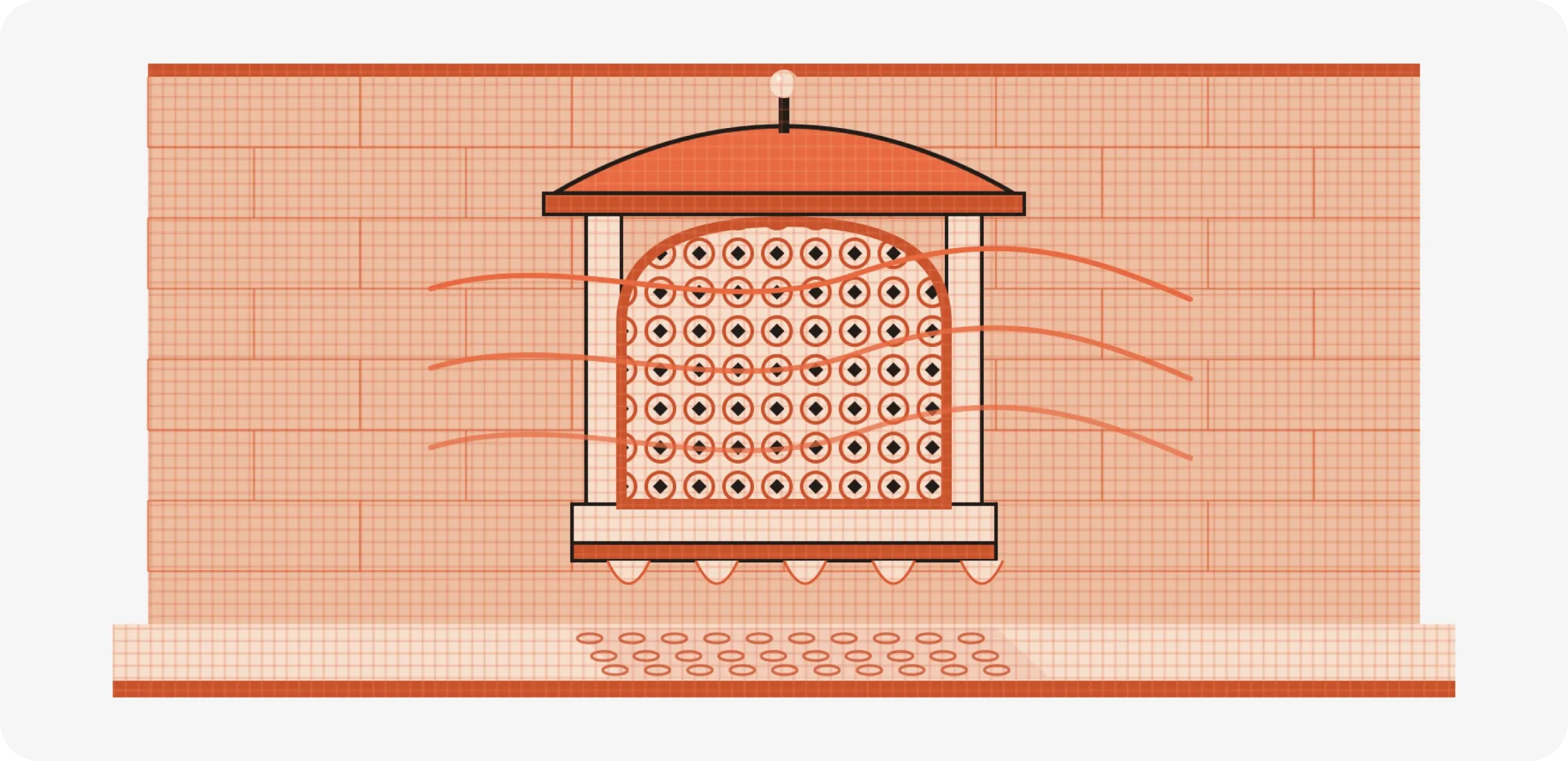
The same thing happens on a much smaller scale in most Indian kitchens. On a pressure cooker, steam builds up until it lifts the weighted valve on the lid and escapes with that familiar whistle. The sound is really just a side effect of releasing pressure, but it has become one of the most useful bits of feedback in the house. People count whistles the way they would read a timer, and plenty of us can tell from another room how far along the dal is. Nobody designed that whistle to be loved, but it's a perfect example of one form doing a mechanical job and a communication job at the same time. Those double jobs are where a lot of the best design comes from, and learning to spot them is most of the skill.
On a screen, nothing pushes back except your judgement
Physical objects come with a built-in editor. Gravity, materials, the size of a hand and the cost of a mould all push back on a designer's ideas. A teacup handle can only get so thin before it snaps or burns your fingers. On a screen, almost none of that exists. A button can be any shape, size or colour, and it costs nothing extra to make it look like wood, glass or nothing at all. That freedom makes Sullivan's phrase more important and much harder to apply, because the only thing keeping form in line is the designer's judgement.
The last fifteen years of interface design show this nicely. In the early smartphone years, Apple's apps imitated real objects, so the calendar was dressed in stitched leather and the notes app looked like a yellow legal pad. Critics called it fake and cluttered. In 2013, iOS 7 swept most of that away for flat colour, thin type and lots of white space, and much of the industry followed. Both sides believed they were following function. The realistic textures helped people who had never used a touchscreen understand what each app was for, and the flat style cleared away visual noise once people no longer needed that help. Neither was simply right. They were serving different people at different moments.
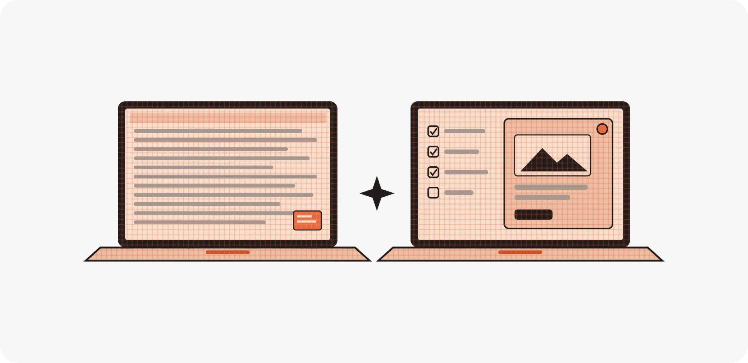
I ran into my own version of this while designing an agentic AI system at Rocketium. Our first version showed the agents' raw thinking on screen, partly because hiding it would have taken engineering much longer. Technically, it was very "functional": everything the system did was visible. In practice, designers read the wall of text, felt overwhelmed and clicked Proceed without checking the actual output they were meant to review. The form was showing everything except what mattered. When we rebuilt it around a simple plan, a clear status and the output itself, people started trusting it. That experience is why, for digital products, I translate the phrase a little. On a screen, the main function of form is to help people understand what something is, what will happen if they touch it, and what just happened when they did. Anything that gets in the way of that isn't following function, however clean it looks.
It works better as a question than a rule
After all of this, I don't think form follows function is wrong. I think it goes wrong when we treat it as a rule, and becomes really useful when we treat it as a question. The rule version says: strip it back until only the job is left. The question version asks: what are all the jobs this thing has to do, for whom, and which ones matter most? The first one tends to give you interchangeable grey boxes. The second gives you the jaali, the pressure cooker whistle and a calculator a stranger can pick up and use without instructions.
In practice, this gives designers a simple habit before shaping anything. Write down the functions, not just the obvious one, including the practical jobs, the jobs of making the thing understandable, and the emotional and cultural jobs that people rarely say out loud but always feel. Then rank them, because no form can serve every function equally well, and deciding which ones win is most of the design work. And when someone in a review calls a detail "just decoration", the useful response isn't to defend it or delete it straight away. It's to ask what job that detail is doing, if any, and be honest about the answer.
Which brings me back to Buffalo. Sullivan would have said the leaves and vines on the Guaranty Building were part of its function, because they made an office block feel alive and proud instead of like a stack of filing cabinets, and because they pulled the eye upwards along the height that the steel frame had made possible. You don't have to agree with him, and plenty of people since have said this stretches the word "function" too far. But the building is a good reminder that the phrase began as a generous idea about expressing what something is, and only later shrank into a rule about taking things away.
Further reading: Louis Sullivan, "The Tall Office Building Artistically Considered" (1896) · Adolf Loos, "Ornament and Crime" (1910) · Robert Venturi, Complexity and Contradiction in Architecture (1966) · Venturi, Scott Brown and Izenour, Learning from Las Vegas (1972) · Henry Petroski, The Evolution of Useful Things (1992)