Three places held the brand. None of them agreed.
September 14, 2025
I designed the information architecture that gave every campaign one source of truth for its brand, replacing repeated setup with a single Brand Kit everything else pulls from.
- Role
- Product Designer, IA & design
- Timeline
- 2 months
- Team
- Director of design, PMs, Engineers and Visual designers
- Impact
- One setup per campaign, not per project
Context
The same five colors, uploaded for the tenth time.
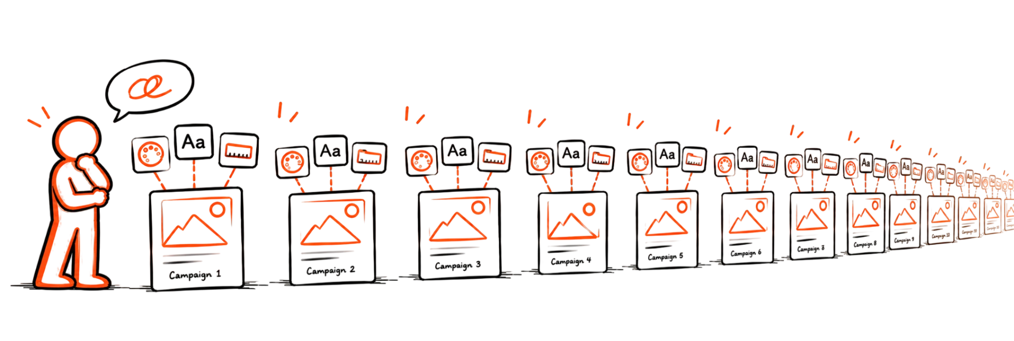
A campaign wasn't one project. It was many, and every one of them started from zero. Colors and fonts got uploaded inside the editor. Sizes got chosen again while picking a template, and again in the campaign's own sizes tab.
Three places, each capable of holding the same setup. None of them synced with the other two.
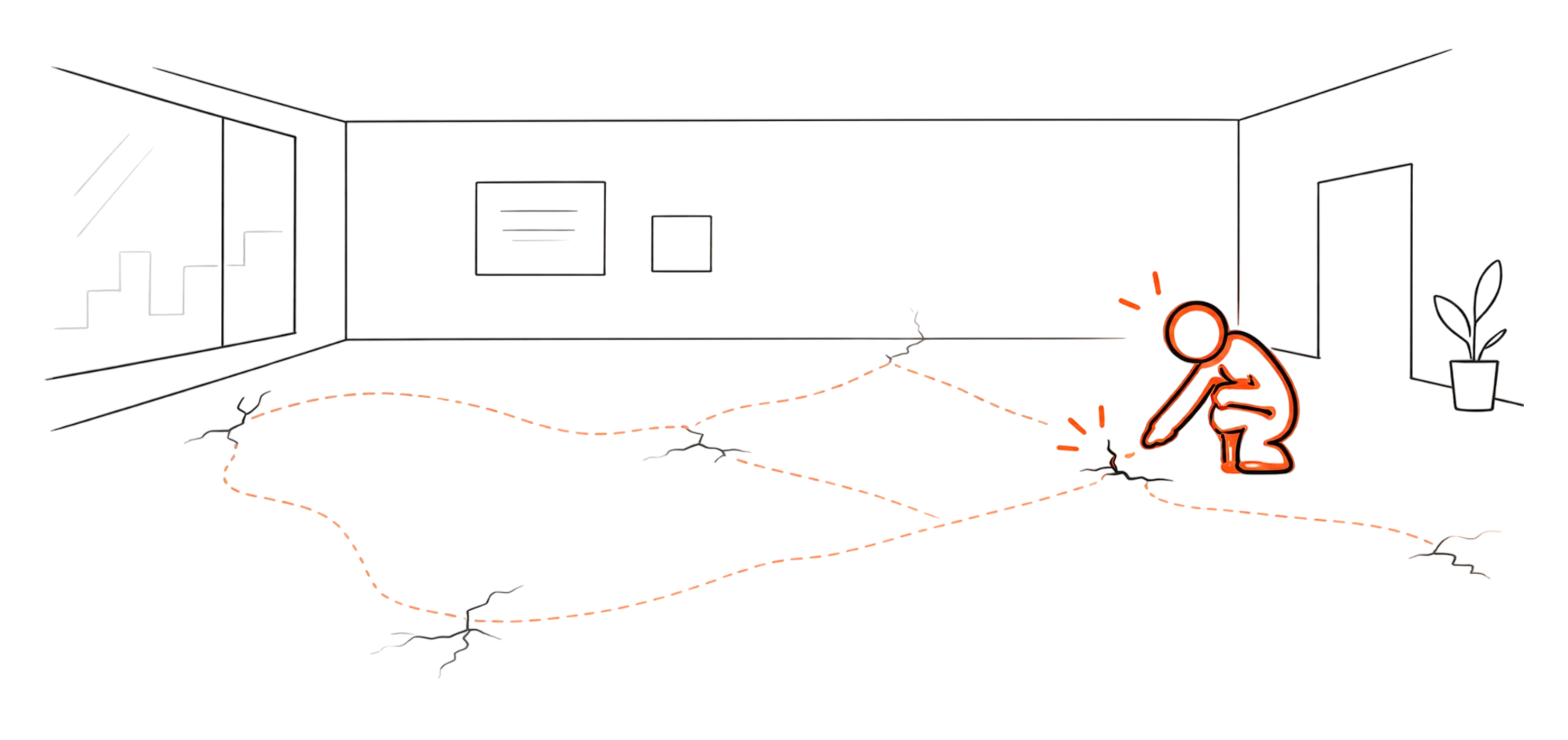
The brand didn't change between project four and project five. Someone still rebuilt it, every time, because there was nowhere to point and say: this is it, this is the brand.
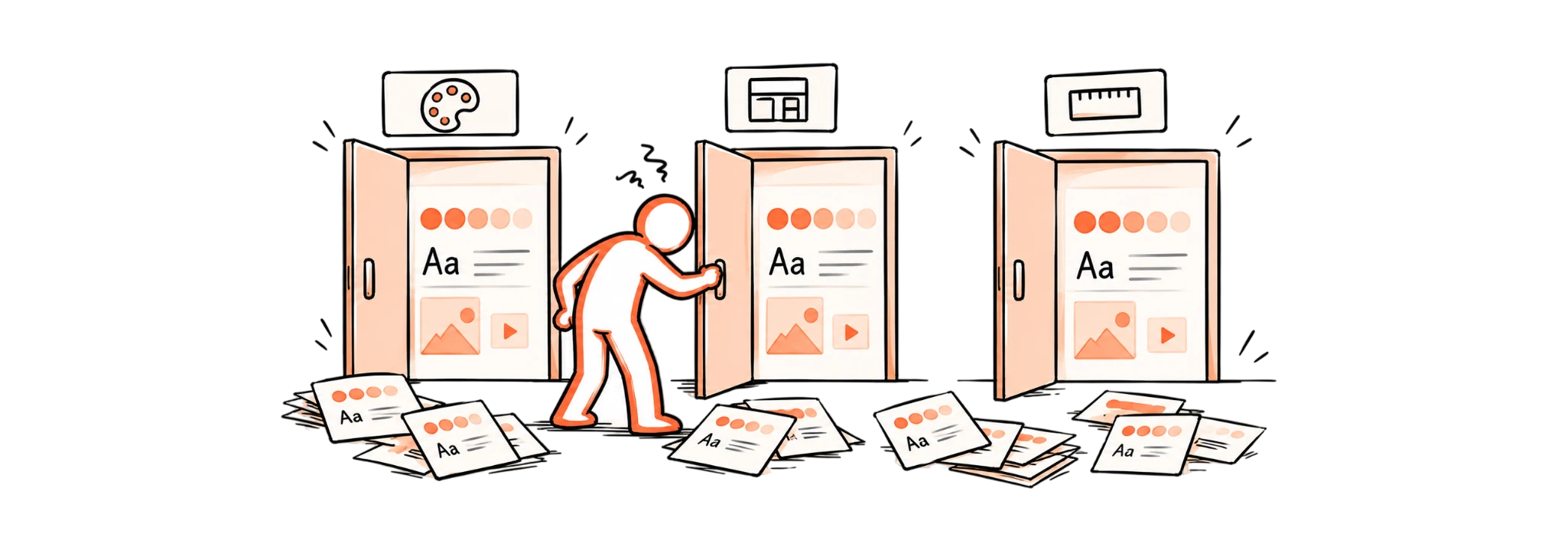
Just three scattered entry points, and whoever set up the next project had to remember, or rediscover, what the last one already knew.
Problem statement
Every project asked the same question. Nobody had the same answer twice.
When nothing lived in one place, the gaps showed up everywhere.
1.The brand drifted.
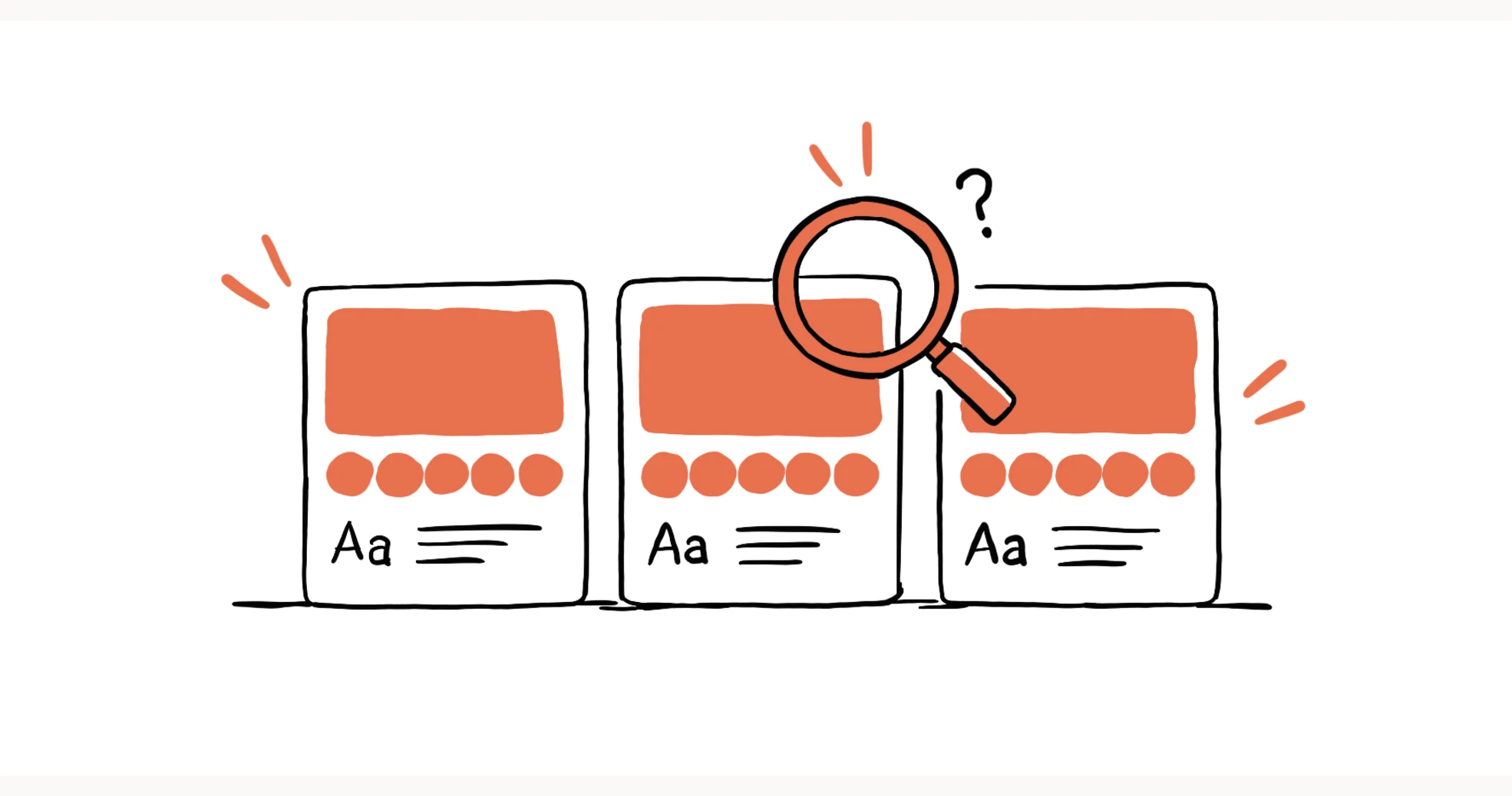
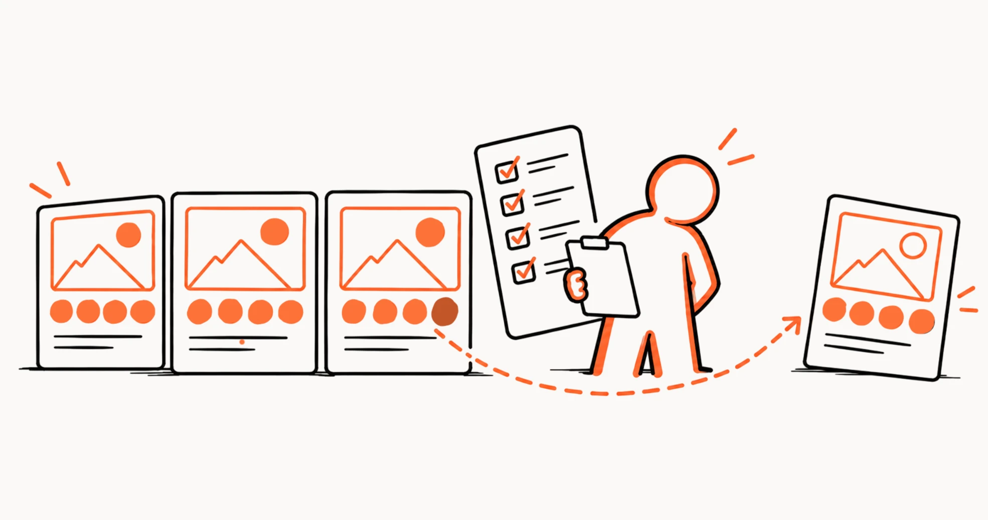
A color uploaded fresh for project four wasn't always the exact color from project one. Small differences crept in, unnoticed, until a campaign that was supposed to look like one thing looked like several slightly different things.
2.The same work happened again, and again.
Every new project meant re-uploading fonts, re-adding colors, re-selecting sizes, work that had already been done, sometimes just hours earlier, for the same campaign.
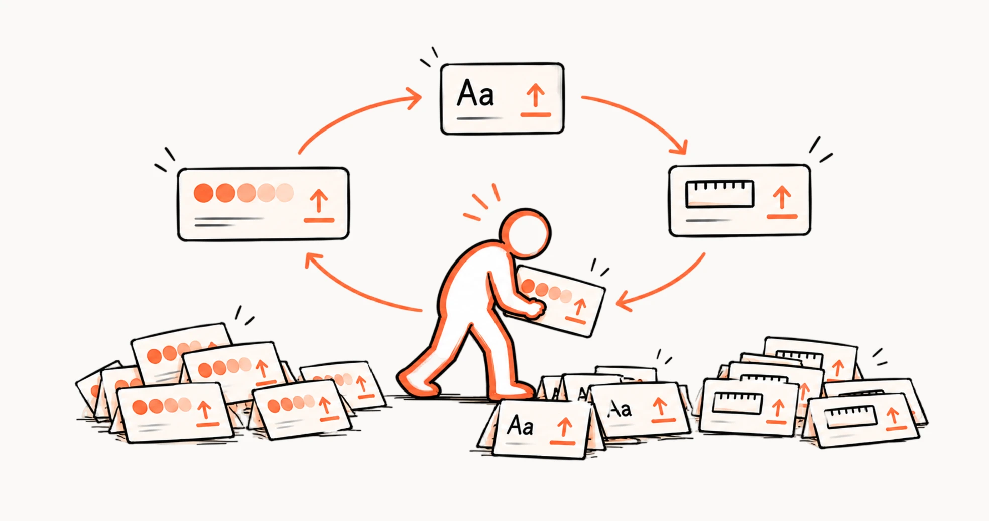
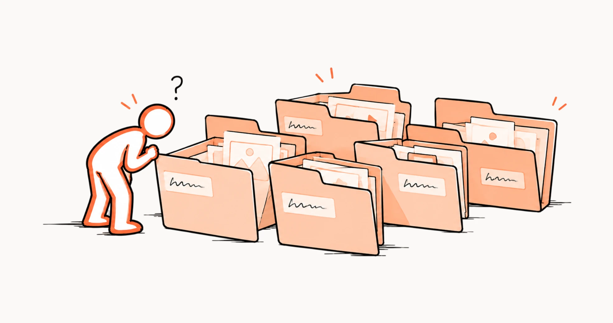
3.New people had nowhere to look.
A designer joining a campaign midway had no single place to learn what the brand actually was. They dug through old projects, hoping to find a version close enough to copy from.
4.Mistakes slipped through quietly.
An outdated color. A size nobody meant to still be using. With nothing centralized, nothing flagged it. It just shipped.
Four different symptoms. One missing thing underneath all of them: a place to call the source of truth.
How might we give every project in a campaign one place to pull the brand from, so nothing has to be rebuilt, redecided, or rediscovered?
Role and scope
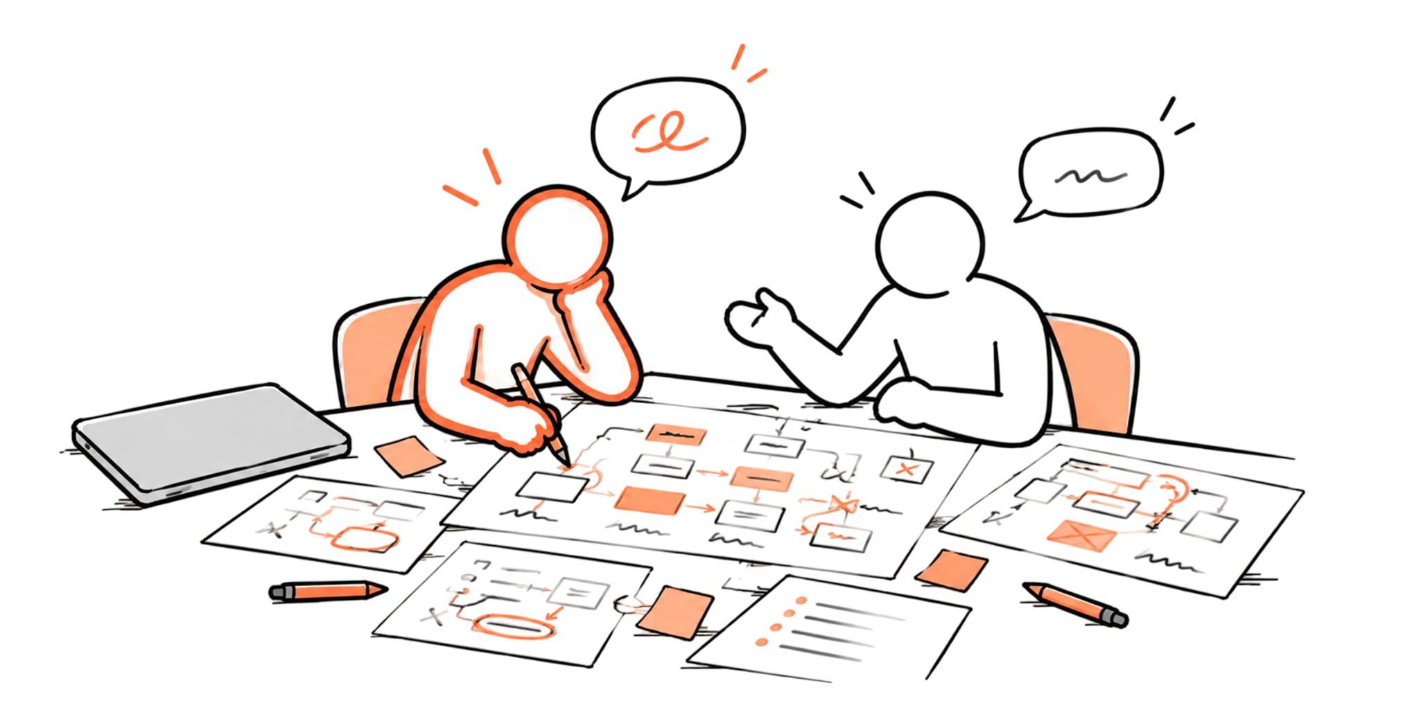
Two people, a lot of drawings, and no UI for weeks.
I worked on this with Rocketium's Director of Design, and we made a deliberate choice early on: no designing, not yet. Before anything touched a screen, we mapped how people actually moved through sizes, fonts, and colors today, three separate places, three separate habits, drawn out by hand until the pattern was impossible to miss.
Only once the structure was right did we let ourselves design it. The interface came last, and it came easier for having waited.
It also happened to be some of the most fun I've had on a project. Open brainstorming, a lot of bad jokes, and a working relationship where disagreeing with each other never felt like a risk.
Research and discovery
The problem was never new. It just got louder.
This wasn't something we uncovered. It had been sitting inside the product from the start, a known gap nobody had the volume to feel yet.
Then Rocketium grew. More customers, more campaigns, more projects inside each one, and the old gap stopped being theoretical. One designer said what everyone else was quietly thinking: "It's tiring to set this up again and again."
That was the whole discovery. Not a hidden workaround, not a surprising workflow. Just a problem that had always existed, finally loud enough to act on.
The architecture
One hub. Everything else nested inside it.
The fix wasn't a new feature. It was a new shape for what already existed.
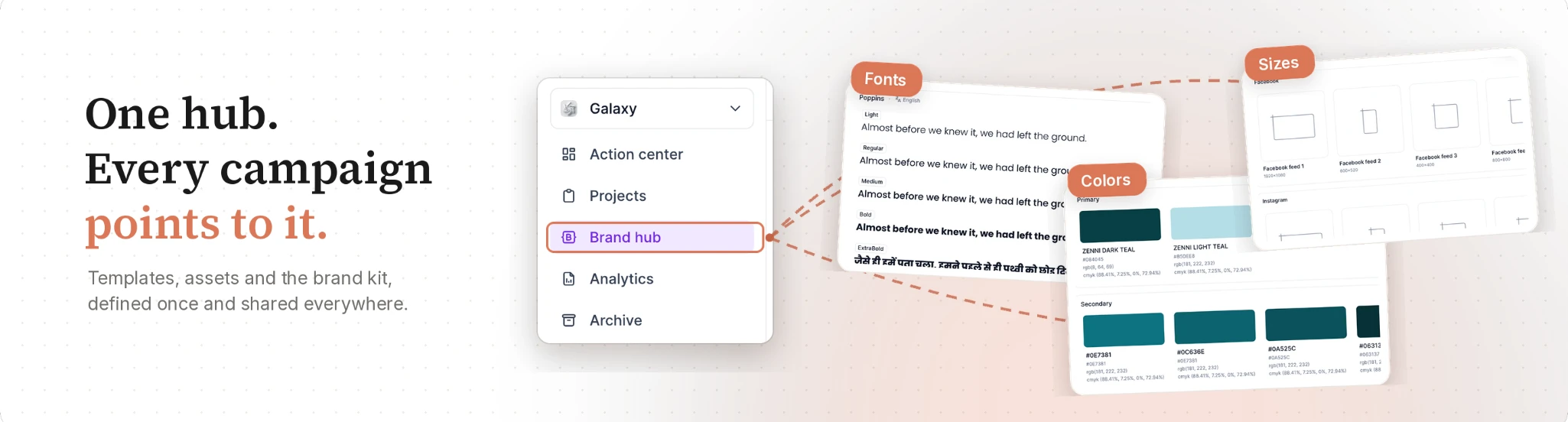
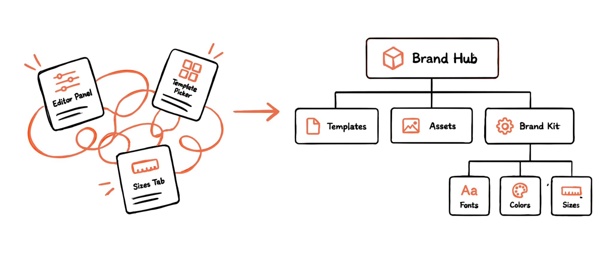
Everything a campaign needed, its templates, its assets, its fonts, colors, and sizes, moved under one roof: the Brand Hub. Inside it, three clear categories. Templates, ready to reuse. Assets, the campaign's media, centralized. And the Brand Kit, holding fonts, colors, and sizes as one set, defined once.
Nothing about this needed new technology. It needed someone to decide where everything actually belonged, and to stop pretending three scattered entry points were a system.
Once the structure existed, every project inside a campaign could simply point to it, instead of rebuilding it.
Inside the brand hub
One place. Every campaign points to it.
Access points
No project to open first, no digging. Just the sidebar, one click, and the whole brand sitting there, Templates, Assets, Brand Kit, already sorted the way it should've been from the start.
Fonts
It starts empty, and that's the point. Add one family, and every weight shows up with it, nothing flattened into one guess. Even the language gets asked upfront, because not every brand speaks English only. Then it travels, edit it once, share it anywhere.
Colors
No more hex codes pretending to be names. Add a color, name it like a person would, Primary, not #0E7381. Adjust it when it's slightly off. Send it to another campaign, and it just arrives, already labeled, already right.
Sizes
Pick a category, or start a new one. Name the size, set the numbers, done. Outdated one, gone in a click. And the next campaign that needs it? It's already there, waiting.
Impact
The numbers. And what they actually meant.
- 1 setupnot 20+
- ~90%fewer mismatches
- Under 2minto onboard a new project
A campaign with a dozen projects used to mean a dozen uploads. Now it means one, and everything else just points to it.
With colors, fonts, and sizes pulled from one place, the small drift between projects, a shade slightly off, a size that shouldn't exist, had far less room to creep in.
What used to mean digging through old files to guess the brand now means opening the Brand Hub and finding it already there.
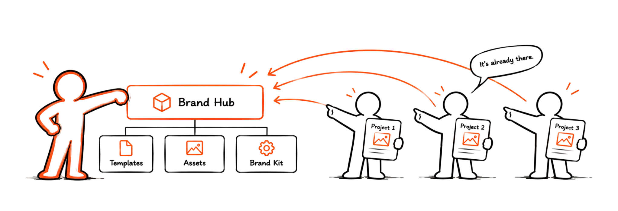
The work was always ready on day one. Now, so was everyone else
Learnings
What this taught me about problems that never announce themselves.
Not every project starts with a crisis. This one didn't. Nothing broke, nobody escalated, the gap had been sitting there since the beginning, quiet enough to live with.
That's the part I'd pay closer attention to next time. The loudest problems get fixed first, simply because they're loud. The quiet ones wait, and they cost just as much, they just cost it slowly, a few minutes at a time, across hundreds of projects, until the total is enormous and nobody ever added it up.
I also learned something about sequence. We didn't open a design tool for weeks. We drew, argued, redrew, until the structure made sense on paper. The interface came last, and it came easier for it. Good architecture isn't glamorous work. It rarely photographs well. But it's the part that decides whether everything built on top of it holds up, or quietly drifts, the way the old system did.
If a problem has been tolerated for years, that's not proof it's small. Sometimes it's just proof nobody added up what it was costing.